Molecuve — Logo and Visual Identity

Molecuve
Molecuve is a modern online learning platform designed to simplify and enhance the learning experience. Unlike traditional methods that rely on lengthy theoretical texts, Molecuve offers concise, focused content supported by engaging visual representations and animations. Research underscores that visual learning is significantly more effective than purely text-based approaches, making Molecuve a forward-thinking choice for education.
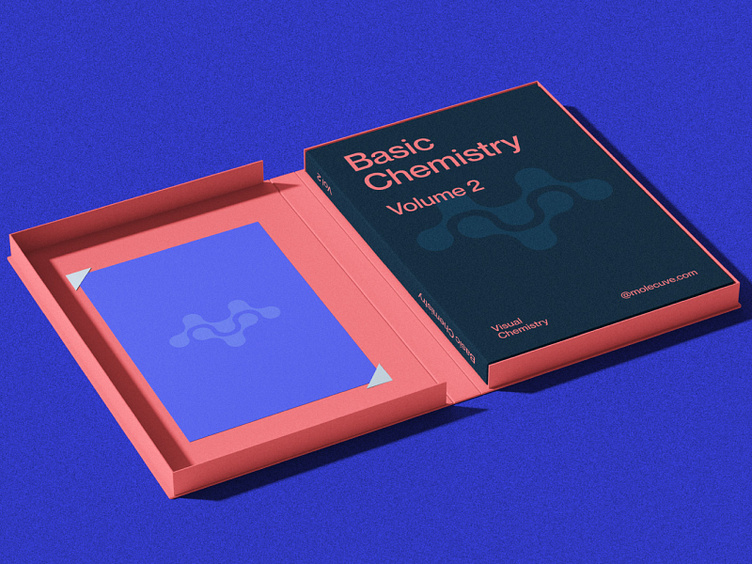
The company’s branding has undergone a thoughtful transformation. The previous logo lacked distinction in a crowded market, prompting the need for a complete rebrand. After extensive discussions, the name "Molecuve" was proposed, a creative twist on the word "molecule," with the letter "i" replaced by "v," reflecting the client’s last name. The name, paired with rounded geometric curves in the design, conveys approachability and fosters a stronger connection with the audience.
The newly crafted logo integrates the letters "m" and "v" to form a molecular structure, symbolizing both innovation and the platform's industry focus. Its unique and memorable design establishes a strong visual identity, ensuring the brand stands out while maintaining relevance to its core mission.
—
Contact me if you want amazing designs.
Full case study: Behance