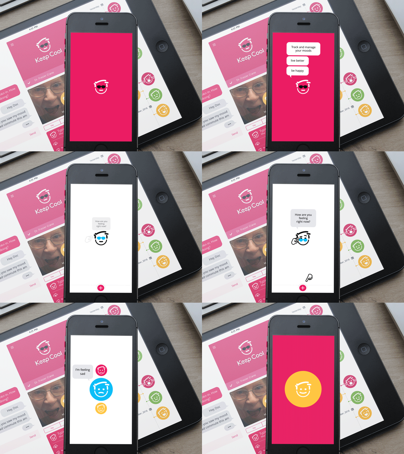
mHealth app intro - Daily UX #004
Exploring how to take the first time user directly into using the app (capturing a mood) as a part of on boarding (no yucky registration forms to fill out first).
Once the user selects their mood (app has over 50 moods to choose from even though we are only showing three here) we capture a selfie and analyze it for emotional state and compare it to their stated mood. I'm looping it after the mood selection so it looks pretty on dribbble :)
We'll take any thoughts you guys have thanks!
More by Agilitee View profile
Like
