Credit Card Checkout
Overview:
Presenting my latest design exploration: a credit card checkout page designed with a focus on minimalism, a sleek dark theme, and user-centricity. In today’s digital landscape, the checkout process is a critical touchpoint for any business. This concept aims to make that experience as smooth, secure, and visually appealing as possible, especially for users who appreciate the elegance and reduced eye strain of dark mode interfaces.
Design Thinking - Key Decisions Behind the Design:
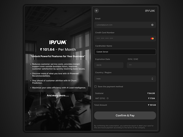
Embracing Minimalism: In the realm of checkout pages, clarity and speed are paramount. I opted for a minimalist approach to eliminate distractions and guide the user directly through the payment process. Every element, from the input fields to the call-to-action button, is intentionally placed and styled to reduce cognitive load and ensure a seamless flow.
The Power of Dark Mode: Dark mode isn't just a trend; it’s a user preference for reduced glare, enhanced focus, and a modern aesthetic. This design leverages a sophisticated dark palette to create a visually calming and professional experience. The dark background allows the essential form elements to pop, improving readability and visual hierarchy. It’s designed for users who appreciate a contemporary and less visually overwhelming interface, particularly during late-night browsing or in low-light environments.
Left-Side Value Proposition - Beyond Just the Form: Recognizing that the checkout page is often the final point of persuasion, I incorporated a dedicated left-side section. This isn’t just visual filler; it’s a strategic space to reinforce the value users are receiving. By showcasing key benefits like "Reduces customer service costs," "AI-Powered Recommendations," and "AI Churn Prediction," we remind users of the powerful features they are unlocking and justify their purchase decision right at the moment of transaction. This approach transforms the checkout from a purely transactional step into a value affirmation.
Form Clarity & User Flow: The right-side of the design is dedicated to the core payment form. Input fields are generously spaced and clearly labeled for effortless completion. Visual cues, like the card brand icon dynamically appearing within the card number field, provide subtle yet helpful feedback. The progress indicator (although simple in this design) hints at a streamlined, single-page checkout, further minimizing user effort.
Visual Security & Trust: While not explicitly shown in this static image, considerations for security are baked in. In a live implementation, visual cues like security badges, padlock icons, and clear HTTPS indicators would be essential. The overall clean and professional aesthetic also contributes to a sense of trustworthiness and reliability, crucial for sensitive transactions like payment processing.
Market Relevance & Minimalist Dark Mode Differentiation:
This design resonates with current trends and market demands in several ways:
Echoes Familiar Checkout Patterns: It maintains a recognizable structure common to many online checkout pages – email, card details, billing address (simplified to country in this example), and a clear summary. This familiarity ensures users won’t feel lost or confused during the process.
Dark Mode as a Growing Preference: As dark mode gains mainstream adoption across operating systems and applications, designing for this aesthetic becomes increasingly relevant. This design directly caters to the significant and growing segment of users who prefer dark interfaces.
Elevated User Experience: While many checkout pages are functional, they often lack visual appeal. This design aims to elevate the user experience by providing not just a working form, but a pleasant and modern one. The minimal dark theme helps achieve this, offering a refined alternative to often cluttered and brightly lit checkout flows.
Value-Driven Checkout: The inclusion of the left-side value section is a departure from purely transactional checkout pages. It moves beyond simply collecting payment information and proactively communicates value to the user, potentially reducing cart abandonment and increasing customer confidence.
Let me know what you think! I'm always eager for feedback and discussion on design approaches, especially in critical user flows like e-commerce checkout. What are your thoughts on minimalist dark mode for payment pages? Are there any elements you feel could be further enhanced?
#DailyUI
