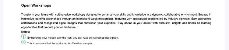
UI/UX & Front-End | Responsive Workshop Page
This conceptual project, inspired by an old design, was created to demonstrate my expertise in graphic design, UI/UX, and front-end development. The redesign aimed to enhance user experience while establishing a structured, visually appealing interface.
🔹 Design & Development Process:
1️⃣ Analyzing the Previous Design & Research:
Identifying UX issues in the old version, including lack of mobile compatibility, poor navigation, and unstructured information display.
Conducting user behavior analysis and benchmarking successful designs.
Defining redesign objectives based on UI/UX principles and WCAG accessibility standards.
2️⃣ Wireframing & UI Design:
Creating low-fidelity wireframes to test information architecture.
Establishing a modern and minimal visual identity using Adobe Photoshop & InDesign.
Developing an interactive Adobe XD prototype to refine user interactions.
3️⃣ Front-End Development & Implementation:
Coding the interface using HTML, CSS, and JavaScript for an interactive and responsive experience.
Utilizing Media Queries, Flexbox, and Grid to ensure cross-device compatibility.
Implementing engaging sliders, advanced filtering, and intuitive search functionalities to enhance interactivity.
4️⃣ Testing, Optimization, and Finalization:
Testing the design across various devices (desktop, tablet, mobile).
Optimizing loading speed and performance to improve user experience.
Incorporating feedback and deploying the final optimized version.
🔹 Key Achievements:
✔ Strong graphic design expertise in refining UI and maintaining visual consistency.
✔ Developing a fully responsive interface for seamless cross-device experience.
✔ Creating a highly functional and user-friendly mobile version for better accessibility.
✔ Resolving limitations of the previous design, including lack of responsiveness and mobile adaptation.
This project highlights my skills in graphic design, UI/UX, and front-end development, focusing on creating a professional, interactive, and user-centered experience.

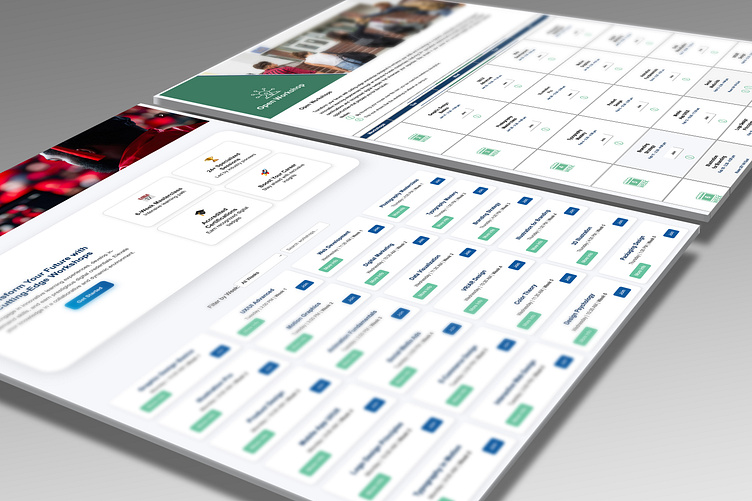
These images provide a clear visual comparison between the old and new designs of the workshop page. The left side showcases the redesigned version, which focuses on improved user experience (UX), enhanced navigation, and a fully responsive layout. In contrast, the right side displays the previous version, which lacked responsiveness and had a rigid, less intuitive structure.
🔹 In this redesign, my focus was on:
✔ Refining the visual identity with a modern and structured layout.
✔ Developing a fully responsive interface that adapts seamlessly across all devices.
✔ Enhancing the user experience by improving navigation and accessibility.
✔ Solving previous design limitations, which were static, inflexible, and non-responsive on mobile.
This comparison highlights how I applied UI/UX principles and graphic design expertise to create a user-friendly and modern experience, making navigation and content access significantly more intuitive.
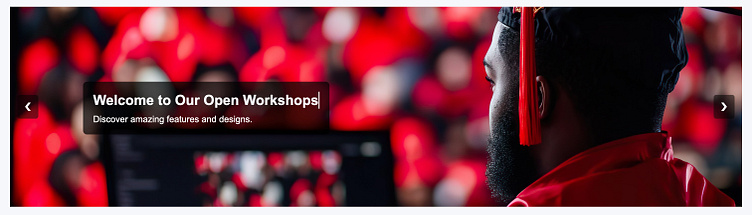

These images showcase a significant transformation between the old banner and the new slider design. The top image presents the redesigned version, featuring dynamic sliders, engaging text effects, and smooth animations. This enhancement not only boosts visual appeal but also improves the functionality of the page, allowing users to interact with key content more effectively and intuitively.
In contrast, the bottom image represents the previous version, which relied on a static, non-interactive banner. This design only displayed a fixed message, lacking any visual effects or user engagement features, which reduced both the visual impact and overall usability of the page.
🔹 In this redesign, my focus was on:
✔ Enhancing user interaction by replacing a static banner with a dynamic slider.
✔ Incorporating engaging text effects and smooth animations to elevate visual appeal.
✔ Improving the page’s functionality by allowing multiple key messages to be displayed dynamically without requiring excessive scrolling.
This transformation makes the new design both aesthetically appealing and functionally superior, delivering a modern and highly effective user experience.
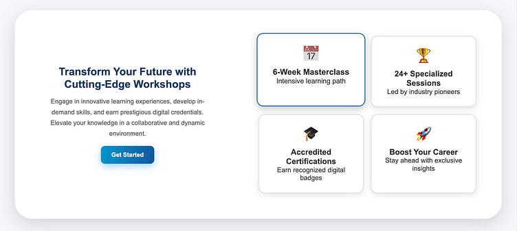
These images illustrate a significant transformation in the page’s user interface design. The top image showcases the new design, featuring four well-structured boxes in two rows. This redesign incorporates modern vector elements, interactive hover effects, and user-friendly buttons, enhancing both engagement and visual clarity.
In contrast, the bottom image displays the previous version, which only contained a simple title, text, and a brief note for the user. This design lacked visual appeal and interactive elements, making it harder for users to engage with the content effectively.
🔹 Key focus areas in this redesign:
✔ Structuring content effectively for a more organized and visually appealing layout.
✔ Adding hover effects and interactive elements to improve usability and engagement.
✔ Eliminating unnecessary complexities to enhance readability and accessibility.
✔ Increasing visual impact through modern vector elements and cohesive typography.
This redesign significantly improves the user experience, ensuring that information is clear, engaging, and easy to navigate.
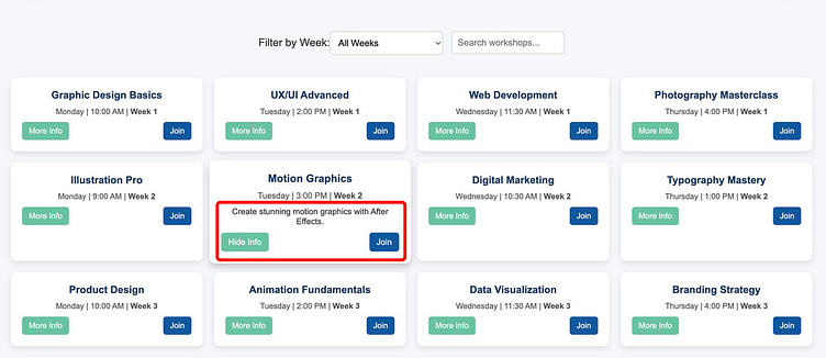

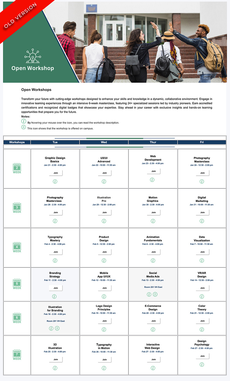
These images illustrate a major improvement in how workshop schedule information is displayed. The two images on the left showcase the new design, featuring a clean, responsive, and user-friendly structure. In this version, workshop details are organized for easier readability, and users can access additional information by clicking the "More Info" button, reducing clutter and enhancing usability.
In contrast, the two images on the right represent the old design, which used a long, cluttered, and difficult-to-navigate table. In this layout, information was densely packed, requiring users to hover over an info icon to reveal additional content. This caused content overflow and visual inconsistencies, making navigation confusing.
🔹 Key improvements in this redesign:
✔ Optimized information structure by replacing the long table with a clearer layout.
✔ Enhanced responsiveness to ensure proper display on all devices.
✔ Improved interactivity with a "More Info" button for seamless content access.
✔ Eliminated previous design flaws, preventing layout instability and overflow issues.
This transformation significantly improves content accessibility and elevates the user experience.
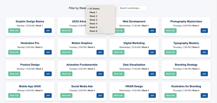
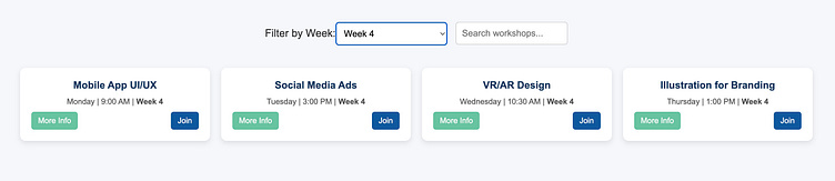
This section highlights a major enhancement in how users access workshop information. The new design introduces a filtering feature based on weeks, allowing users to effortlessly narrow down workshops to their preferred timeframe. This functionality works seamlessly across both desktop and fully responsive mobile versions, significantly improving the user experience.
Additionally, the filtering system functions similarly to a calendar, helping users quickly identify which workshops are available in their chosen week, making planning even more efficient.
🔹 The first image displays the full list of weeks, while the second image demonstrates how selecting Week 4 instantly filters and displays only the relevant workshops. This eliminates the need for time-consuming manual searches and enables users to quickly and efficiently find the content they need.
In contrast, the old design lacked this functionality, forcing users to scroll through long lists manually, which was inefficient and frustrating. The new system was designed after carefully analyzing user needs and identifying pain points in the previous version, ensuring the most effective and user-friendly experience possible.
🔹 Key improvements in this redesign:
✔ A professional filtering system tailored to user needs.
✔ A seamless and efficient user experience on both desktop and mobile.
✔A calendar-like filtering approach that enhances scheduling and selection of workshops.
✔ Faster and more accurate access to workshop information.
✔ Elimination of manual searching, enabling quick access to relevant content.
This new feature empowers users to navigate workshop schedules effortlessly, demonstrating a user-centric and highly functional design approach.
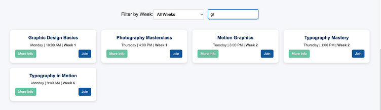
This section highlights one of the most powerful enhancements in the new design—the advanced Search Box. This highly functional feature significantly improves the user experience, especially on mobile devices. Users can quickly find their desired workshop by typing just a few letters, and instantly view key details such as the time, day, and week of the event.
🔹 Key improvements in the new design:
✔ Smart and fast search functionality, eliminating the need for manual scrolling through long lists.
✔ Instant display of workshop details, including date, time, and week, for more efficient navigation.
✔ Seamless mobile performance, making information access smoother and more intuitive than ever.
This search feature not only accelerates user access to relevant content but also enhances efficiency, ensuring a more user-friendly and productive experience.
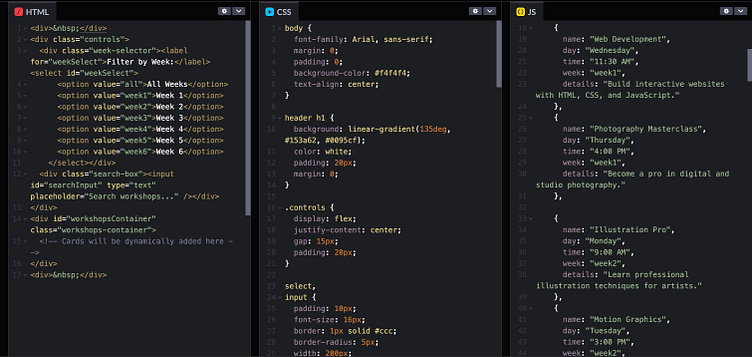
This section displays a sample of my HTML, CSS, and JavaScript code, demonstrating my ability to develop interactive user interfaces and optimize the user experience (UX).
🔹 In this project, my focus was on:
✔ Writing clean, efficient code to build a responsive and intuitive UI.
✔ Blending graphic design and coding skills to enhance both aesthetics and functionality.
✔ Implementing UI/UX best practices, ensuring smooth interactions, easy navigation, and mobile responsiveness.
✔ Optimizing performance to ensure fast loading and seamless execution across all devices.
These code samples highlight my expertise in creating user-centered designs that align with modern web development standards and UI/UX principles.