Property Brothers Handbook Branding
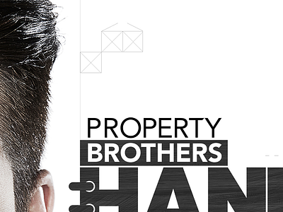

Wanted to create a strong, high contrast brand for the handbook logo that also extended into the look and feel of the app. On the surface it's a simple, block logo treatment incorporating their existing brand, with a few fun details, like subtle painting effects and architectural references.
