Brand identity design for cooking supplies company
Blissful serve is a company that sell cooking supplies with a mission to help parents provide joy in the kitchen when preparing feast for the family. The goal was to design brand identity
CASE STUDY
Message:Comfort, kind
Target audience: Parents
Challenge : The first stumbling block that needed to be dealt with first was to come up with a name that will resonate with message set in place. The second block was to develop consistent brand identity that will resonate with the target audience.
Solution: Observations found during research are, that parents are fun when they are together with their kids, lots of laughter happens.
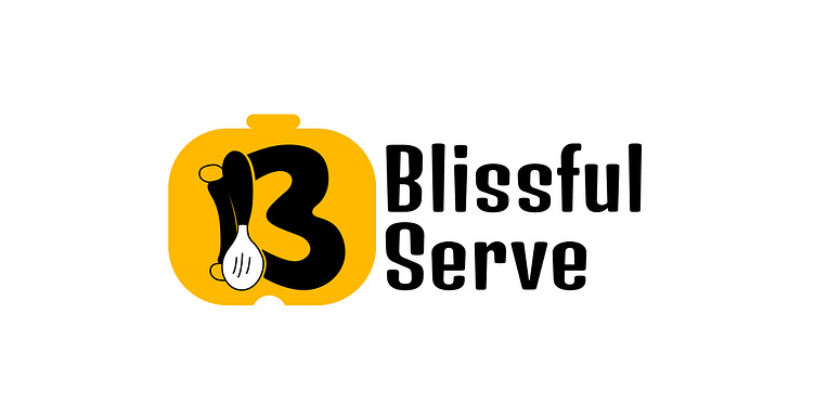
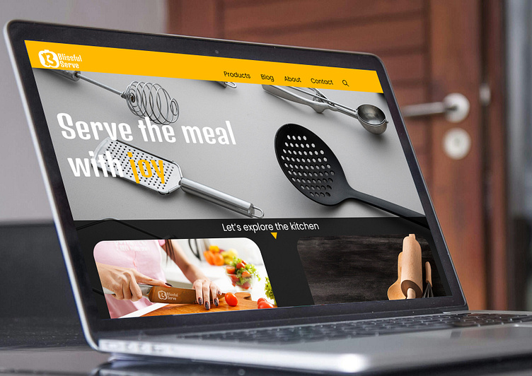
Brand name: So implemented the idea of fun on the name "Blissful". Since mum is the one who do the magic in kitchen of preparing meals, l incorporated "serve" into the name and hence "Blissful Serve". Comfort is also associated with fun, joy.
Font: Denk one font is playful in its structure, how each character respond to another convey the atmosphere of fun, joy, laughter and that's why the font was used.
Colour: Parents bring comfort to the family, make children feel safe and sound. Comfort is associated with warmth, friendliness, creativity, innovative-ness. Hence, the use of yellow colour and to complement the colour, l used black which is associated with boldness and courage of parents. Mums are creative, innovative when it comes to preparing meals for the family and that's why yellow colour.
Tone: fun, friendliness, joyful
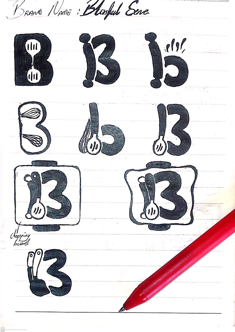
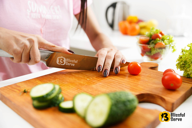
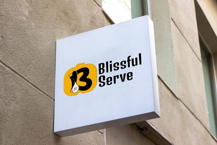
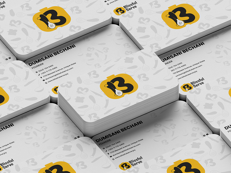
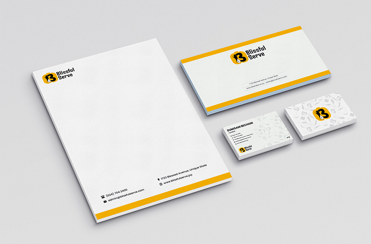
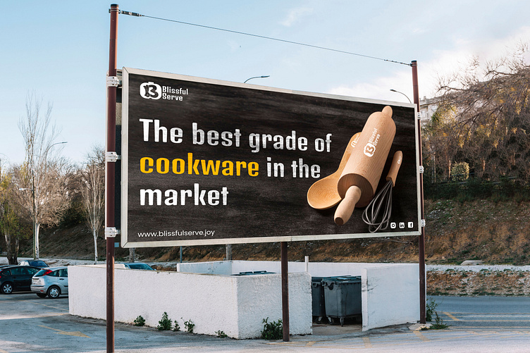
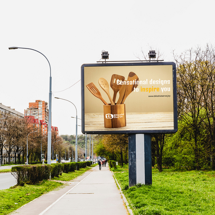
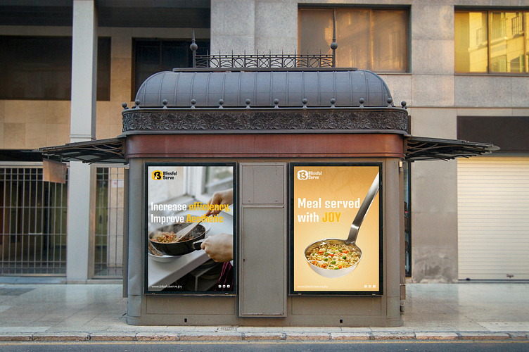
Visual identity: To convey the message to the target audience, consistent visual system was also developed to different touchpoints, which in turn will create memorable experience to the audience.

Do you need brand identity system to achieve your business goals?
Contact: dumisunnybhechanyy@outlook.com or send direct message
