Thermomix UI Concept
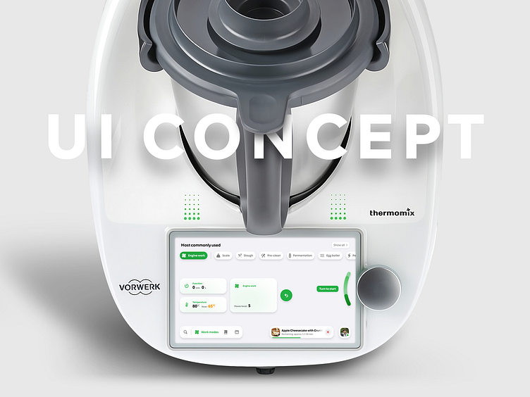
This project was created to improve the UI of the Thermomix TM6 system. However, with the recent release of a completely redesigned version, some of these changes may no longer be relevant. My primary goal was to simplify and unify navigation while enhancing clarity and visual appeal. The focus was on resolving major UI issues and improving the user experience.
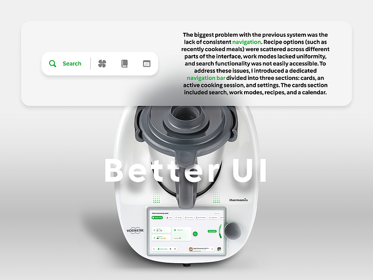
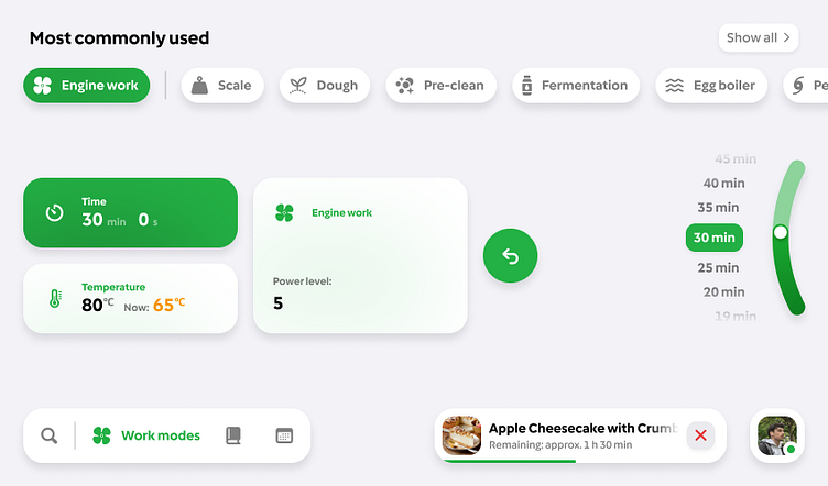
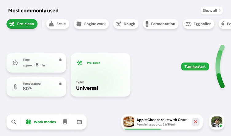
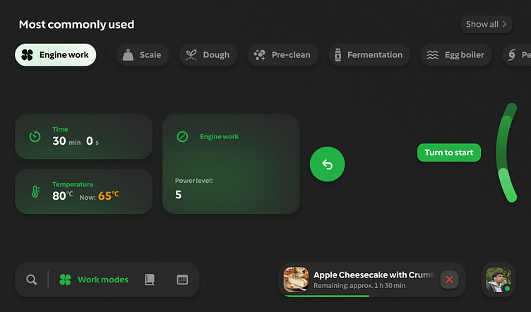
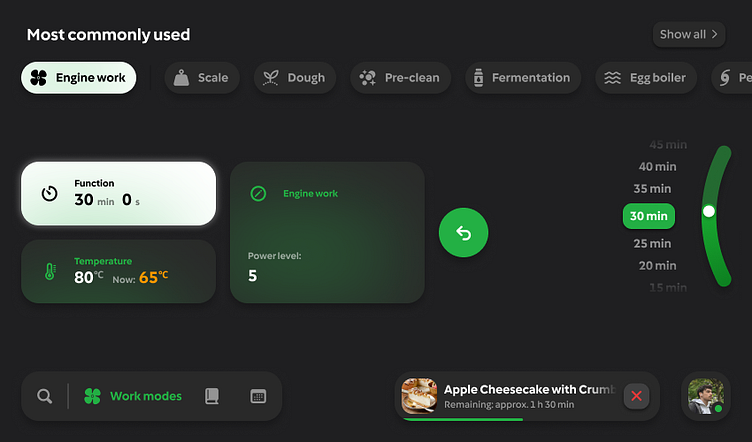
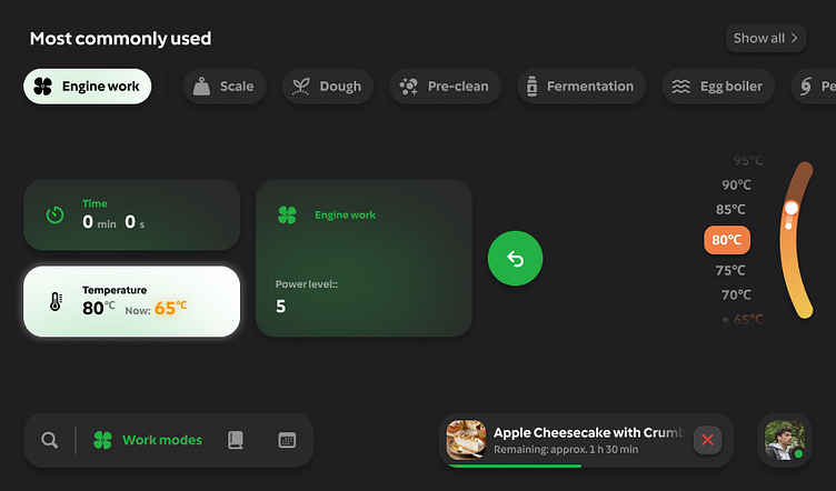
Work Modes
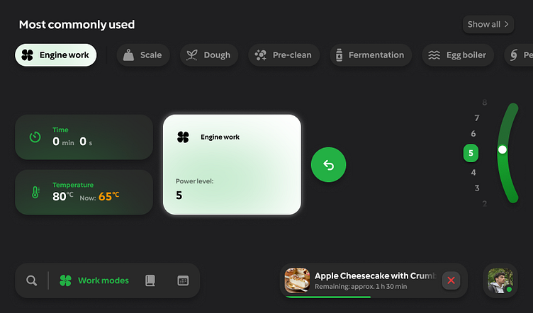
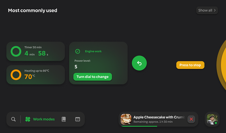
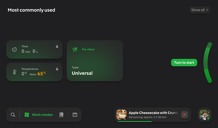
The most significant UI overhaul involved "Work Modes." Previously, engine speed was displayed as the "home screen." In my redesign, it became just one of the many modes available, all of which were now displayed at the top of the screen without requiring any scrolling. The selected mode was always divided into three key segments: time, temperature, and the mode’s control panel. In cases where time and temperature adjustments were not needed (e.g., pre-cleaning mode), they were omitted.
Digital Dial
Another key improvement was the use of the digital dial as the main navigation and control hub. This dial is a highly convenient, multifunctional input method that eliminates the need for touch interactions—particularly useful in kitchen environments where hands may be messy. In addition to adjusting values, the dial could now be used to navigate recipe steps, confirm mode settings, and even start a mode without touching the screen. The interface dynamically responded by displaying information directly next to the dial, mimicking a virtual rotary control.


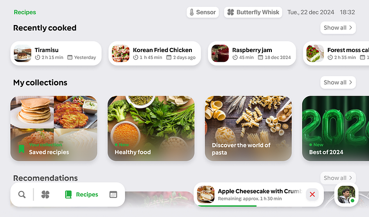
Recipes
The recipe section was redesigned to consolidate all cooking-related information into a single, easily accessible location. Recently cooked meals appear at the top, followed by user-created collections and new recommendations below. This structure allows for effortless exploration of new dishes while keeping personal favorites within reach. The interface also received a fresh, modern update to align with the new visual direction, ensuring a more engaging and intuitive experience.
Dark Mode
A dark mode variant was also introduced to provide users with a visually comfortable alternative, especially useful in low-light environments. This version maintains the same intuitive navigation and structure but offers enhanced contrast and readability in dim settings. The dark theme provides a sleek, futuristic look while retaining all the functional improvements introduced in the redesigned UI.
This project was developed before the announcement of the latest Thermomix model. While the newly released version features a completely different system, this case study serves as a showcase of my design approach and the improvements I envisioned for the previous generation.
Overall, all elements were redesigned to appear more futuristic and align with modern UI trends.
