Improving a feature
The problem
At Greyparrot, we provide AI-powered waste analytics solutions that help waste facilities track and analyze waste composition in real time. Our Alerts Dashboard is a crucial feature that enables users to set alerts on different material types (e.g., metals, plastics) based on predefined thresholds.
However, the existing dashboard was outdated and lacked usability, making it difficult for users to configure and monitor alerts effectively. Our goal was to redesign it with a user-centric approach while ensuring scalability and ease of use.

Discovery
We conducted a stakeholder workshop involving teams from sales, customer management, content, and data to: ✅ Gather feedback on existing pain points. ✅ Identify the most critical improvements needed. ✅ Prioritize feature requests based on user needs.
One key insight that shaped our redesign was that the dashboard was often displayed on large monitors in waste facilities, meaning:
Readability from a distance was crucial.
The layout had to accommodate large screens without unnecessary scrolling.
Key information should be accessible at a glance.

Key changes requested
After analyzing user needs, we implemented the following key updates:
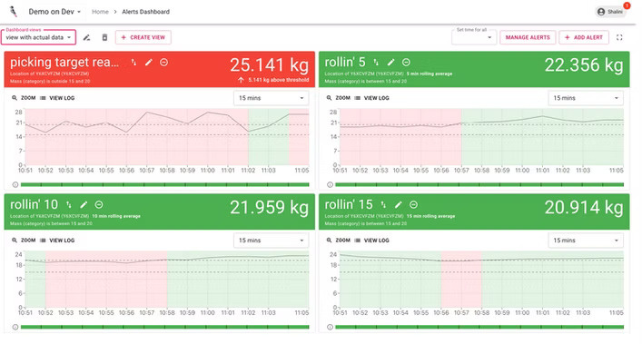
✅ Rolling Average Calculations – Instead of just showing real-time spikes, we introduced rolling averages to provide a more stable and meaningful view of waste trends over time.
✅ Range-Based Thresholds – Users can now set dynamic thresholds rather than static limits, allowing for greater flexibility in defining acceptable waste levels.
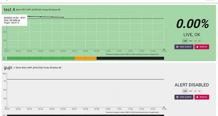
✅ Download & Inspect Feature – Enables facility managers to download alert data for deeper analysis and inspection, improving decision-making.
✅ Global X-Axis Zoom – Allows users to zoom into specific time periods across all charts, making it easier to analyze trends at different granularities.
✅ Y-Axis Zooming for Granular Insights – Helps in identifying minor fluctuations that could be critical for quality control.
Additional changes proposed
✅ Reordering Alert Cards – Users can now prioritize alerts based on importance, improving workflow efficiency.
✅ Show/Hide Chart Feature (Removed) – Initially proposed, this feature was later removed based on user feedback, as users preferred consistent visual representation of alerts without toggling charts on and off.
✅ Fullscreen Mode for Dashboard – A much-needed improvement for better usability on large monitors in waste facilities.
✅ Edit Alerts Directly from Dashboard – Users can now modify alerts without navigating away, reducing friction in managing waste thresholds

Design Process & Key Considerations
1. Sketching & Layout Exploration
Once we defined user needs, we proceeded to sketch an ideal dashboard, carefully considering trade-offs based on feasibility and impact.
2. Critical Observation: Large-Screen Usability
During our research, we discovered that waste facilities displayed the Alerts Dashboard on large monitors in prominent locations. This insight significantly influenced our design choices: ✅ Readability from a Distance – Larger fonts and clear visual hierarchy. ✅ Optimized for Big Screens – Responsive layouts with grid-based designs. ✅ No-Scroll View – Prioritizing key data within a single glance.
Iterations & Final Design
Through multiple feedback loops with the product manager and business team, we refined the design, incorporating key features such as: ✅ In-line Alert Editing – Users can modify alert settings directly from the dashboard. ✅ Quick Navigation Buttons – A switch between the Manage Alerts page and the dashboard. ✅ Enhanced Data Visualization – Improved graphs and visual indicators.
Some features were intentionally omitted (e.g., the ability to hide/show graph components) to keep the scope focused on high-priority needs.

Implementation & Results
The final version was handed off to the development team, who successfully implemented the responsive grid and UI components. The redesigned beta version received positive feedback from users, with final tweaks made before the official launch.
Future iterations will focus on monitoring the impact of these changes and prioritizing additional features based on customer feedback and business value.
The improved Alerts dashboard saved 2 months of revenue from customer data i.e 16% approx of revenue

