Under Armour Treatment
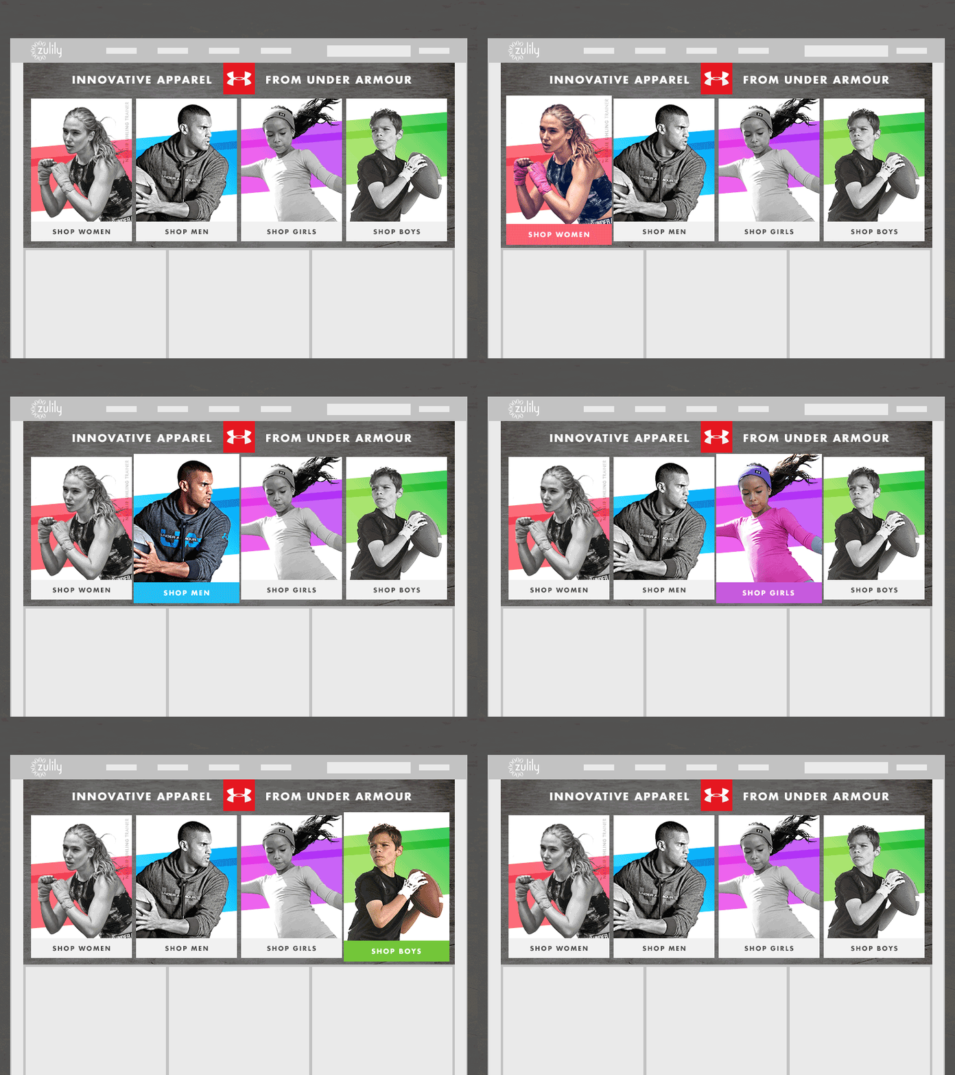
Homepage execution for zulily's February 2016 Under Armour event. Tiles switch from black & white to color on hover (transition was smoother in the actual build).
One challenge with this project was that all photography was vendor supplied, but shot in a variety of environments and lighting conditions. To make the creative feel more cohesive we clipped out the models, made the photos black and white, and ran a stripe across all backgrounds. By showing only one color image at a time the difference in photography isn't as noticeable.
More by Shanna Williams View profile
Like
