Crush Jersey and Hoodie Design
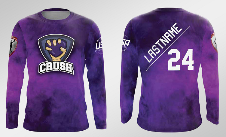
Crush Jersey Design
Working alongside other designers, we created an awesome dodgeball jersey for my team Crush. We started with the signature purple theme and collaborated with a designer to develop the logo.
I noticed that most jersey backs followed a standard format with the name at the top and an oversized number below but I wanted to shake things up. Instead of the traditional layout, I introduced an angled design giving more emphasis to the name since it is the key identifier.
We then worked with a designer to bring it all together incorporating a bold gradient purple background.
The result was a striking dynamic jersey that has stood the test of time surviving multiple print runs and still looking great on the court.
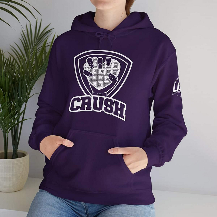
Crush Hoodie Design
Building off the jersey design, we decided to create team hoodies for Crush. For the logo, I was inspired by outlined versions of NFL logos and wanted to apply the same concept.
I came up with the idea of stripping the original logo down to its core elements, highlighting what makes it unique. This outlined version gave the design a fresh look while maintaining the team's identity. It was a fun way to reimagine an existing design and create something bold and distinctive for the hoodies.

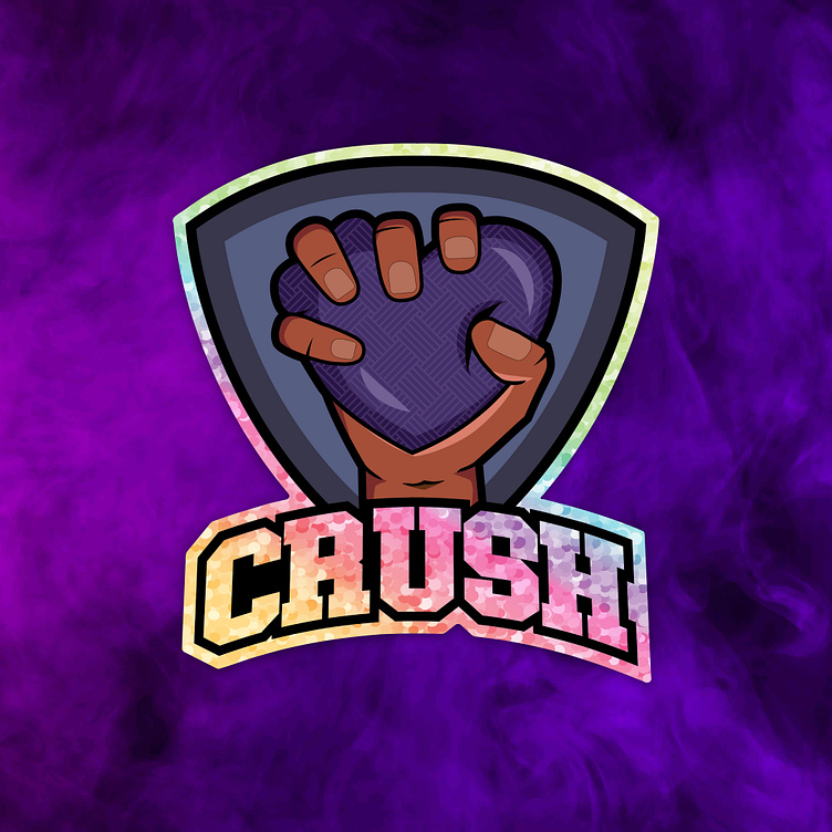
Crush logo redesign
After many seasons of playing, we received requests to make the Crush logo more diverse and inclusive. The redesigned version features a darker-skinned hand along with a rainbow and glitter background, bringing more vibrancy and representation to the team’s identity.
The idea was inspired by the glitter stickers we had made for the team, which added a fun and eye-catching element. The new logo was well received and officially replaced the old one in future print runs.