The Stories Behind Iconic Designs
This design is generated with the help of ChatGPT
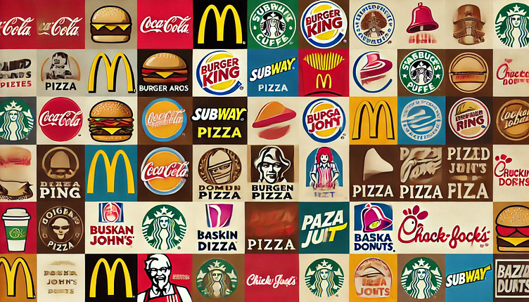
15 Famous Fast-Food Logos and Their Hidden Meanings
Do you know how fast-food logos stand out? It is their logo design. They have logo designs with unique meanings and purposes. These brands aren’t just famous for their food. They are recognized for their credibility as well. It is their logos that play a huge role in recognition. Someone who is starting a food chain must have a custom logo. It will help them tell their story and remain memorable. In this blog, we will discuss the famous fast-food logos. Let’s see the idea behind each logo design and uncover hidden meanings.
Burger King
You can quickly recognize Burger King’s logo. The design is very simple yet effective. You can see their brand name sandwiched between two buns. With its simple logo, they are allowing customers to connect and memorize their brand. Using orange and red colors creates a sense of excitement and hunger. The name between the buns displays brand recognition. Having a custom logo helps them stand out in the fast-food industry quite well. If we decode their logo design, it represents burgers. The colors entice hunger for a flame-grilled burger or sandwich.
McDonald’s
Even a four-year-old can identify a McDonald’s logo. It is one of the most famous in the world. The brand has used a watermark and symbolic logo design to create it. You can see the golden arches making the letter “M,”. This is also something that makes it easy to identify. The color scheme shows excitement, happiness, and hunger. It is now one of the global brands. The credit goes to their successful marketing and branding skills. You can hire a professional graphic design agency to create timeless logos like MacDonalds.
Subway
Subway has done a wonderful job with its logo design. They have used green and yellow to show the importance of health. They make you eat fresh vegetables that you would avoid normally. The logo color theme is a true representation of freshness and health. Subway’s logo design is simple with a deeper meaning. They use a wordmark logo with a symbolic logo design in bold, sans-serif fonts. It gives it a clean and modern look. The arrow on the “S” and “Y” indicates fast service. These details make the design more than just a name. They tell a unique story. If you are a health-conscious brand, hire a good graphic design agency to make logos with such meaningful elements.
Starbucks
Coffee lovers know the importance of Starbucks in life. They served it right with their iconic siren logo design. It is inspired by Greek mythology. They have a logo design which is a combination of a pictorial emblem with a wordmark logo type. The logo indicates attraction and pleasure. The green color represents freshness and a premium feel. They have done a wonderful job in making their brand unforgettable. A well-accomplished podcast logo design can have the same impact on digital brands.
Domino’s Pizza
Domino’s Pizza has a simple yet meaningful design. They used wordmarks and symbolic logo designs. Three dots represent the original locations of the company. The use of red and blue colors creates a sense of energy and trust. They have one of the best fast-food logos which reflects their strong brand essence. Over the years, Dominos has refined its logo. They are now focusing on the symbol and keeping fonts simple. It is its strong visual identity that has made Domino memorable through its logo.
Pizza Hut
Pizza Hut's logo is famous for its combination logo design. It features both a symbol and text. This is the reason behind their strong brand identity. Have you seen the red hat icon? It is inspired by the roof of early Pizza Hut restaurants. It represents warmth and kindness. There is a circular shape in the newer which represents the shape of a pizza. The font is casual to give a friendly feel. With time, the logo has become simpler and more modern. This makes it easily recognizable on print a digital media. The use of red stimulates appetite, black adds a touch of class, and white keeps it balanced. By keeping its signature look, Pizza Hut’s logo remains iconic and memorable.
Taco Bell
Taco Bell’s logo is a mix of a symbol and text. They use a symbol of the bell which makes it easy for consumers to recognize them. The bell icon represents the founder, Glen Bell. It also shows fun and celebration. Taco Bell’s logo has a bold color theme. They use purple and white colors which gives it a modern and stylish look. Choosing this color combination sets them apart from other fast-food brands. Brands can take inspiration from this to design their podcast logo design.
Wendy’s
Wendy’s logo has a personal touch. It is unique because it portrays Melinda “Wendy” Thomas. She is the founder's daughter. This shows a friendly and homely feel. Wendy’s logo has a hidden MOM name. It is there on Wendy’s collar which supports the idea of home-cooked meals. They represent themselves as welcoming and warm with their choice of colors. The bright red, white, and blue colors represent energy, trust, and freshness. With time, Wendy has modernized their logo. However, the red-haired Wendy remains constant. This personal touch shows the quality and speaks for the brand itself.
Baskin Robbins
Baskin Robbins' logo stands out because of its clever hidden design. The use of playful colors shows a strong brand identity. The most unique feature is the hidden "31" inside the BR letters. This talks about the brand’s famous 31 flavors. It is a concept that sets it apart from other competitors. The use of small but smart details makes the logo fun and memorable. It also reminds customers about the variety and excitement Baskin Robbins offers. The Baskin Robbins logo has a pink and blue color scheme. The pink is to show fun, while the blue conveys trust. The logo has a modern yet timeless look. This makes it one of the most iconic and well-designed logos in the fast-food industry.
Papa John’s
Papa John’s logo is simple but effective. It has been redesigned over the years to reflect its unique brand identity. They use a wordmark logo design type which means that its name is the primary element. The red color shows passion, green shows freshness, white is to add contrast and black is to outline. They also use bold sans-serif fonts to provide a fresh and modern look. A good graphic design agency can create such timeless logos that stand the test of time. The logo doesn’t show pizza but the use of colors and fonts speaks for it.
Tostitos
Tostitos’ logo is one of the most fun and creative logos in the snack industry “T”s are stylized as people sharing chips over a salsa dip. The red dot above ‘I’ represents a bowl of salsa. This logo design has so many small details. It connects consumers emotionally over gathering and snacking. The use of a color theme is also very precise. Black shows boldness, red is for spice, blue is for trust, and yellow/orange is for warmth and crispness. To provide an inviting feel, they use round and titled fonts. Overall, it is one of the best logos in the overall fast-food chain.
Dunkin’ Donuts
Dunkin’ Donuts’ logo is colorful and inviting. It is now rebranded as Dunkin. This shows a bold and energetic feel. The oversized letters reflect an inviting personality. Dunkin used the wordmark logotype to use the brand name as a main design element. The use of orange shows warmth and pink shows sweetness. The name itself explains dunking donuts into coffee and the logo also has a coffee cup icon. The logo is recognized by coffee lovers in the blink of an eye by the consumers.
Chick-fil-A
Chick-fil-A’s logo is the perfect example of simple but smart branding. The logo is iconic and full of brand personality. They used a wordmark logo design type. There is a C-shaped chicken that looks like a chicken head. It also makes it easy for consumers to understand that they serve chicken chicken-focused menu. The use of red and white color shows passion, energy, and cleanliness. This fun and friendly design makes it one of the most memorable fast-food logos. A professional graphic design agency can design similar unique logos to reflect a brand’s values.
KFC
KFC’s logo has evolved a lot. It went from a simple portrait of Colonel Sanders to a modern but minimal appeal. They kept the portrait but gave it a more digital appeal. The name KFC stands for Kentucky Fried Chicken. The brand name shows what they specialize in. Using red for appetite, white for freshness, and black for contrast makes KFC stand out as a fast-food brand. The logo is compelling for its history, personality, and strong brand legacy.
Olive Garden
Olive Garden’s logo uses green tones to highlight its Italian roots. The logo is elegant, warm, and inviting. They focus on Italian-American cuisine with a friend and family dining experience. The handwritten font gives it a welcoming touch. The brand name in the logo highlights Italian culture. They serve fresh hand-made pasta which is evident through its name and color theme. If you want a podcast logo design with a warm feel, this style can be a great inspiration.
Final Thoughts
If you want to know how logo design can impact branding, look at these 15 famous fast-food logos If you’re starting a food business, invest in crafting a custom design logo. A well-designed custom logo design is a must. It can help you strengthen your brand identity. A professional graphic design agency can help create a logo that truly represents your brand. Investing in the right logo can indeed make all the difference. It can help you stand out and define how your business is perceived in the market.
