Enhancing the Pricing Section for a Better User Experience
Enhancing the Pricing Section for a Better User Experience
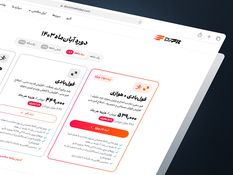

Hey Dribbblers 👋
Here’s a sneak peek of the pricing and selection section I’ve been working on for Dr.Fit.
Dr.Fit is an online fitness platform where users can join live class subscriptions. For example, with a 3-month plan, you’ll have access to 12 live classes per month, training alongside thousands of other members. These live workouts focus on aerobic and full-body exercises, making fitness more accessible and engaging.
For the redesign, my main goals were:
- Clearly separating the three options, with a stronger emphasis on the full plan.
- Highlighting the key benefits and features of each plan.
- Focusing on discounts and the long-term savings users can get with extended duration plans (as per the marketing team's request).
- Simplifying the selection cards by moving less essential details outside of the main content.
Does the highlighted option stand out enough? Would this card layout make it easier for you to choose the right plan? I’d love to hear your thoughts!
Thanks for checking out my latest design! If you're interested in a custom piece, I'd love to hear from you. DM or email me. And of course, don't forget to follow me on Instagram, LinkedIn & Figma for more creative stuff.