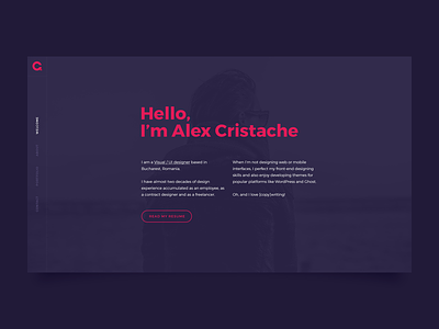
Personal Portfolio: Welcome Screen
After wrapping up the work on my personal monogram I'm starting work on my personal portfolio which is in dire need of an update.
I'm looking for a minimal setup, trying to keep away from the black/white color scheme for diversity. This is the "intro" screen so far. Hope you guys like it (hit "L"). Feedback appreciated.
More by Alex Cristache View profile
Like


