THUNDER | LOGO DESIGN & BRAND IDENTITY
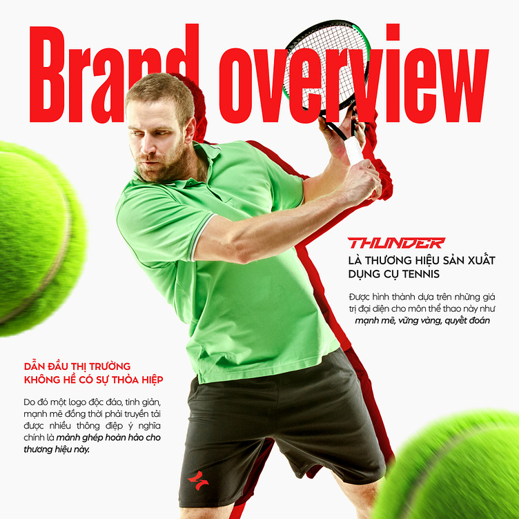
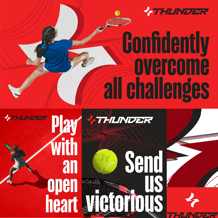
Thunder – a leading tennis equipment brand built on the core values of the sport: strength, stability, and determination. With an unwavering commitment to delivering superior-quality products, Thunder does not compromise on any detail.
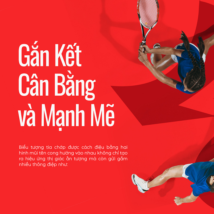
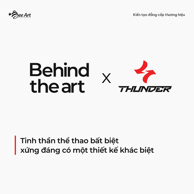
To embody the enduring spirit of sports and fully convey the brand’s power, Bee Art created a unique and striking logo design by applying the principles of minimalism:
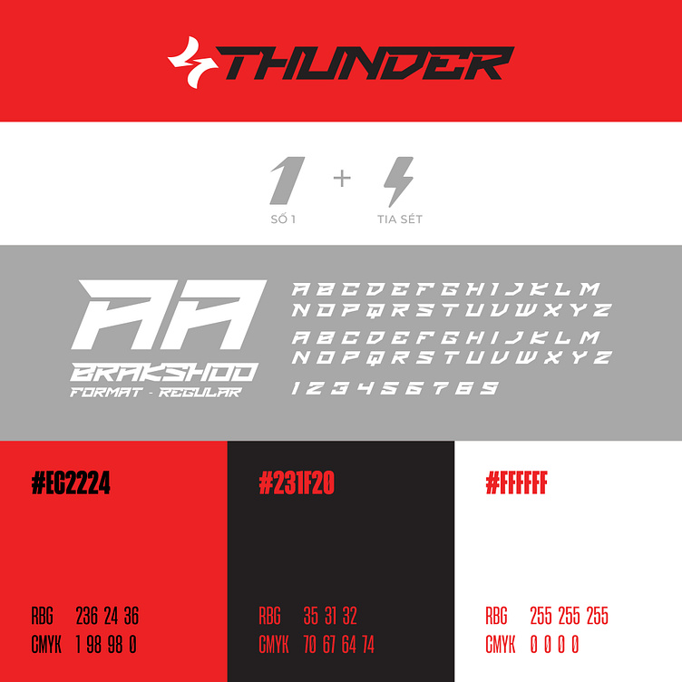
Every line and placement was meticulously calculated to communicate the message with precision. From the number 1, symbolizing leadership, and the lightning bolt, representing energy, to the two arrows, signifying decisiveness—each element is seamlessly integrated through refined artistry and contrasting colors, shaping a distinct identity for the brand.
➣ Explore the journey behind Thunder’s logo design in today’s Behind The Art album.
Designed by Bee Art
-
Client Thunder
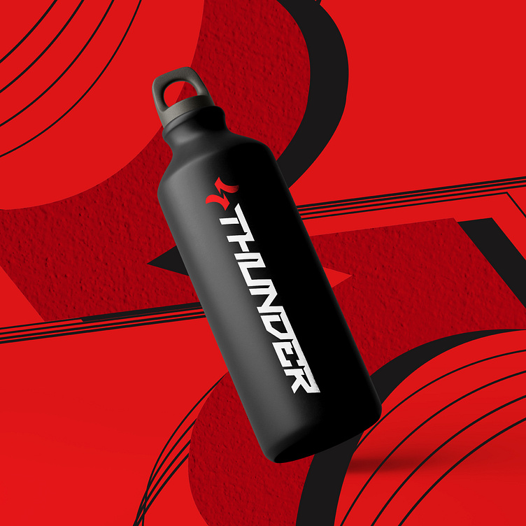
Logo Design Project. Logo is designed for brand specializing in tennis equipment manufacturing.
Copyright© Bee Art. All Right Reserved
Contact us:
• Hotline/ Zalo: (+84) 77 34567 18
• Email: info@beeart.vn
• Website: www.beeart.vn