Brand Case Study - Portokali Original
Overview
The Story Behind Portokali: Designing Freshness from Farm to Brand
For this brand case study, I dived into crafting the identity for Portokali Original—an orange beverage brand rooted in quality, sustainability, and freshness.

Illustrating oranges was a delightful challenge—capturing not just their vibrant color but the texture and life they represent. I focused on creating visuals that conveyed both energy and peace, balancing vivid gradients with subtle natural tones.
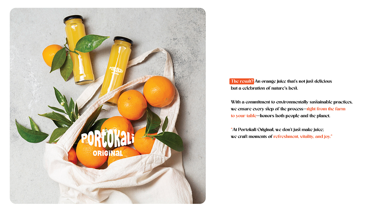
Naming a brand is more than just picking a catchy word. Portokali, which means “orange” in Greek and Turkish, immediately stood out as it connected beautifully to the brand’s sourcing from Greek and Turkish orange farms.
Key Takeaways:
The importance of authentic storytelling in brand design
How research can inspire creative direction
The role of sustainability in modern branding
Closing: If you're curious about seeing the full case study, check it out on Behance.
Let me know your thoughts—I’d love to hear your feedback!
