Adega Frantz

A pioneering brand in the region
Adega Frantz began as a budding business, initially struggling to establish a strong identity while striving to refine its operations. With a bold and innovative approach to the regional market, the company faced both the exciting opportunities and inherent challenges of being a pioneer. In this context, Grate was selected to lead the branding project.
Beyond the unique opportunity to innovate, the founder of the business harbors a deep passion for the products and the benefits they offer. It was essential to channel this positive energy into something tangible—something capable of inspiring the internal team and attracting potential customers.
At a national level, competition was still in a similar stage of development, creating space for the establishment of a strong and distinctive brand. With a well-structured identity and a clear purpose, the brand could not only stand out regionally but also compete with major players across Brazil, cementing its relevance in the market.


A concept aligned with the brand's essence
After extensive market research, our team met with Adega Frantz's team to define the strategy and ensure that every element built from that point forward would reflect its identity and align with the brand's vision.
All explored concepts originated from this foundation, and in the end, there was a perfect fit: a concept that clearly expressed the brand’s personality traits, the meaning of the business, and its societal impact, while firmly embracing Adega Frantz's roots and credentials.
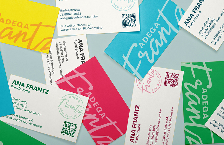


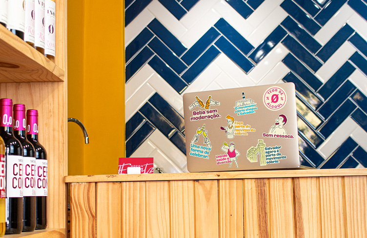
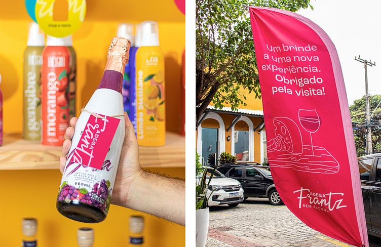
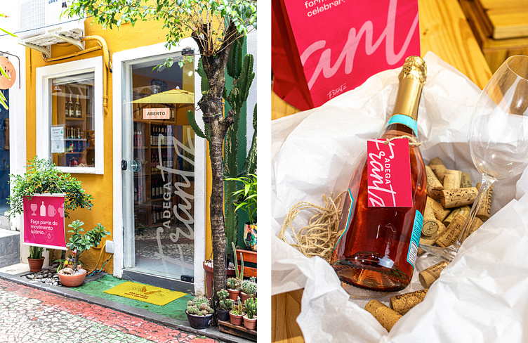
This is no ordinary wine shop, and that is evident from the very first glance. With a vibrant, multicolored palette inspired by its signature products, the brand challenges conventional perceptions. In a society where alcohol is often linked to fun, Adega Frantz redefines the narrative, proving that choosing sobriety can also be fun, lively, and engaging.
Each color holds a special meaning: Garnacha Red evokes wine, just like Vine Green. Yeast Yellow pays tribute to beer, while Juniper Blue draws inspiration from gin.
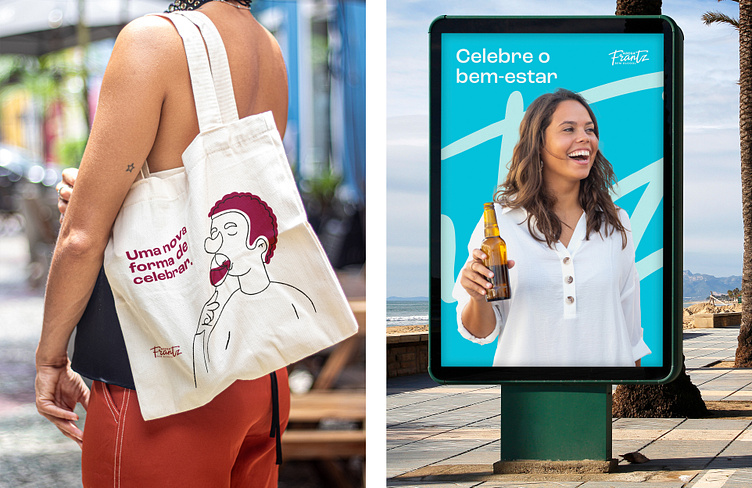
Another standout feature is the illustrations, depicting characters with serene expressions and celebratory moments—always in a lighthearted and humorous way. To balance this aesthetic, a set of solid and minimalist icons was developed, serving as graphic elements in compositions.
At the heart of the design is the handwritten-style logo, which conveys a sense of ease while retaining sophistication. Its fluid curves offer versatility, allowing for creative graphic applications that enhance its distinctive look.
The brand’s tone of voice is warm, inviting, and inclusive—designed to engage a diverse audience. This personality comes to life through a modern sans-serif typeface that is full of character.


The combination of passion, innovation, and consistency has resulted in a strong and memorable presence, capable of inspiring both customers and employees. More than just competing, the brand has proven that it is possible to transform a concept into a meaningful experience, consolidating its impact and paving the way for sustainable and promising growth.