E-Commerce Checkout Flow
Is Your Checkout Process Helping Users or Making Them Leave?
👉 The Problem:
A checkout process that frustrates users instead of converting them.
↳ Manually entering shipping details (no autofill).
↳ A cluttered payment page with too many choices.
↳ No progress indicator, leaving users unsure of the next steps.
↳ No way to review items before paying.
When checkout feels like a hassle, users abandon their carts. And lost checkouts mean lost sales.
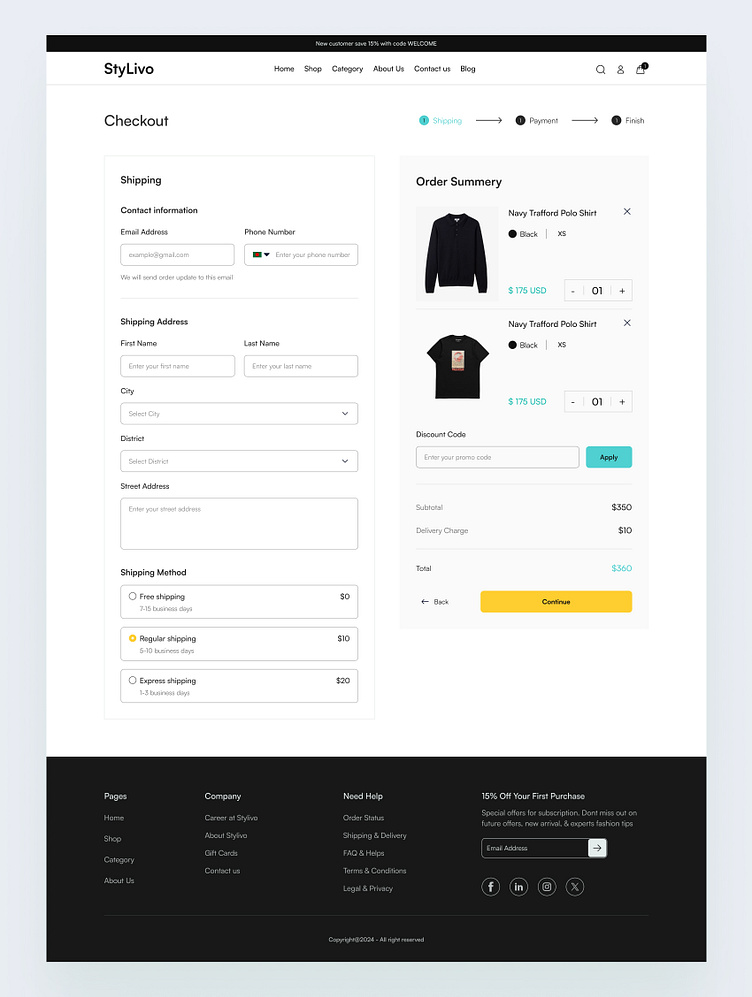
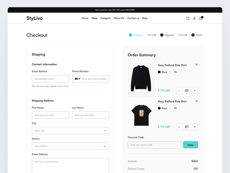
👉 The Solution:
A seamless, user-friendly checkout that drives conversions.
↳ Autofill for shipping details to save time.
↳ A clean, simple payment page with a clear call-to-action.
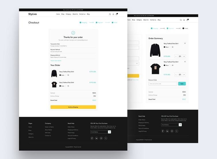
↳ A progress indicator so users know what’s next.
↳ An order review page to prevent last-minute doubts.
A frictionless experience means more completed checkouts and happier customers.