Guided wellness platform for women and expecting parents.
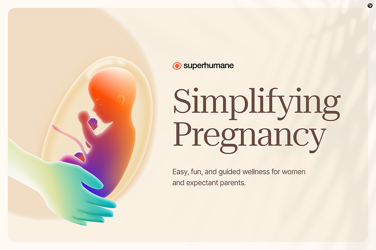
When my client came to me with this idea, they had one request—capture the feeling of safety, warmth, and love that a mother gives her child, even before birth.
I knew this wasn’t just about visuals; it had to feel like home.
That’s why the mother’s hand is in a soft green shade—it symbolizes safety, protection, and care. It gently cradles the life growing inside her, just like every mother instinctively does.
The baby, wrapped in warm, glowing colors, represents vitality, energy, and the joy of new beginnings.
The aura surrounding the womb? That’s the silent bond, the invisible thread of love that connects them. It had to feel soft, warm, and full of life—because that’s exactly what this moment is.
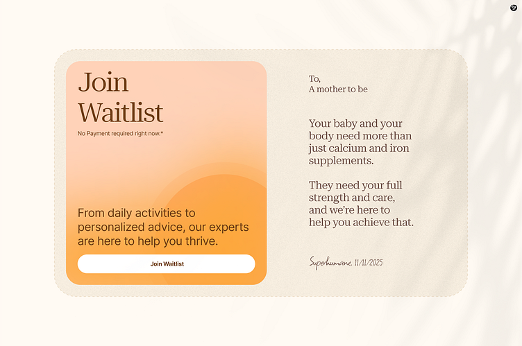
The waitlist section welcomes mothers with a warm, personal touch.
A simple letter speaks directly to them, offering support beyond supplements. Soft tones create a sense of safety, while the handwritten signature adds a human connection.
It’s more than just signing up—it shows mothers they’re cared for from the start.
This wasn’t just about making a design; it was about telling a story—a story of love, protection, and the quiet strength of a mother.
Have question regarding anything design? Let's Talk
Find me on social media
