Case Study - Rebranding for AI product Developers
Branding. Strategy. Experience
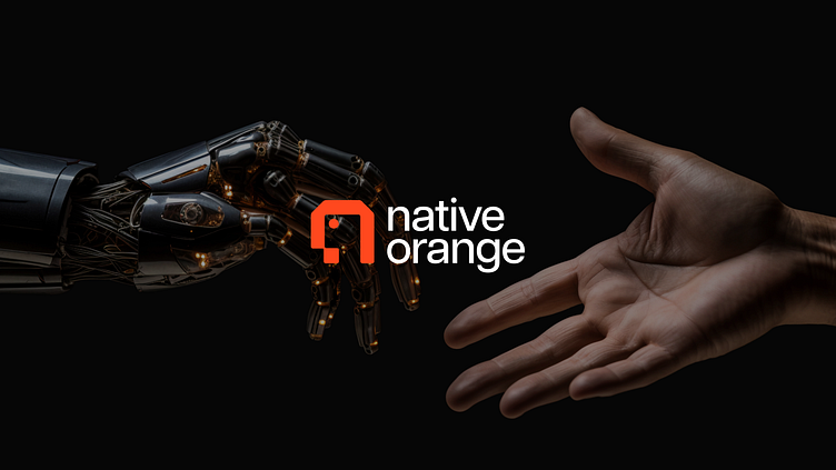
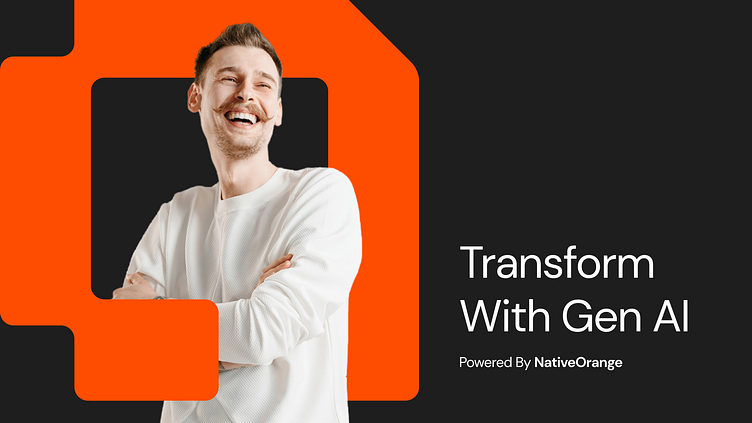
The new NativeOrange logo, brought to life by @leo9.design, represents a brand pushing the boundaries of AI innovation. It’s more than just a logo - it’s a statement of expertise and forward-thinking in the Gen AI landscape.
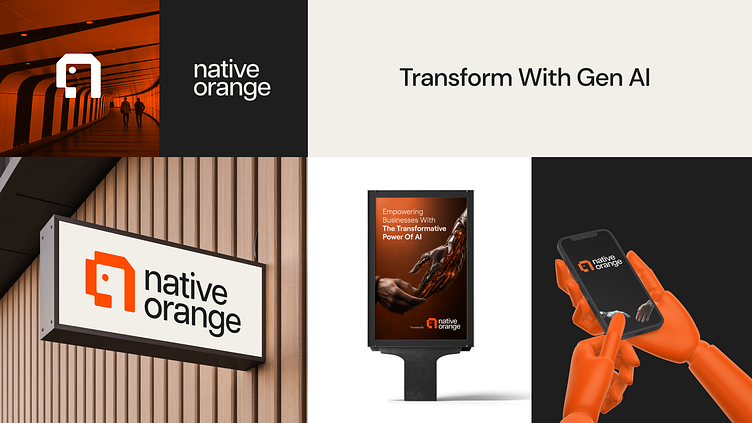
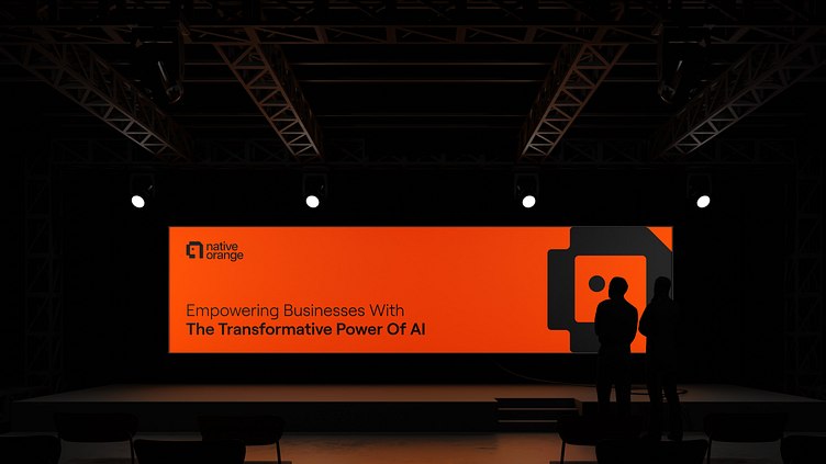
From advertising boards to visiting cards, our complete branding suite, crafted by Leo9 Design, brings the essence of innovation and AI-driven expertise to life. Every visual element, whether on a billboard or a business card, echoes the bold, forward-thinking identity of NativeOrange.
We’ve taken their vision of empowering enterprises in a Gen AI world and brought it to life through strategic branding, a dynamic website, and a memorable logo. Our approach, rooted in neuromarketing and behavioral science, has positioned NativeOrange perfectly within their target market. With industry veterans from tech giants like AWS, Google, and Microsoft, NativeOrange is ready to redefine the future.
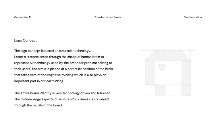
Logo Concept
The logo concept is based on futuristic technology. Letter 'n' is represented through the shape of human brain to represent AI technology used by the brand for problem solving to their users. The circle is placed at a particular position of the brain that takes care of the cognitive thinking which is also plays an important part in critical thinking. The entire brand identity is very technology driven and futuristic. The clean and minimal edgy aspects of serious b2b business is conveyed through the visuals of the brand.
LET'S CREATE EXPERIENCES!
✉️ Let's work together - info@leo9studio.com
IND: +91 9920 282 736 / +91 7208 149 788
USA:+1 (802) 347-3690