Dashboard UI

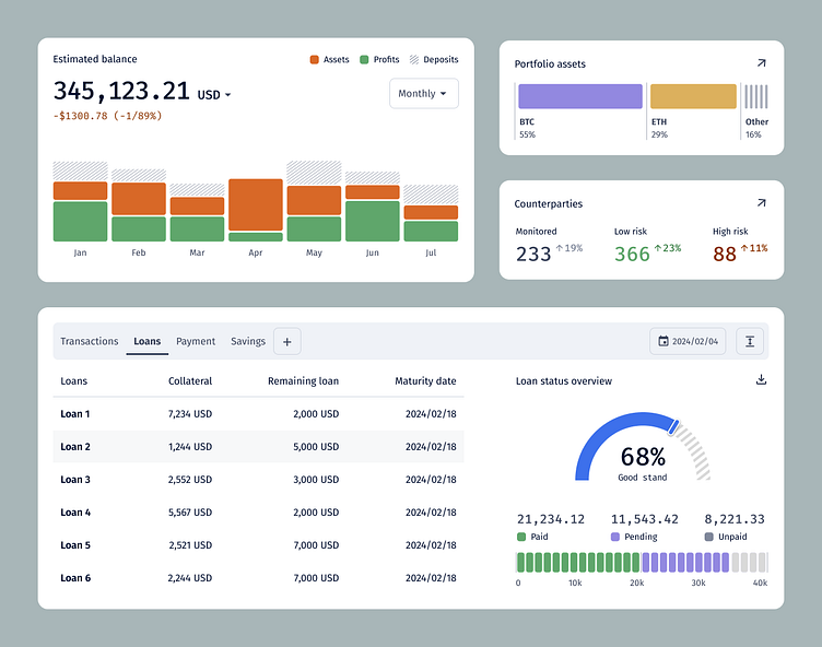
I turned complex data into clear and accessible designs to create this overview financial dashboard. I used various colours to draw users' attention to specific data points. I kept the overall style simple, clear and easy-to-read.
What would you have done differently? :)