[LOGO DESIGN] CHIP JUICE
Chip Juice - Sweet from the pure
--------
Logo | Branding | Brand Identity
Field: Fruit juice
____
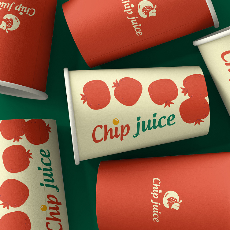
Chip Juice was born with the mission of bringing a positive taste experience to customers. Therefore, all products from Chip Juice use fresh, delicious, pure fruit. To reflect the investment in core quality, Chip Juice requested a logo with a variety of colors, expressing a fresh feeling and creating associations with fruit.
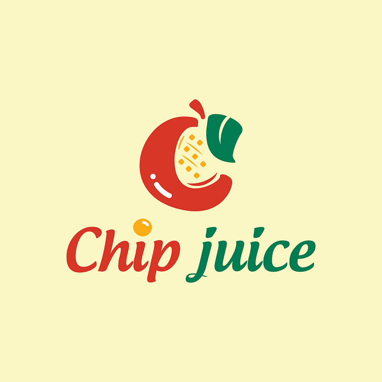
From that desire, Kaiza's creative team came up with the idea of combining the images of apples, mangoes and leaves as the central elements. We cleverly integrated them by drawing associations. The red arc on the outside represents the image of an apple, the yellow plaid pattern on the inside is a slice of a ripe mango and finally the image of a fresh green leaf to balance the color of the overall design. Along with that, we used the red and green tones as the main tones. In which, the red tone stimulates the taste buds and the blue tone creates associations with cool, sweet, pure and original fruit juices.
Designed by Kaiza
Copyright © Kaiza. All Right Reserved
Contact us:
KAIZA CO.,LTD
• P: 0889 996 399
• E: info@kaiza.vn
• W: www.kaiza.vn
Connect me @ Behance - Instagram - Pinterest