Redesign Logo Evernote
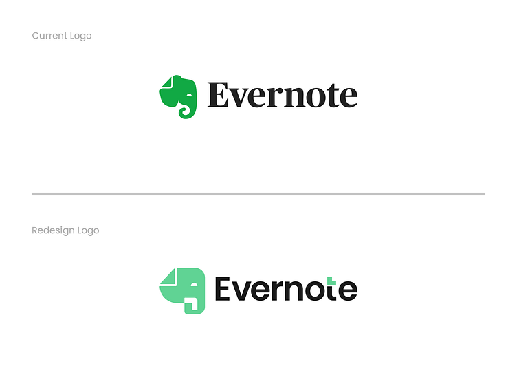
So, here’s the thingGaragephic Studio decided to spice things up with a little design challenge: redesigning the Evernote logo!No, this isn’t an official rebrand—just a fun, creative exercise to see how we could reimagine an already iconic logo. Sometimes, stepping outside the usual client work and experimenting with familiar brands is the best way to keep the creativity flowing.
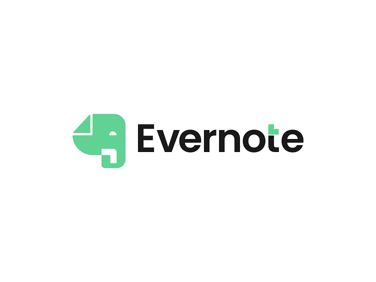
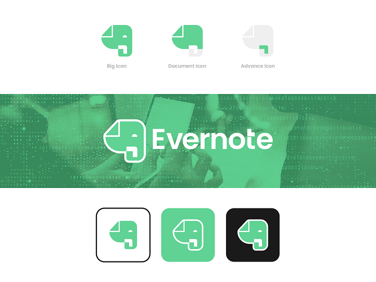
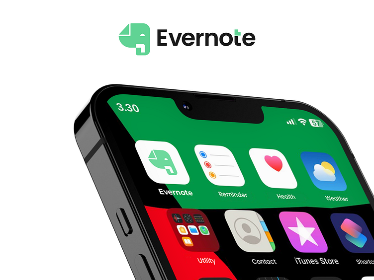
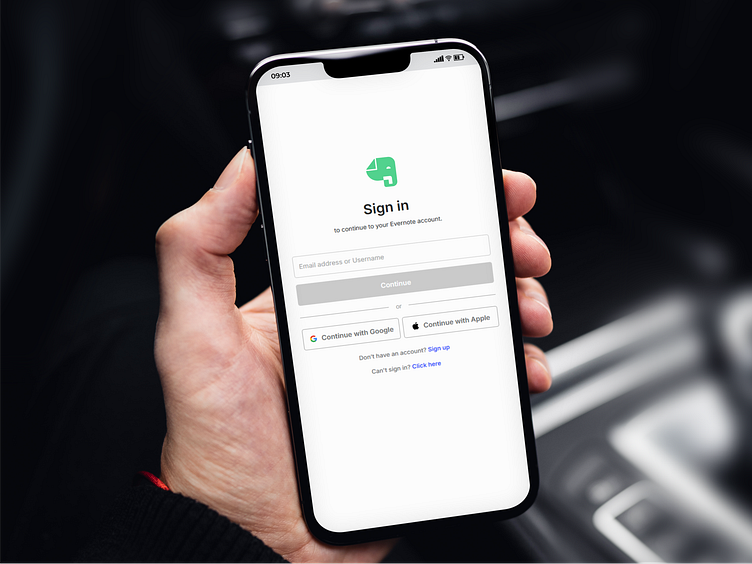
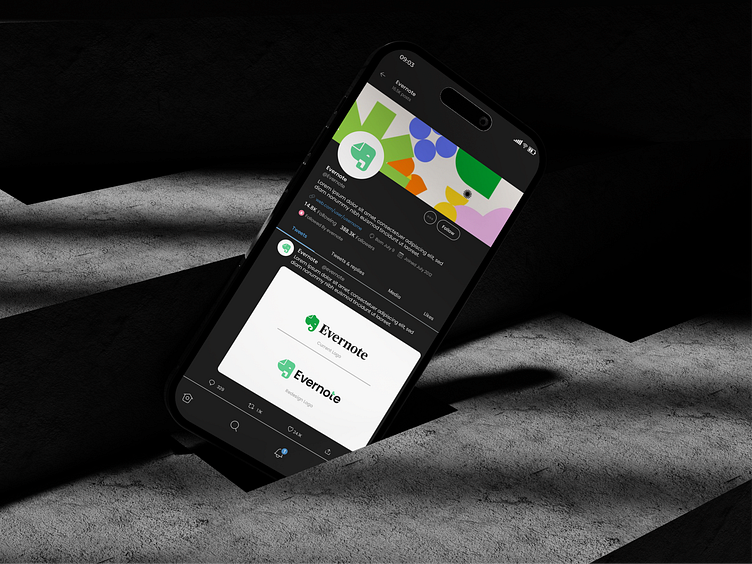
For this redesign, we kept the essence of Evernote’s signature elephant but gave it a more modern, structured look. The lines are cleaner, the curves are more refined, and we even added a subtle touch to the “t” in Evernote—symbolizing organization and note-taking in a fresh, minimal way. It’s all about finding the balance between familiarity and innovation, and we had a blast playing around with different ideas.
Now, we want to hear from you. Do you think this redesign stays true to Evernote’s identity, or would you have done something completely different? Let’s talk design, drop your thoughts in the comments.