Scholarbee Brand Refresh

Scholarbee Brand Refresh
Introduction
Scholarbee, a Pakistan university platform, aimed to elevate its brand without losing its existing recognition. After exploring both rebranding and refreshing options, we chose the latter—a strategic refresh that would enhance its identity while maintaining familiarity. This approach ensured the brand remained polished, scalable, and aligned with its evolving presence.
The Challenge
The goal was to create a scalable brand system that supports future growth. This wasn’t about starting from scratch but rather refining and optimizing what was already working, making the brand more cohesive and adaptable.
Approach & Strategy
To maintain continuity while enhancing Scholarbee’s identity, we focused on strategic refinements rather than drastic changes. Key areas of improvement included:
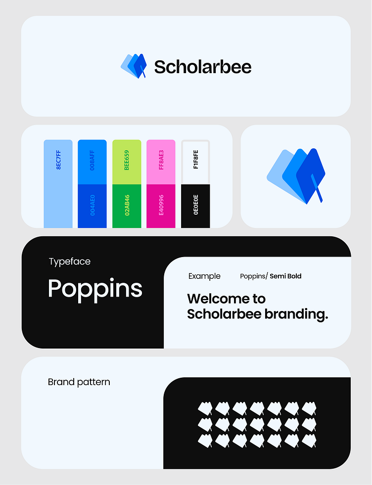
1. Color Optimization
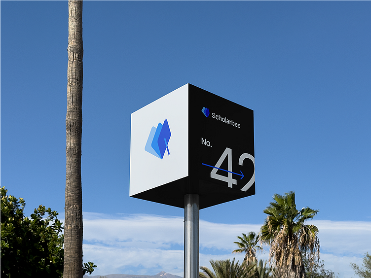
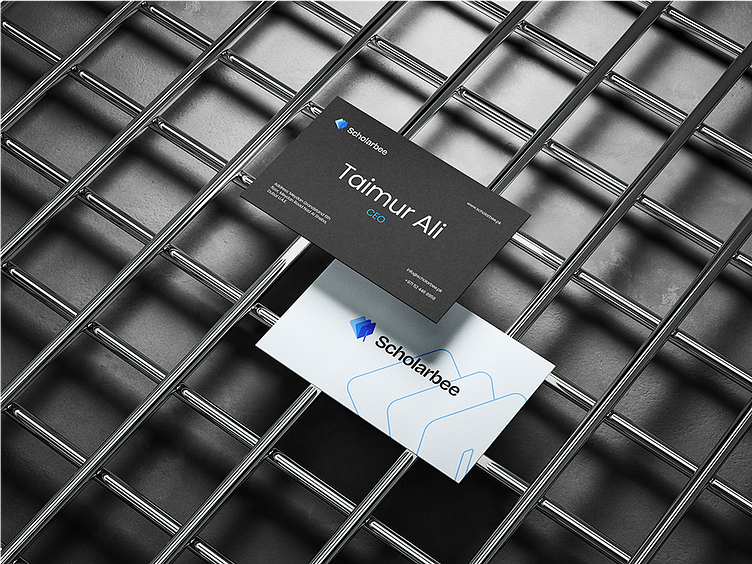
Scholarbee’s existing palette had a strong foundation, but refinements were made for better harmony and usability. The blues (8EC7FF, 004AE0, 008AFF) remained central to maintain brand recognition, while supporting colors like green (02AB46, BEE659) and pink (E40996, FF8AE3) were adjusted for improved contrast and accessibility. The neutral black (0E0E0E) and soft white (F1F8FE) ensured clarity and balance across digital and print applications.
2. Typography Refinement
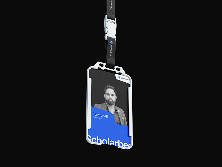
The brand transitioned to Poppins, a modern and approachable typeface that enhances readability and aligns with Scholarbee’s tech-forward identity.
3. Logo & Visual Alignment
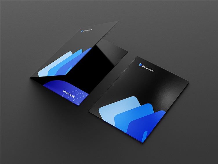
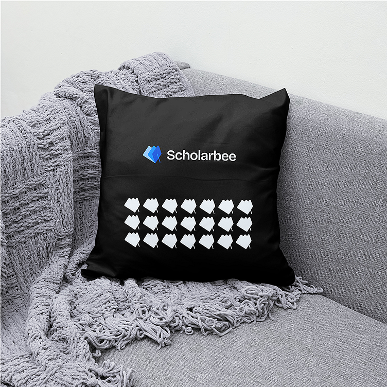
The logo was subtly refined, softening sharp edges to create a more approachable and balanced look. This change improved versatility and ensured better adaptability across different applications.
Conclusion
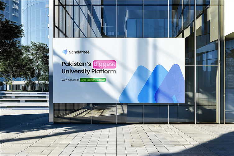
Scholarbee’s brand refresh was about evolution, not revolution. By refining its core visual elements, and improving usability, the brand is now better positioned to connect universities with top student talent while maintaining the trust and recognition it has built over time.