Terra - CBD Oil Bottle Label & Box Packaging Design
Terra - CBD Oil Bottle Label & Box Packaging Design
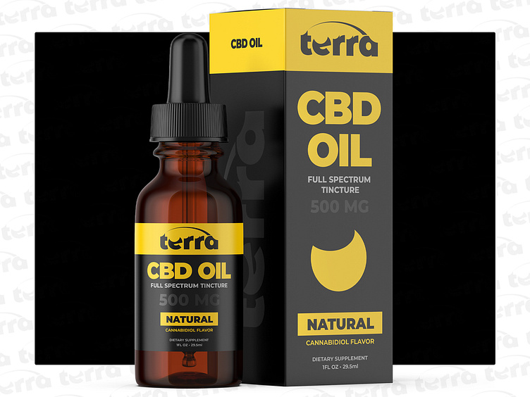
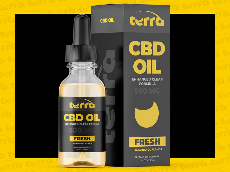
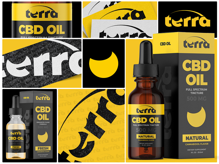
Our objective for Terra was to develop a brand identity that conveyed quality, purity, and a connection to nature for their line of CBD oils. We aimed to achieve this through a clean and modern design aesthetic, incorporating natural elements and a sophisticated color palette.
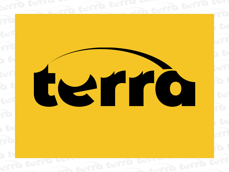
Logo Development: The "Terra" wordmark was designed with a focus on simplicity and elegance. The clean typography and subtle leaf symbol subtly hint at the natural origins of the product while maintaining a modern and sophisticated look.
Color Palette Selection: The combination of black and yellow was chosen to create a high-contrast, eye-catching design. The yellow evokes feelings of natural energy and optimism, while the black provides a grounding and sophisticated backdrop.
Packaging System: We developed a packaging system that is both informative and visually appealing. The boxes clearly communicate key product information, including the type of CBD (Full Spectrum, Enhanced Clear Formula), strength (500mg), and flavor (Natural, Fresh).
Design Elements:
Typography: The clean, sans-serif typeface used for the "Terra" wordmark and product information creates a modern and minimalist aesthetic.
Leaf Symbol: The subtle leaf symbol incorporated into the logo and packaging subtly reinforces the natural and plant-based origins of the CBD oil.
Texture and Pattern: The close-up shots of the packaging reveal a subtle texture and pattern, adding a tactile element and visual interest.
Product Photography: The lifestyle shot of the bottle and box on a textured surface conveys a sense of quality and sophistication.