Landing Page for German EduTech Company
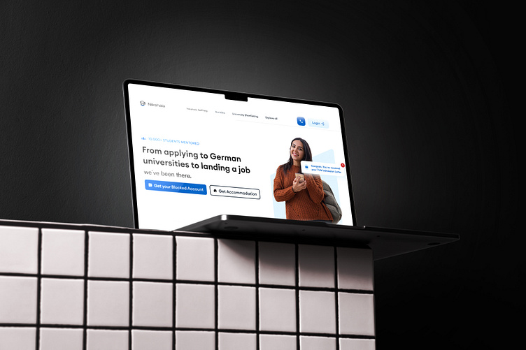
The Nikshala platform streamlines the journey from university applications to job placements in Germany. Featuring a clean, user-friendly interface, ensuring a seamless experience for over 10,000 mentored students.
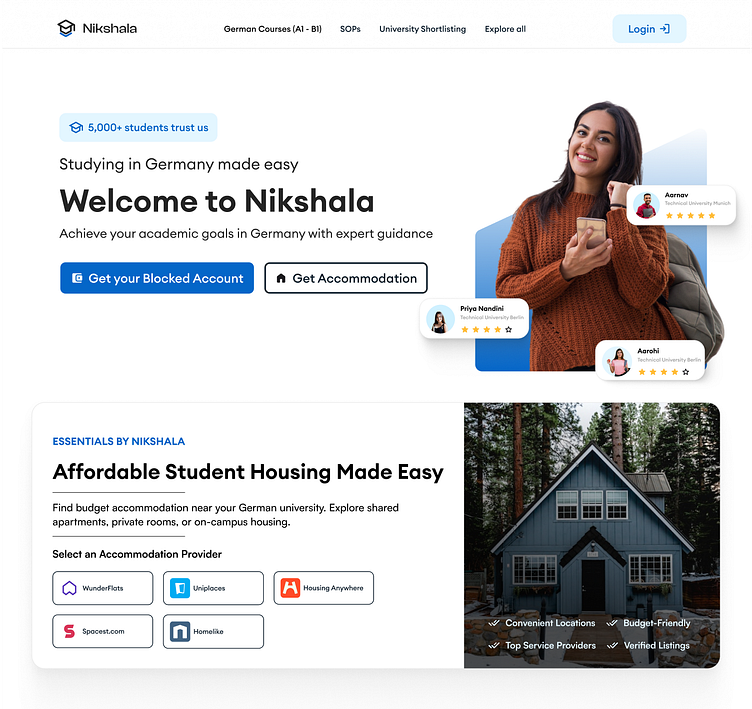
The hero section features a bold, dark background with prominent call-to-action buttons, paired with a relatable student image and notification graphic to emphasize the platform’s services. Transitioning into the body, the light layout highlights the Nikshala Self help tool with clear headings, trust-building ratings, and a Trello-style visual, ensuring a clean and engaging user experience.
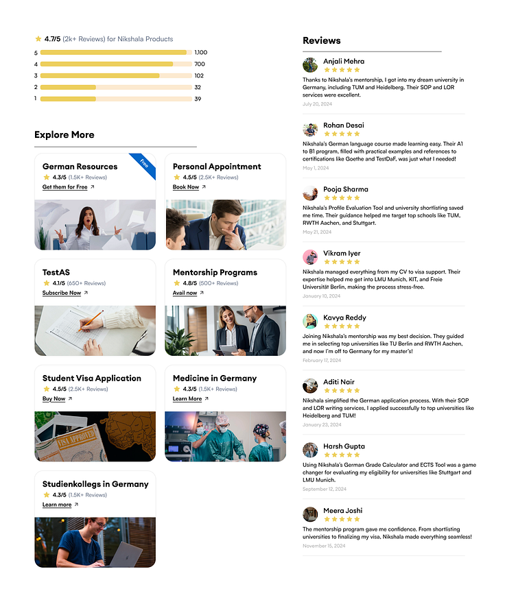
This section highlights Nikshala's exceptional customer ratings with a 4.7/5 average and detailed reviews from satisfied users, showcasing their success stories. The "Explore More" cards provide quick access to key resources, mentorship programs, and services like visa applications and university guidance, ensuring a streamlined user journey.
This design is a perfect blend of aesthetics and functionality, delivering a seamless user journey. The bold hero section grabs attention instantly, while the structured body and resource sections ensure clarity and easy navigation. The use of reviews and ratings builds trust, and the interactive elements make the experience engaging. Would love to hear your thoughts!