My Ten Nights: Payment Redesign
Hello there! 👋
I'm John a contracted senior product designer at My Ten Nights; a donation platform for users to automate their donations over the last 10 nights of Ramadan.
So what was the brief?
The brief was a redesign of My 10 Night's payment process. Designing a new collection of UI components and flows based on user experience designs created by the UX team.
The landing page created in phase 1 of the project: Ramadan Wrapped 2024 also needed remixing as it would be the entry point for the new payment process. The landing pages would be switched by developers at the beginning of Ramadan so users can start donating.
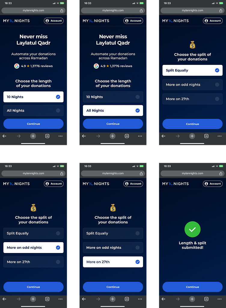
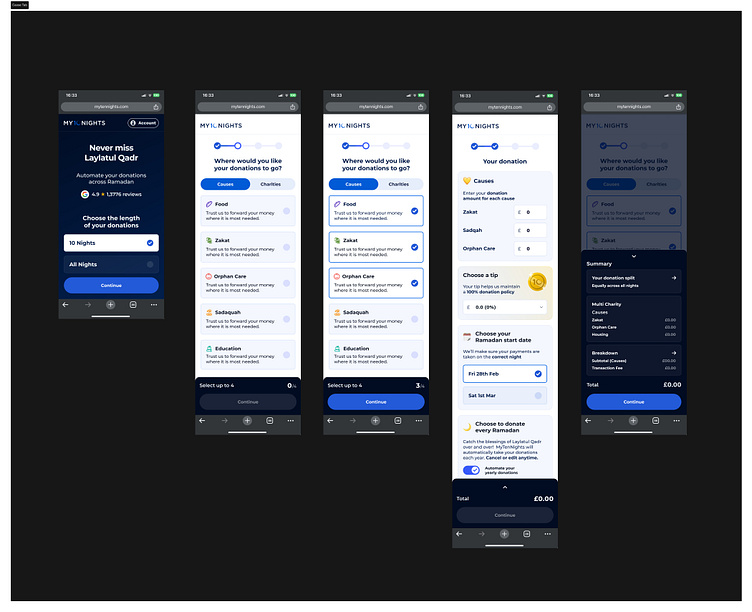
📱Payment step 1: Landing Page
The first step on the donation payment is the user choosing the length of the payment, and how the user wants to split the donation.
The landing page flow was split into three screens. The first is the landing page which includes the hero and 2 options with radio buttons and check marks. The first item is selected by default so users know that the components are tappable and can be changed.
The second screen gives the user the option to choose between 3 donation split options reusing the same selector components. The final screen is a confirmation screen with a reward animation to motivate the user to continue the payment process and tap the continue CTA.
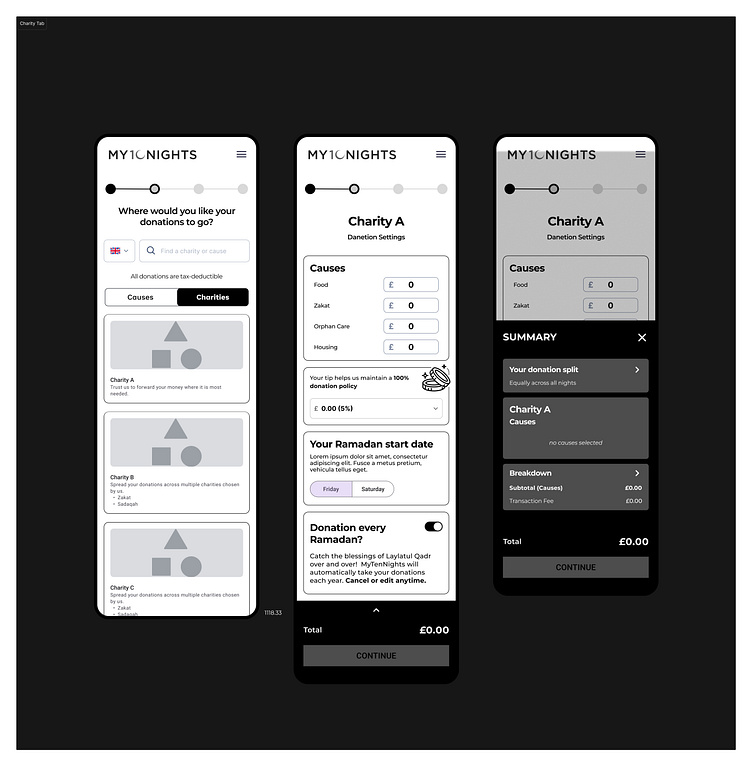
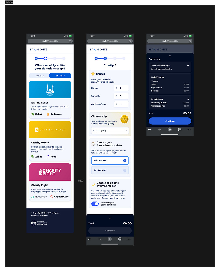
👯 Payment step 2: Tabs
The second step of the payment process is the user choosing whether they want to donate to a single charity or to choose specific causes to donate to instead.
The UX team created flows and screen designs for a 2 path entry point for the user, where the user can toggle between Causes and Charity tabs. This is the second step after the landing page entry point for the payment process flow. UX designs for the Causes tab below followed by UI designs, side by sides, and UI components.

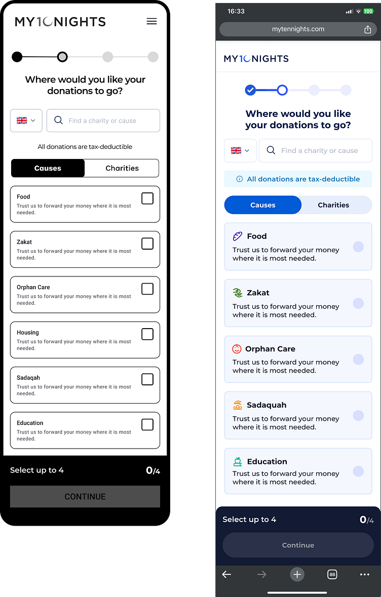
Components
Payment process cards using emojis as assets to give more context where needed. Custom vector coin graphic also created for to highlight the 'Choose a tip' card.
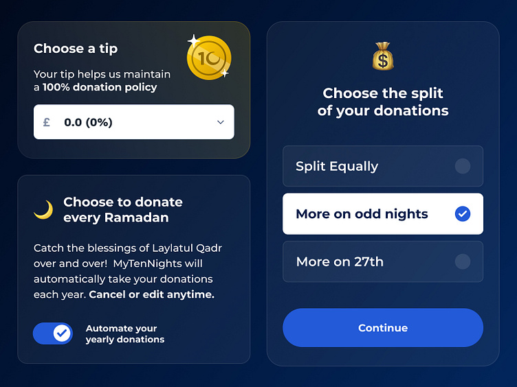
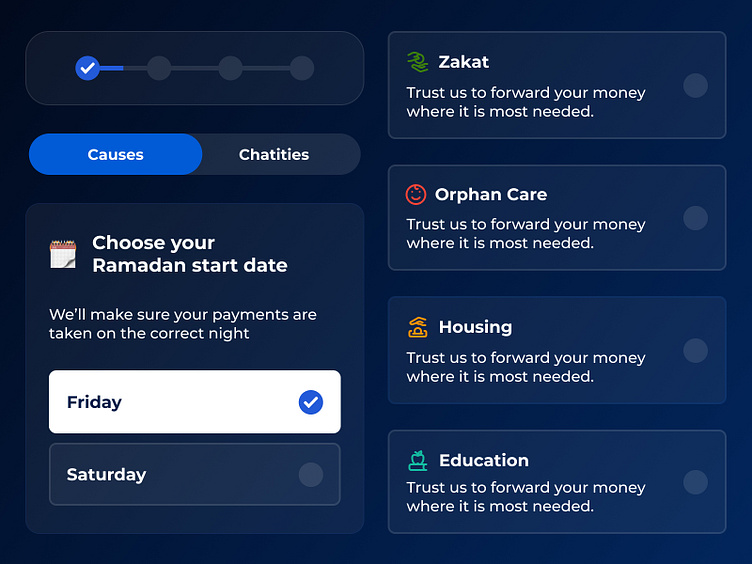
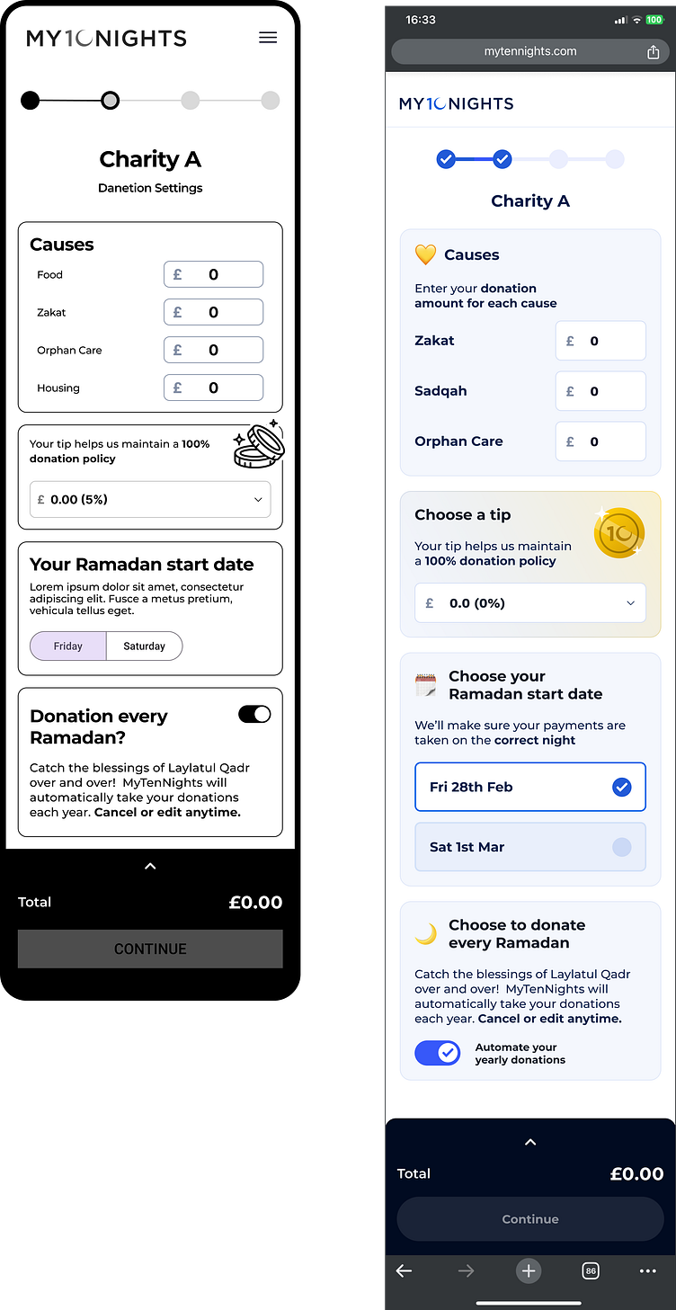
🧮 Payment step 3: Donation
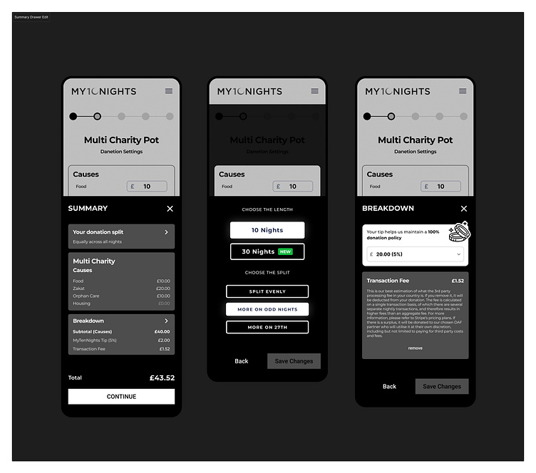
The third step of the payment process is the user choosing how much they want to donate, and checking their donation amounts in the summary.

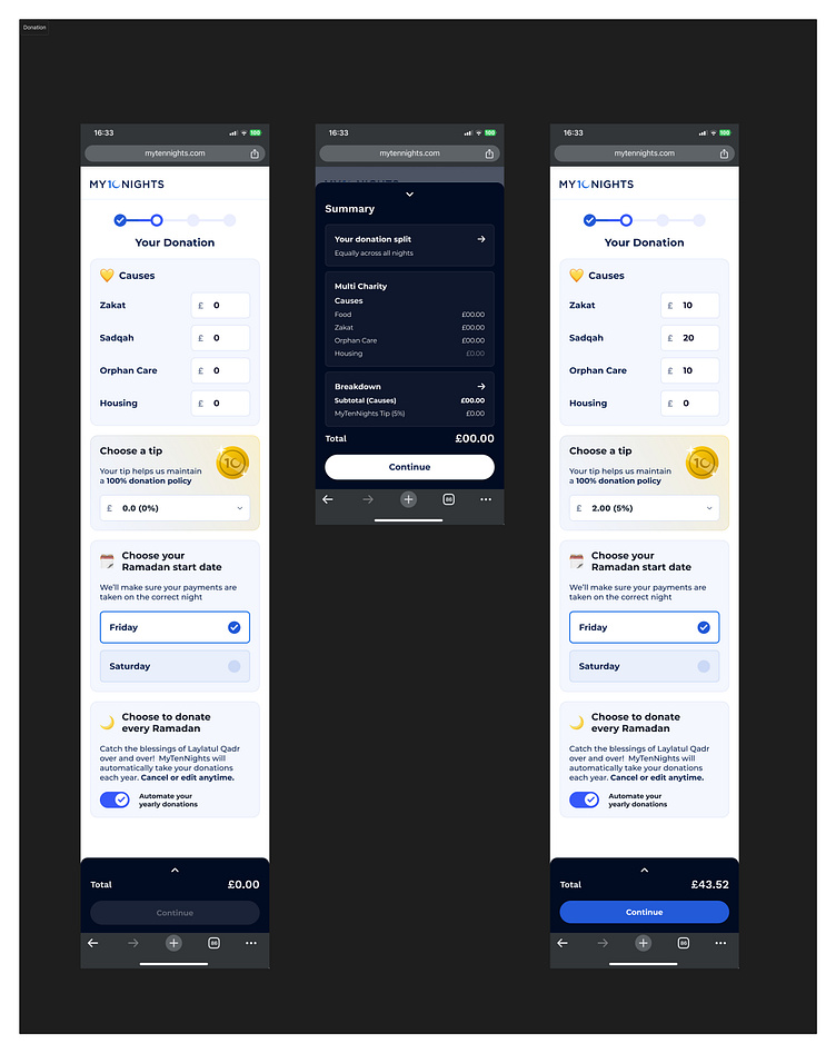
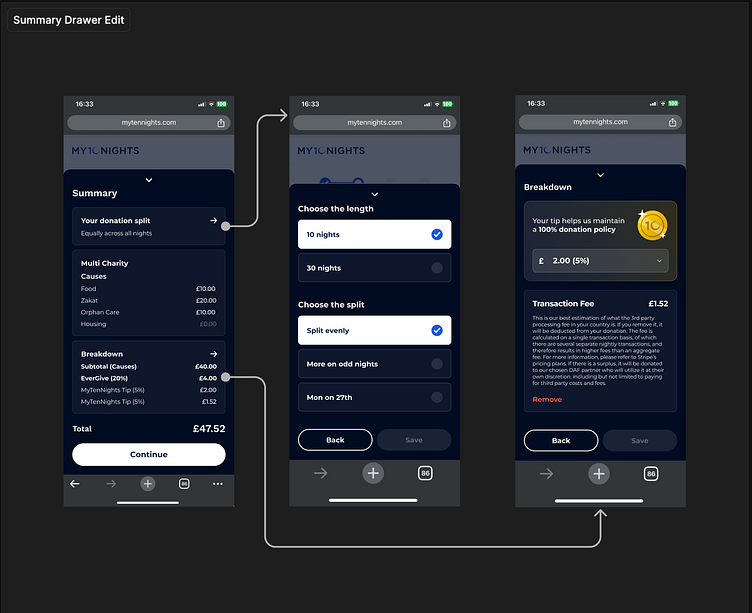
🤔 Edit Donations
From the Summary drawer the user can also edit their donation using reused components from earlier in the flow to amend their selections.
The arrows below show how the user can edit their donation selections from the Summary drawer.
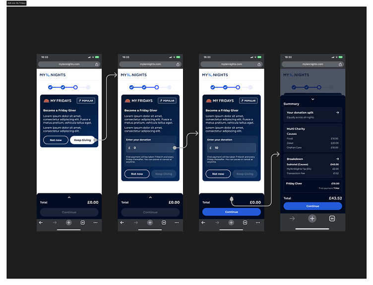
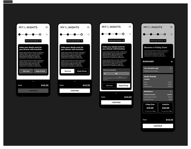
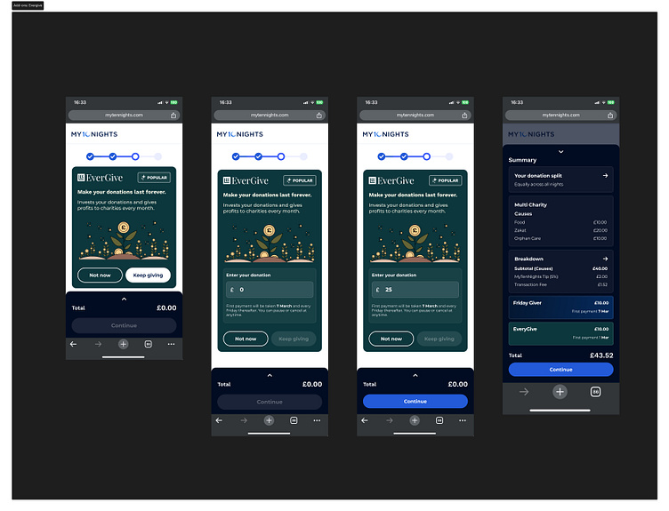
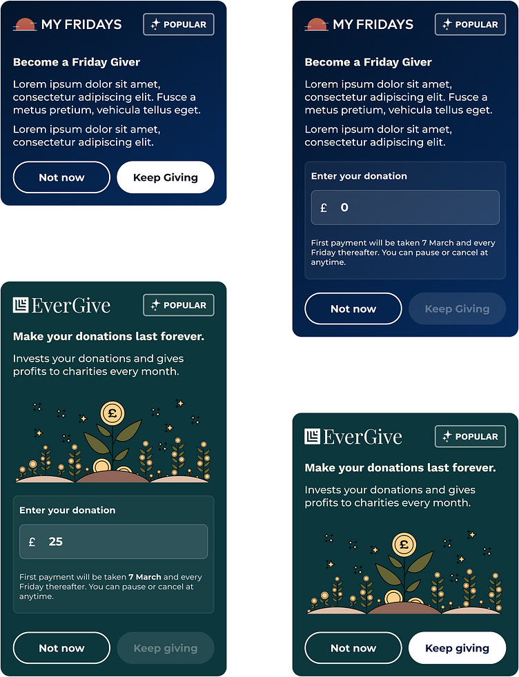
🛒 Payment step 4: Add-ons
The fourth step of the payment process are the add-ons. There are two different up sells in this step. The first is My Fridays a weekly donation service, and the second is EverGive constant recurring donations. I created components using brand styling from My Fridays and EverGive.


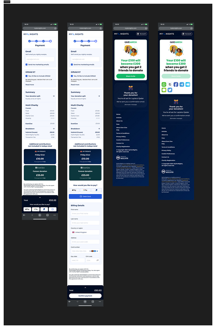
💳 Payment step 5: Payment
The fifth step of the payment process is the payment and the payment conformation and sharing.
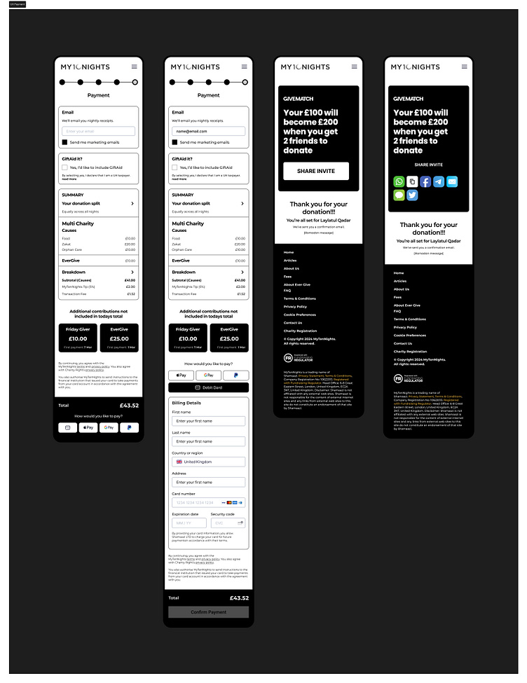
The drawer with the payment options is also fixed to the bottom of the screen so the user can tap the buttons for quick payment options.
Thank you for reading, what are your thoughts? Let me know in the comment section! Press "L" on your keyboard to show some love ❤️