Inventory Management Table Redesign
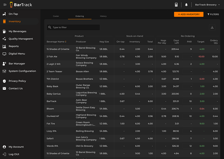
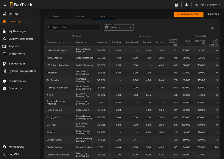

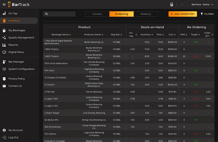
Managing beverage inventory effectively is crucial for bar operators, but the previous UI had an overly cluttered table, making it difficult to extract key insights at a glance.
This redesign focused on streamlining data presentation, improving usability, and refining the information hierarchy through a collaborative process. The goal was to reduce visual noise, enhance readability, and make ordering decisions faster and more intuitive.
Key Enhancements:
🔹 Decluttered Data Presentation – Removed unnecessary columns and streamlined critical information for better scannability.
🔹 Improved Readability – Balanced typography, spacing, and contrast for enhanced clarity.
🔹 Actionable Insights at a Glance – Focused on making key inventory and reordering data more digestible.
🔹 Collaborative Design Process – Worked with colleagues to determine what information was essential, what could be removed, and what could be improved for efficiency.
Final Thoughts
This redesign was an exercise in thoughtful UI simplification, balancing data density with clarity. By refining information hierarchy and improving user flows, we created a more intuitive, scannable, and efficient Inventory Management experience for bar operators.
💡 This project reinforced the importance of collaboration in UX—iterating with colleagues helped determine what was truly essential for decision-making.
