Color and Conversion
One of my favorite things about the internet is that the design is not set in stone.
This means as a Brand Experience team we have the luxury of launching and testing our work to see, well, what is working. That is exactly what happened with our homepage, which features a large color gradient from our brand. We wanted to know if color alone could impact conversion rates of our anonymous prospects signing up for free Docusign trials.
Cue the color experiment
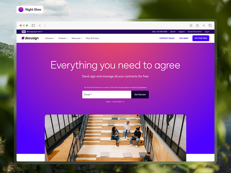
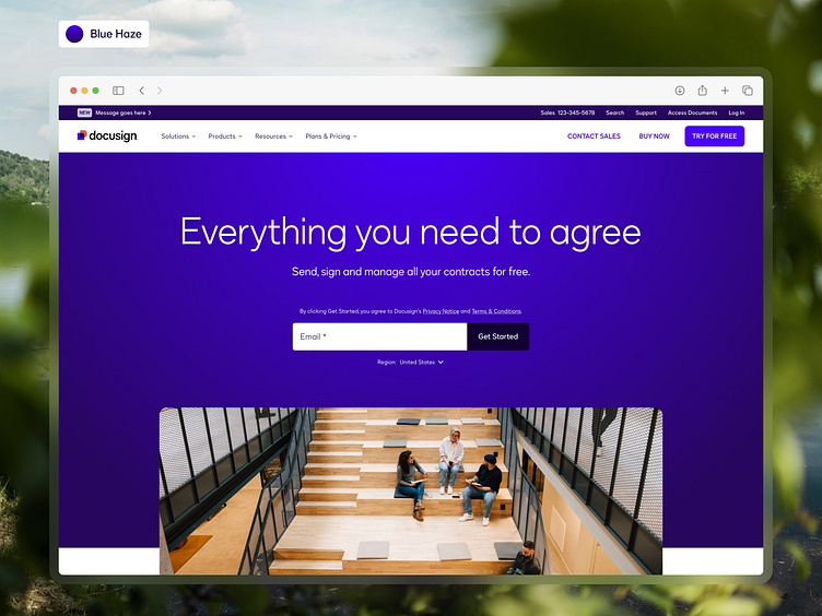
For two months our website's Product Management and Web Operations team ran a test on the Docusign homepage in Canada to show our anonymous prospects two color themes of the homepage hero: our vibrant Night Glow vs our deep Blue Haze, and see which one would impact conversion.
As a brand team, we thought that leading with our Hero persona gradient of Night Glow would draw users in and give them the confidence to sign up for trials. But it turns out that Sage's Blue Haze significantly stole the show.
Changing the background color to Blue Haze achieved a 5.6% gain in trial sign-us and positive downstream impact too.
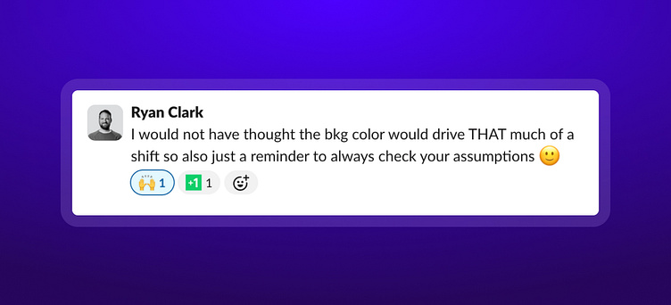
Talk about a great example of how checking your assumptions and being willing to pivot with data can help evolve your designs and get real results!
