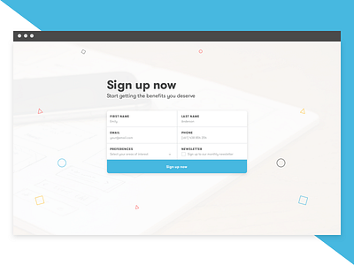
Desktop sign up form
This shot was done to get practice on a slightly different take to designing up form fields based on an article I read. The form input labels are top aligned within the overall input field itself. This style of input form field is closer related to paper forms.
This type of form would be great to test to see the difference in user completion and overall experience/satisfaction.
Font used was GT Walsheim and picture sourced from stocksnap.io. Feedback welcome!
More by Ben Low View profile
Like
