The Walpole Barn Box
Designed as an elegant container for gifts, purchases, or subscriptions, this packaging solution was aimed at elevating the Walpole Barn from a "hole in the wall" store to a "can't miss" destination for locals and vacationers alike.
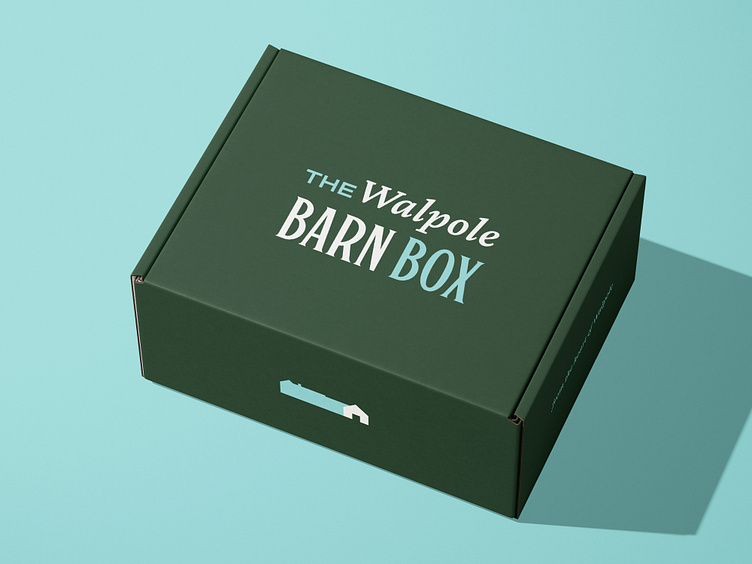
The typographic solution on the outer lid uses color to call out the brand name (Walpole Barn) while placing the primary emphasis on "Barn Box," an ownable phrase intended to link the charm of the property to the quality and uniqueness of the items inside. Compared to other wordmarks created for the client, this is the only one that fits into a rectangular shape — an intentional decision to play up the box theme.
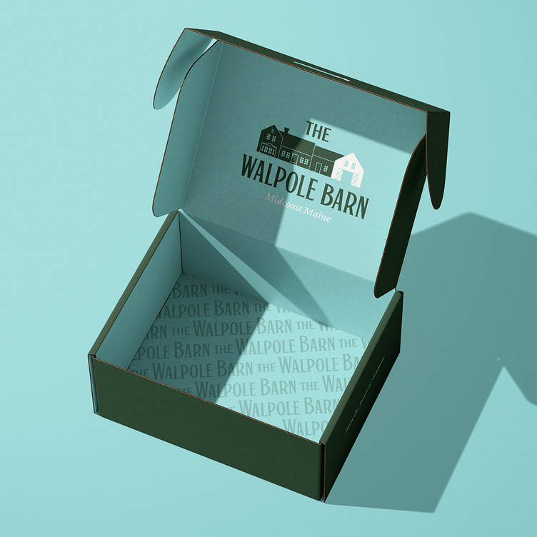
The interior of the box features a detailed illustration of the Walpole Barn property, a pop of contrasting color, and a brand pattern featuring the wordmark.
Would you like to work together on a packaging project like this? Email me at dan@qrscreative.com!
Fonts used for this project:
Söhne Breit — Klim Type Foundry
Botanist — Carmel Type Co.
Crimson Pro — Google Fonts