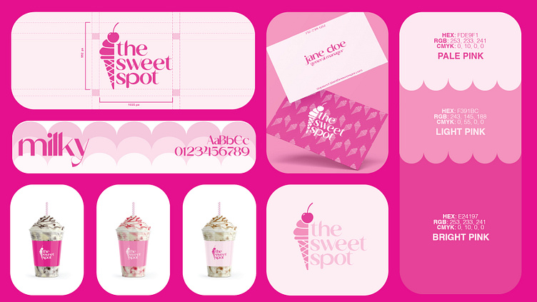
The Sweet Spot Branding
the sweet spot is more than just a dessert shop, it’s an experience. from handcrafted milkshakes in mason jars to freshly made bubble waffles, every detail is designed to delight. their bold, playful approach to desserts inspired me to explore a fresh visual identity that better captures the indulgence and charm of their offerings.
this conceptual rebrand is a personal project designed to refine my branding skills and explore how a more elevated yet whimsical aesthetic could enhance the brand’s personality. while the original identity leans into fun and high-energy visuals, my goal was to refine that playfulness into something that feels both polished and inviting. the sweet spot is all about indulgence, crafted, intentional, and experience-driven.
for the logo, i kept the core elements recognizable but refined them for better readability and balance. the ice cream cone icon is seamlessly integrated into the type, acting as both a playful nod to their menu and a strong, memorable brand mark.
i explored typography that blends modern elegance with charm. the lowercase styling creates a friendly, approachable feel, while subtle serif details add sophistication. rounded letterforms reinforce a soft, inviting look that mirrors the decadence of their desserts.
let me know your thoughts!