Building Reliable Roads


Building Reliable Roads
Brand Identity Development for the Mirny* Road Management Authority
Task
To create a logo and corporate identity that associate with the company’s activities.
Solution
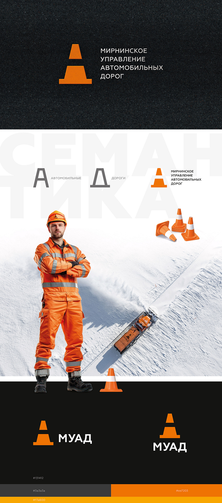
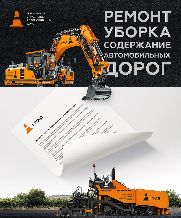
The image of a traffic cone is directly linked to roadwork. The Mirny Road Management Authority is engaged in the construction, repair, and maintenance of transport infrastructure, making a traffic cone-shaped logo a clear reflection of the company’s specialization.
Additionally, the logo incorporates deeper meanings: the form of the letter «A» representing «Auto» the perspective of a receding roadway, and a dashed road marking. These elements emphasize dynamics, movement, and progress.
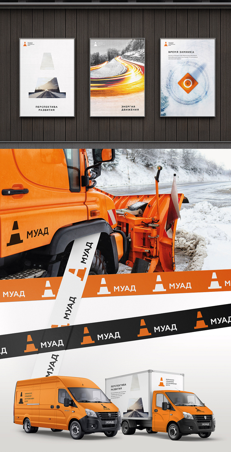
The corporate identity features orange, black, and gray colors. Orange symbolizes roadwork, warning signs, and specialized equipment, evoking attention and energy. Black and gray represent reliability, technological advancement, and road surfaces, creating a visual contrast while conveying the company’s professionalism and strict standards.
The developed corporate identity not only reflects the company’s operations but also highlights its commitment to innovation, technology, comfort, and road safety.
*Mirny city (Republic of Sakha, Yakutia)
