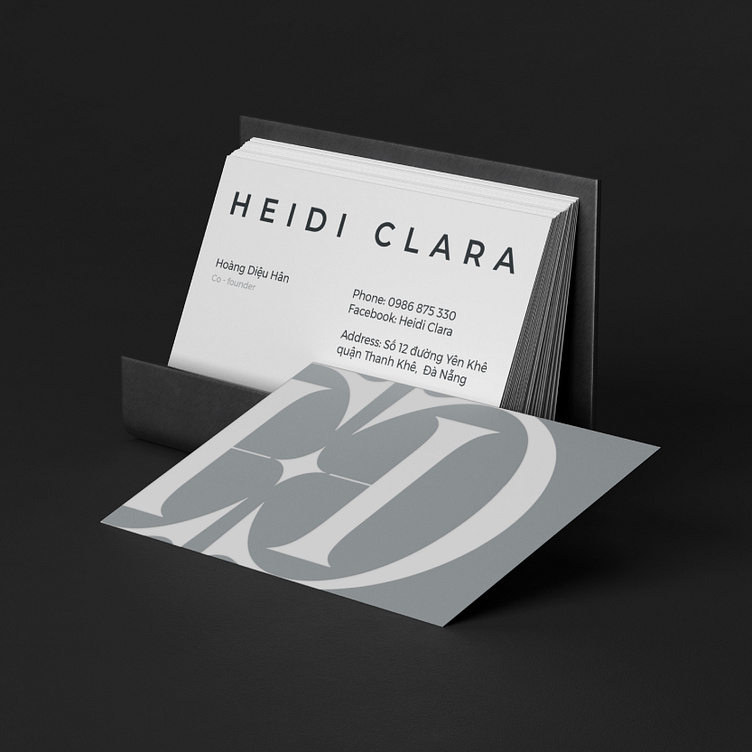
[LOGO DESIGN] HEIDI CLARA
With Heidi Clara - Every girl is a flower.
____
Logo | Branding | Brand Identity
Field: Cosmetics
____
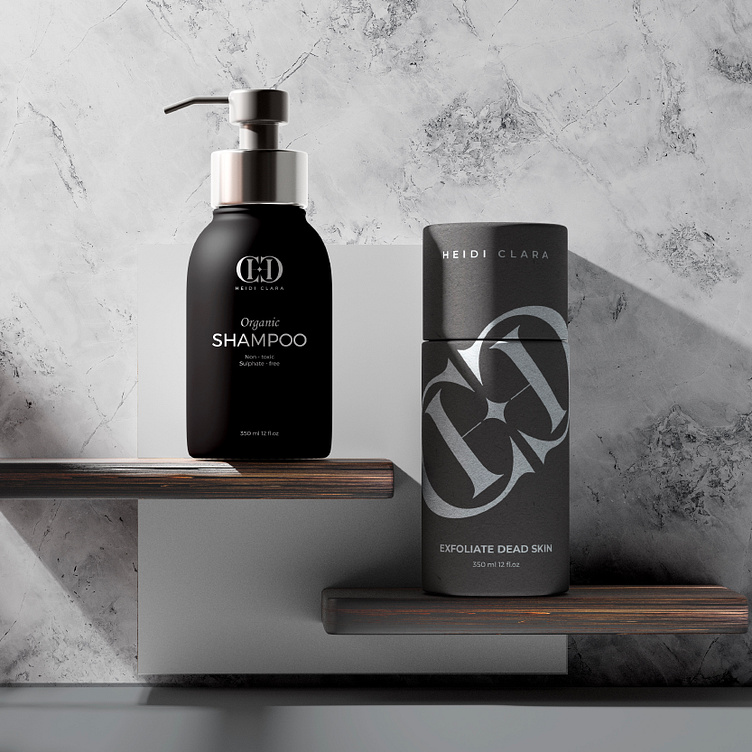
The cosmetics market is now witnessing fierce competition from many different brands, large and small. However, that cannot stop Heidi Clara from being born with the desire to bring quality cosmetic products that are safe and gentle on the skin of Vietnamese people.
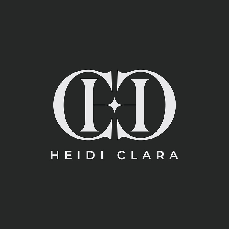
However, unlike most existing cosmetic brands, Heidi Clara requested a logo that is solid, creating a sense of trust and sustainability instead of soft or overly stylized designs.
With that desire, Kaiza came up with the idea of using the two letters "H" and "C" (representing the brand name) as the central element. Then, we based on the symmetrical structure of the letter "H" and developed the arc of the letter "C" around it. This idea was created to give the logo a sense of solidity and stability. In addition, the four-pointed star symbol is placed in the middle as an affirmation of product quality, the sophistication of the brand and also creates a sense of luxury and femininity.
Designed by Kaiza
Copyright © Kaiza. All Right Reserved
Contact us:
KAIZA CO.,LTD
• P: 0889 996 399
• E: info@kaiza.vn
• W: www.kaiza.vn
Connect me @ Behance - Instagram - Pinterest