DM_A website
I've always been passionate about architecture and an admirer of DMA's work – having been lucky enough to tour one of their Auckland projects first-hand. Years ago, I started this partnership with a rebranding exercise and design and development for DMA's award-winning previous website. Recently, Daniel got back in touch, feeling the time was right to mix things up, and create a new site that better reflects the current state of the architecture studio.
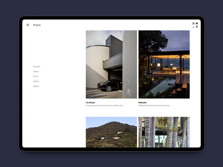
Our goals were to keep the existing brand and minimal aesthetic, but rework the content and design to improve project case studies, better tell the story of the studio's value offering, and create a memorable experience that reflects the quality of DMA's built projects.
We accomplished this through three unique interaction patterns: A fun reveal effect on project hover that gives users a glimpse into deeper imagery while browsing projects. A page layering system that allows quick shifting between projects and news articles. And a horizontal scrolling mechanism that turns project walkthroughs into a focused linear experience.
These design features add moments of memorable delight to an otherwise minimal experience – just the right balance to let the architecture work speak for itself and the website to surprise as its own delightfully designed object.