GlowShield - Minimalist Sunscreen Packaging Design
Project Overview
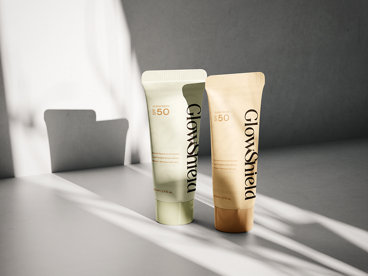
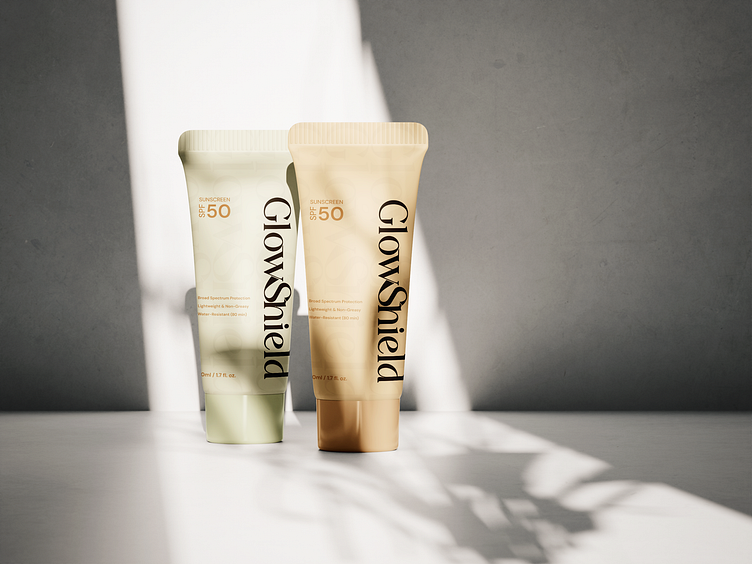
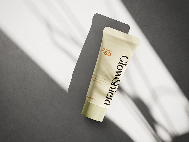
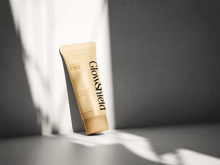
GlowShield is a premium sunscreen brand designed for those who appreciate minimal elegance and high-quality skincare. The packaging concept focuses on typography and a clean aesthetic, ensuring a sophisticated, luxurious feel while maintaining clarity and readability.
Design Concept & Approach
🔹 Minimal & Elegant – A soft, muted color palette (beige and cream) with gold accents enhances the premium appeal.
🔹 Typography-Driven – A bold yet refined serif typeface for the brand name, ensuring strong visual identity.
🔹 Clean Layout – Essential information like SPF 50, key benefits, and volume is subtly arranged for easy readability.
🔹 Subtle Pattern Detailing – Adds depth to the background without overpowering the minimalist approach.
Color Palette 🎨
Soft Beige – Main tube color for a warm, natural feel.
Ivory Cream – Secondary packaging for variation.
Deep Brown – Typography for contrast and readability.
Final Thoughts
This design perfectly embodies sophistication and simplicity, making it an ideal choice for a modern skincare brand. The refined typography and balanced color scheme create a visually appealing and market-ready sunscreen packaging.
📩 Contact for Design Services
📧 Email: designservices@basicblend.info
🔗 Behance: https://www.behance.net/basicblend
📷 Instagram: https://www.instagram.com/basicblend_graphic/
📷 twitter: https://x.com/Basicblend97
Feel free to connect for custom branding, packaging, and design projects! 🚀✨
