Aerolase® Rebranding
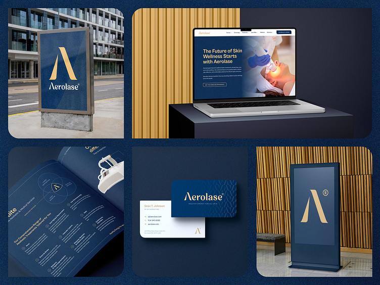
Aerolase® unveiled its fresh new brand and we’re extremely proud to have been part of the transformation!
This rebrand isn’t just a new logo and colours—it’s a reflection of the power, precision, and innovation behind their laser technology.
The refined “A” icon, the elegant new logotype, the tagline Healthy Energy for All Skin…every detail was carefully chosen to show how Aerolase is both timeless and cutting-edge, luxurious and accessible.
Let's link up.
Ooho Agency | Website | LinkedIn | Info@ooho.io
Some of our services.
Animations | Branding | Illustrations | Logos | Marketing | Photography | Product design | UI/UX design | Webdesign | Web development
Oh! Don't forget to press that L button if you like what you see.
