Noze - Case Study - UI/UX design
Client
One UI solution for a site that had a lot to show.
Noze is a company developing sensor technology - digital noses that provide insights into air quality.
Therefore, their sensors can be used in areas related to the transportation and storage of food, the presence of toxins, laboratories, and anywhere where it is necessary to determine what exactly is in the air.
Because of the large amount of information essential for users from different industries, my main task was to create a well-organized space. A site that clearly presents the technology, statistics, results, and possibilities offered by Noze products.
The goal was to ensure everything was easy to navigate and visually engaging while still conveying the complex and innovative nature of their work

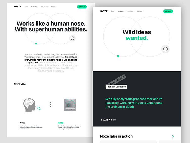
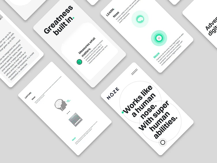
Clear & Legible UI
First and foremost, I made sure the UI is light and the content is easily legible. For such advanced technology, it's crucial to educate users quickly and keep them engaged. The best way to achieve this is by using a balanced mix of content.
A combination of abstract shapes, animation, and graphics helps create the atmosphere of the Noze brand. With brief and concise copy, this mix ensures users can quickly scan the site's offerings without feeling overwhelmed.
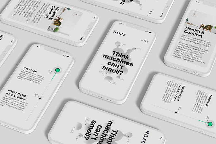
Responsive design
I created a hierarchy of explanations and descriptions, allowing users to decide how much they want to read and explore each section. The goal was for users to absorb the content gradually, step by step, on both desktop and mobile, without feeling overwhelmed or confused.
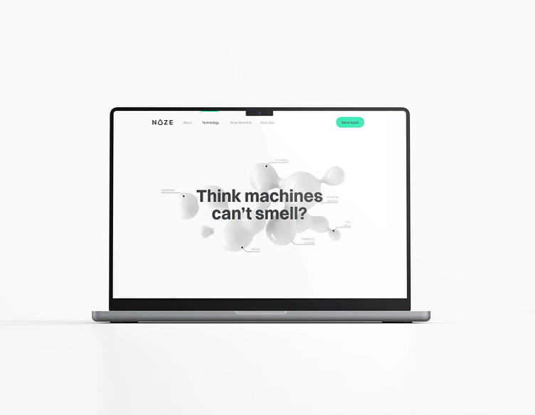
For that scientific look
I used the Noze brand palette for the colors. A clean background with light green accents helps convey a scientific, modern feel. The rounded and fluid shapes were intentionally incorporated to evoke a sense of tranquility and safety, aligning with Noze’s core message. The brand's bold messages were strategically placed in prominent areas of the UI, guiding users through the site seamlessly.
Being a group of innovators, Noze wanted a modern and professional website. I made sure that beneath the smart design, there’s also a solid, stable site structure.
This is another UI solution where I aimed to prove that speed, functionality, and aesthetics can work seamlessly together. The goal was to provide an enjoyable and meaningful experience for both users and site owners.
🔗 Check it out live here: noze.ca
Would love to hear your thoughts!
