Design Brief: Color System
Color System for an LMS Platform
Overview
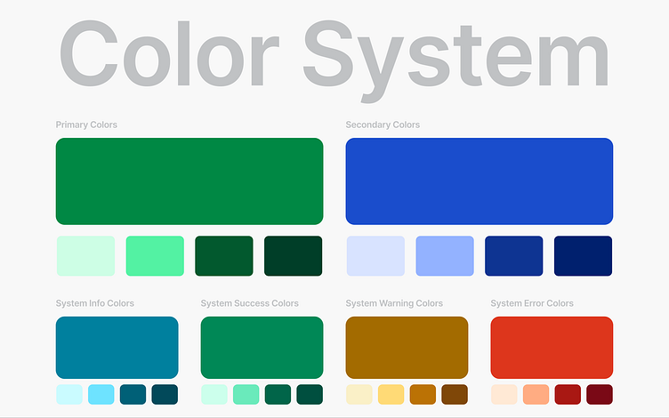
This color system is designed to create a modern, accessible, and cohesive identity for a Learning Management System (LMS). The selected colors ensure clarity, usability, and compliance with WCAG AA standards.
Color Selection & Rationale
• Primary Color: Symbolizes growth, trust, and stability, reinforcing productivity.
• Secondary Color: Adds professionalism and focus, balancing the UI.
• System Colors (Success, Warning, Error, Info): Carefully chosen for alerts and status indicators while ensuring AA contrast compliance for readability.
Accessibility & Contrast Compliance
All colors meet at least AA (4.5:1) contrast standards, ensuring legibility and inclusivity for all users.
• Primary (#008844) – 4.56 AA
• Secondary (#1A4DCC) – 7.05 AAA
• Info (#00809E) – 4.58 AA
• Success (#008856) – 4.51 AA
• Warning (#A36B00) – 4.51 AA
• Error (#DD361C) – 4.51 AA
Brand Principles & UI Application
This color system enhances clarity, trust, and efficiency while ensuring consistency across UI elements.
• Primary Color → Main actions, branding, and key UI components.
• Secondary & Neutral Colors → Support contrast and readability.
• System Colors → Highlight alerts and important messages.
The final design aligns with brand identity and accessibility to provide a seamless and inclusive user experience.