Engaging Landing Page Design for GrabOn: A Visual & Branding
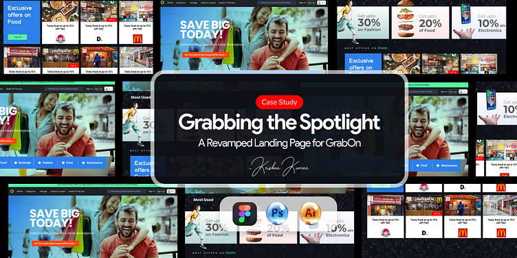
This is a redesigned landing page for GrabOn,
aimed at enhancing user engagement, brand recall, and overall visual aesthetics. The primary focus was to create a layout that highlights GrabOn’s value proposition while improving usability and branding elements.
Key features of the redesign include:
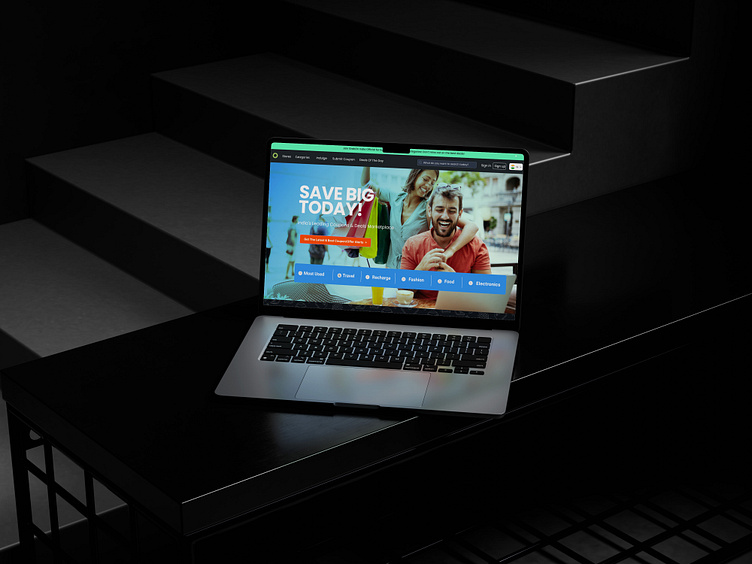
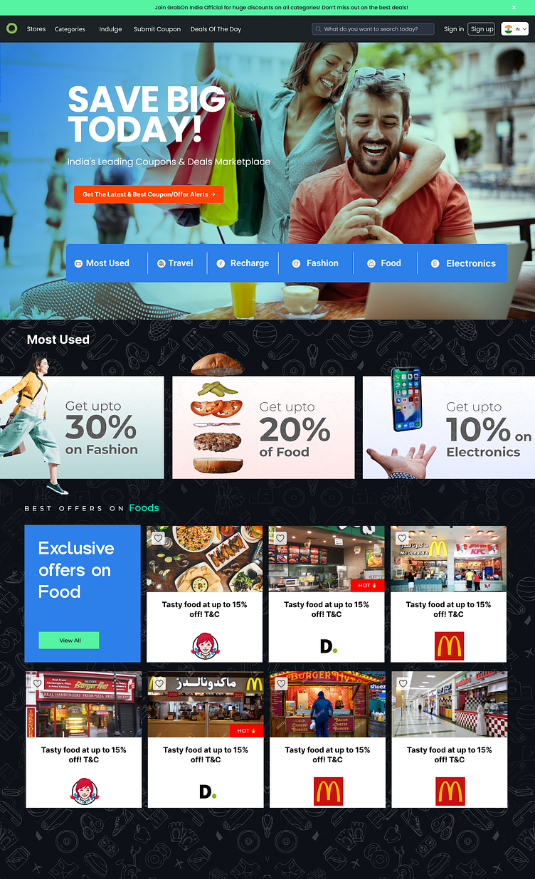
Hero Section: Eye-catching tagline with vibrant colors and imagery to captivate attention and communicate the brand's focus on deals and savings.
Category Tabs: Clean and organized navigation for better user accessibility.
Offers Showcase: Well-defined sections for “Most Used” and “Best Offers” to highlight popular deals visually.
Visual Hierarchy: Improved content flow with consistent font sizes, bold typography, and vibrant colors to guide user focus.
Case Study: How This Design Elevates Branding and User Experience
Objective:
To create a visually appealing landing page that aligns with GrabOn’s branding while resolving existing usability and aesthetic challenges.
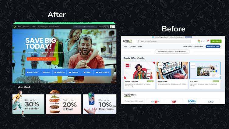
Key Issues in the Previous Design:
Cluttered Layout: The original landing page was overloaded with content, leading to user confusion.
Lack of Visual Appeal: Insufficient use of vibrant colors and engaging imagery reduced the overall impact.
Poor Content Hierarchy: Users struggled to identify important sections quickly.
Outdated Typography: Fonts lacked modernity and accessibility.
Solutions Implemented:
Streamlined Layout:
Adopted a modular grid system to organize content into clearly defined sections.
Used ample whitespace to declutter the design and improve readability.
Enhanced Branding:
Incorporated GrabOn’s primary colors (electric blue and lime green) with accents of orange to evoke excitement and urgency.
Used lifestyle imagery to make the platform more relatable and engaging.
Improved Content Hierarchy:
Highlighted the “Save Big Today!” tagline and prominent CTA buttons in the hero section.
Designed category tabs and deal cards with contrasting colors and typography for better focus.
Modern Typography:
Used Poppins for headings and Roboto for body text to ensure readability and visual appeal.
Impact:
User Engagement: The vibrant and visually striking design attracts attention and keeps users engaged.
Improved Navigation: Clear segmentation of categories and offers enhances usability.
Stronger Branding: A cohesive color palette and updated typography align with GrabOn’s mission to be India’s leading deal marketplace.
Scalability: The responsive design ensures consistent experience across all devices.
If you loved this transformation for GrabOn, drop a ❤️ and share your thoughts in the comments! Follow me for more bold and creative design inspirations—together, let’s make the web more beautiful, one project at a time. ✨🚀
