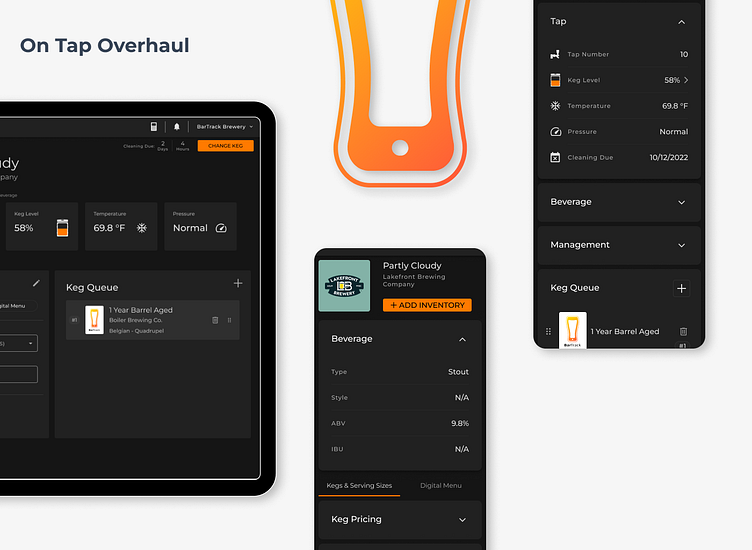
On Tap Overhaul
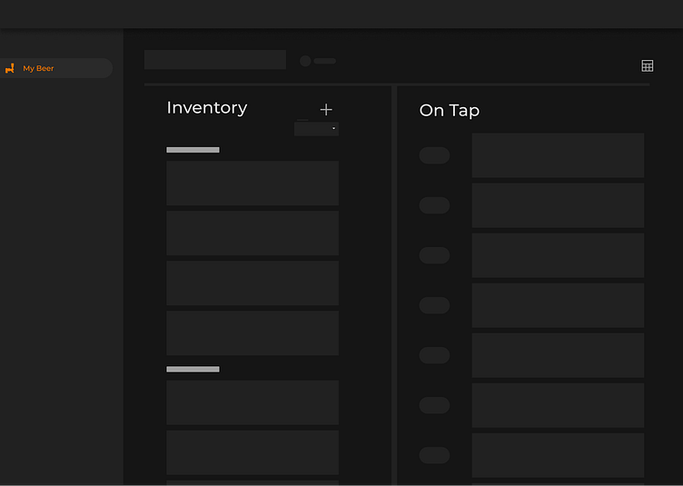
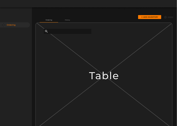
Before I Got Involved 👀
This was the original UI before I stepped in. Functional, but cluttered. The hierarchy was inconsistent, the visual balance was off, and the user experience felt overwhelming. A lot of elements were fighting for attention, making quick decision-making harder than it should be.
🚀 A Fresh Perspective: My First Redesign Initiative
This was my first project after working with their devs to establish their first design system. Coming in with a fresh perspective, I went all in—mapping out a series of wireframes that reimagined how the platform could be structured. I was eager to challenge existing conventions, pitching bold ideas that aligned with my personal mental model of how the system should function. This included merging On-Tap and Inventory, enhancing My Beverages into a more intuitive Beverage List & Offerings, and refining navigation to streamline user workflows. As expected, these ideas were met with some hesitation—big changes always are. But I like to document these early pitches, even if they don’t get implemented right away. They serve as a reminder of how I initially viewed the product and where I saw opportunities for improvement from day one....
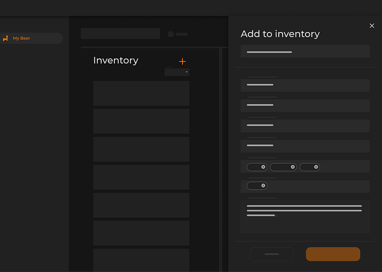
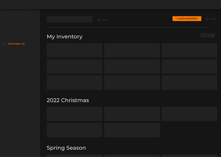
Bringing Structure to the Chaos
This wireframe served as the precursor to the final design, marking the first step in refining the platform’s information architecture. My goal was to rearrange elements intuitively, making data easier to understand at a glance while maintaining a sleek, structured aesthetic.
This was also the first time seeing our design system come to life—moving from theoretical components to practical application. I focused on hierarchy, usability, and clarity, ensuring that users could navigate the platform effortlessly while still accessing the depth of information they needed.
It was more than just a wireframe; it was the foundation of a more intuitive, scalable, and visually cohesive platform.
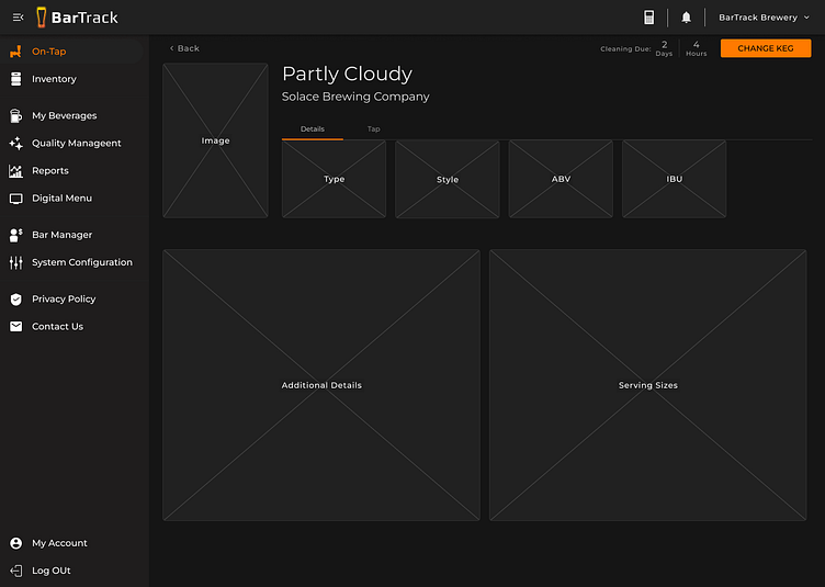
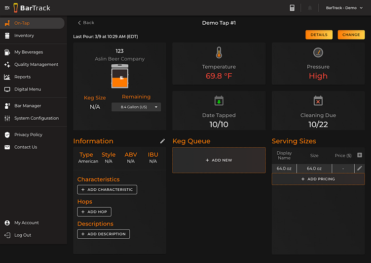
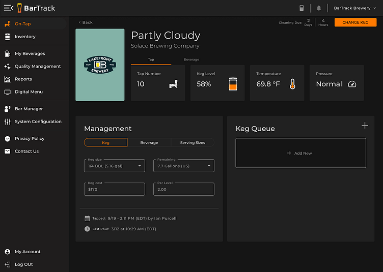
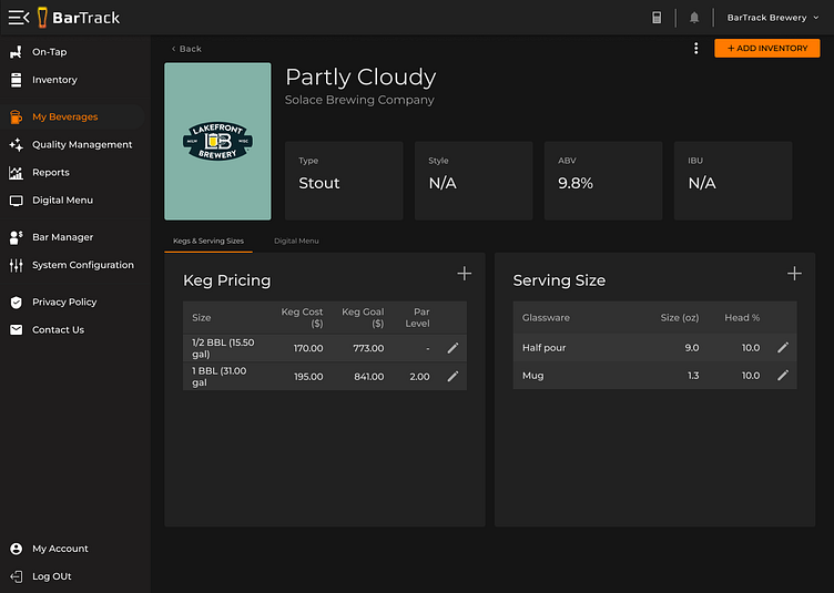
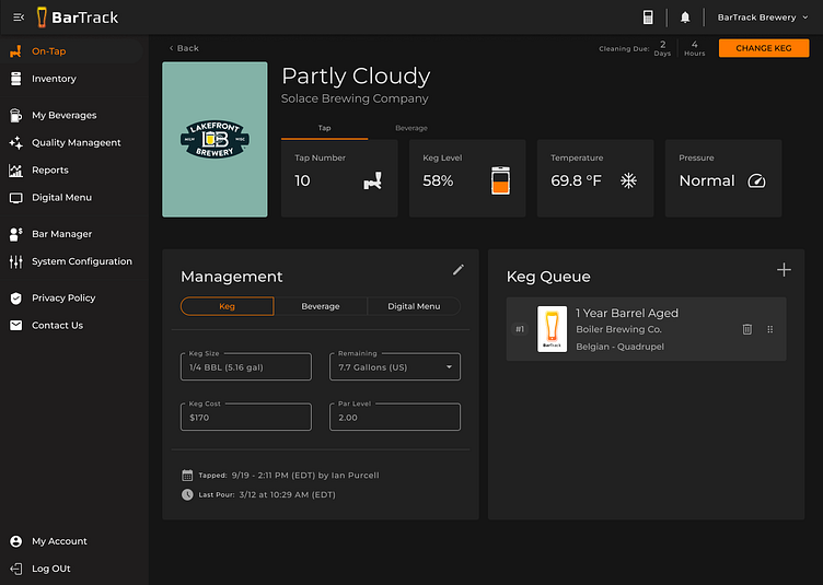
Final Design: A Drastically Improved UI with Teamwide Input
This gallery showcases the final screens, reflecting a major transformation in usability and aesthetics. The UI was completely refined with clear hierarchy, improved readability, and a sleek, modern design. Navigation and structure were reworked to improve clarity, making it easier for users to interact with the platform intuitively.
To ensure alignment, I ran company-wide Slack polls for any aesthetic disagreements. One major debate was over our CTA orange, where some pushed back against following the 60:30:10 color rule. By facilitating open discussions, we struck a balance between visual appeal and usability best practices.

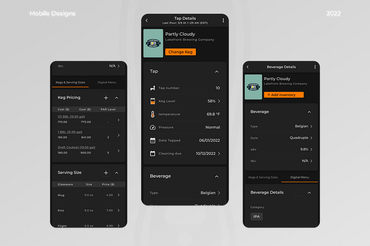
The Outcome
The final design was well received, validating the effort put into refining the information architecture and user experience. This project also marked my first time designing in dark theme, which introduced new challenges in contrast, accessibility, and maintaining visual balance. Overall, this experience reinforced the value of collaboration, iteration, and user-centered design, setting a strong foundation for future enhancements. 🚀