Accessibility enhancements for ESB PosLite sign-up screen
Hey there! I'm excited to share a project I recently completed for my UX Product Design Certification. I gave the UI of a SaaS company a fresh look. Here's a bit more about the project and I'd love to hear your thoughts!
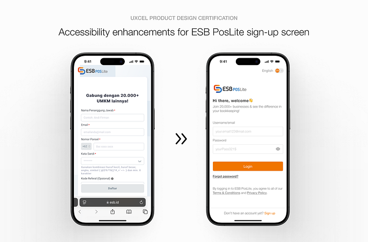
Overview
This project was focused on enhancing the accessibility and user experience perspective of the ESB PosLite mobile screen. The initial design had many usability issues that could affect people with disabilities and decrease overall user experience.
Key Issue
Accessibility concern
The page failed to fulfill WCAG standards, with a low-resolution logo, inadequate visual contrast, white space, font sizes, and weights.
Complex registration
The users encountered more friction while signing up for the original design. Mobile screens have limited real estate; Inputting more data can overwhelm users and make the process feel daunting.
New design solution
User experience perspective
The smallest font size is 16px for easy reading and more accessibility.
The background is off-white for ease of eyes and reducing stress.
Using Helvetica typeface to reduce friction.
Solid color background to allow accessibility for all users.
Designing only one-page sign-up for faster completion, reducing cognitive load, and minimizing drop-off.
Conclusion
This project points out the necessity of bringing accessibility and user experience into account throughout the design process. The sign-up page was improved by making small but effective adjustments that made it more accessible and user-friendly.
