Furō
The rebranding of Furō, a real estate project in Buenos Aires, began when the client approached us with the need to give the brand greater strength and personality while preserving its original essence.
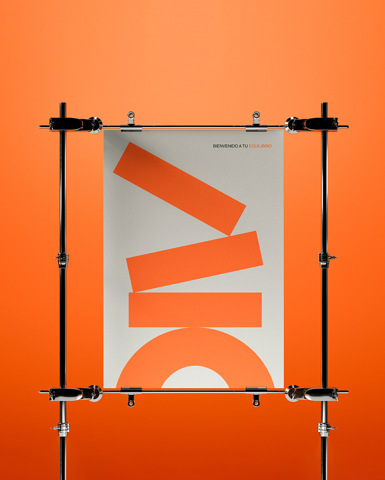
As part of this process, we developed and articulated a core brand concept inspired by modern life's fast-paced and stressful rhythm. Living in balance became more than just a phrase — it evolved into a guiding philosophy for Furō: a call to reconnect with what truly matters and rediscover the value of time and space.
We made subtle yet meaningful adjustments to the logo, highlighting the -tilde- over the "O" as a central symbol to convey the concept of balance. This element became the heart of the new identity, symbolizing harmony and equilibrium — perfectly aligned with Furō’s concept as a place where everything finds its perfect balance.
See the entire project here