Facultad Typeface

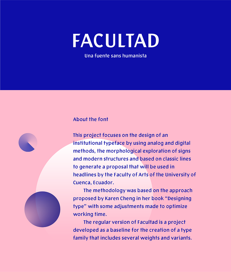
This project focuses on designing an institutional typeface using both analog and digital methods. Facultad, in its Regular weight, is conceived as a foundational project for the future development of a typeface family with more weights and variations, intended for the Faculty of Arts at the University of Cuenca, Ecuador. Facultad draws inspiration from the profile of the institution and its four schools (Music, Dance and Theater, Visual Arts, Design) and the development of the arts within the academic context. The process began with sketching uppercase letters using calligraphic pens, and once the basic set was completed, vectorization and spacing followed.
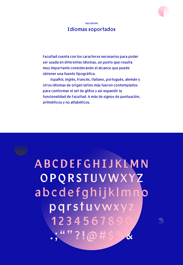
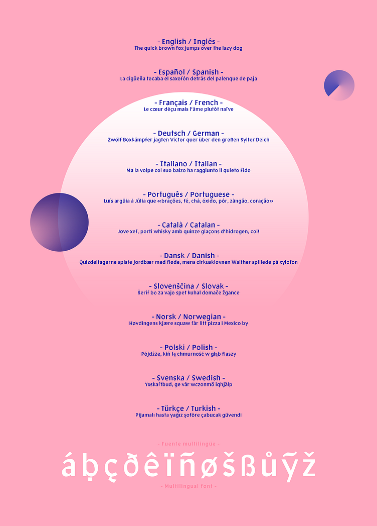
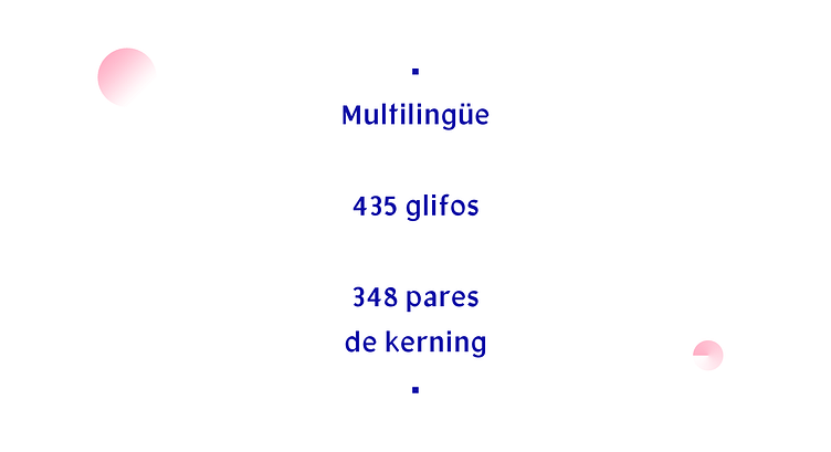
Being generated from calligraphic writing, the characters acquire morphological features such as angular terminations, inclined modulations, and intermediate contrast. One distinguishing property of the typeface is that it is built with classical structures in its dimensions while maintaining modern proportions in stroke thickness. Additionally, its x-height and wide apertures are notable. All these characteristics classify it as a humanist sans serif typeface. Facultad was designed to be multilingual, accommodating Spanish, English, French, Italian, Portuguese, German, and other Latin-origin languages, as well as punctuation, arithmetic, and non-alphabetic symbols.
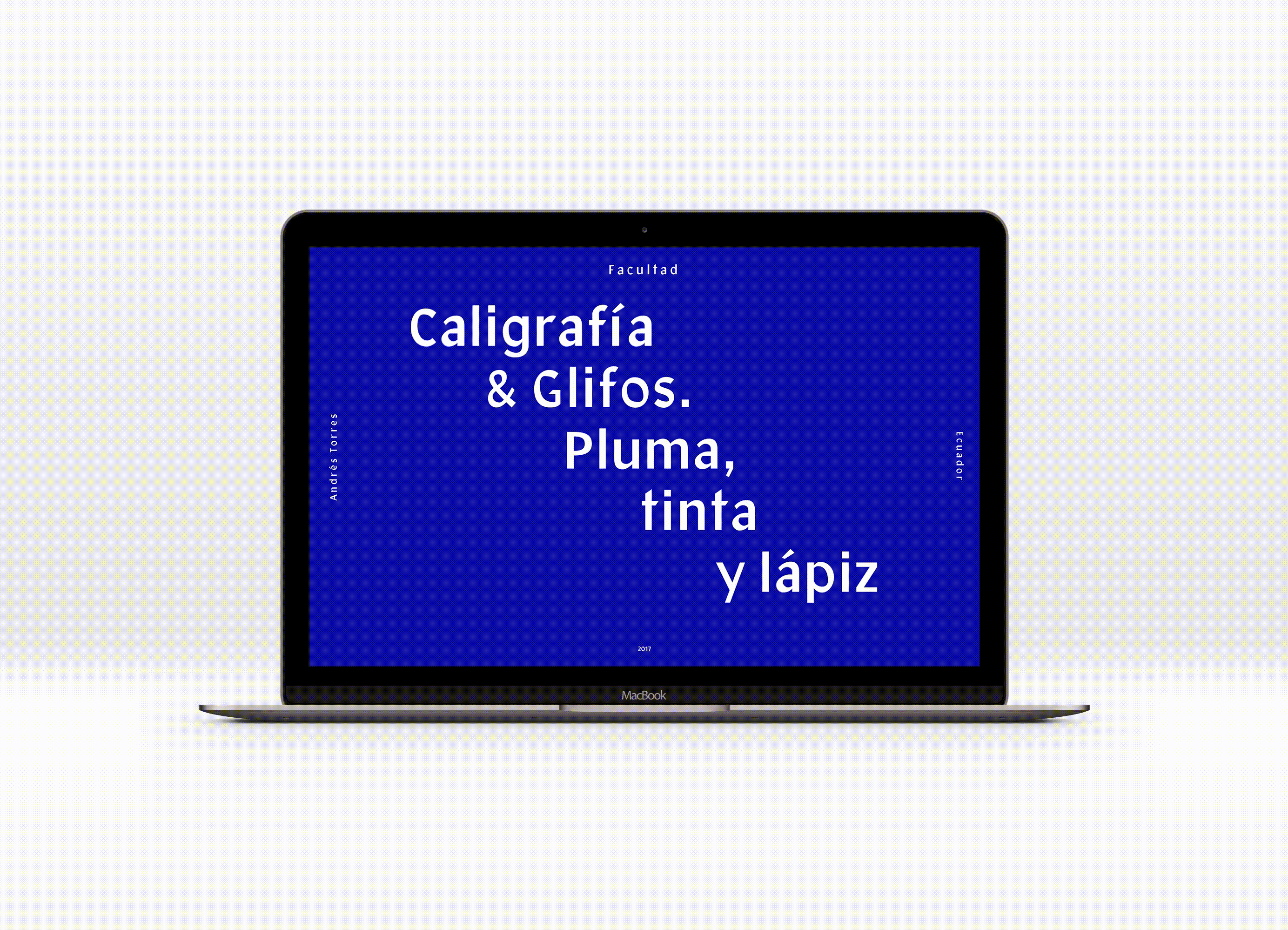
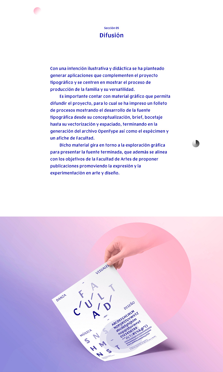
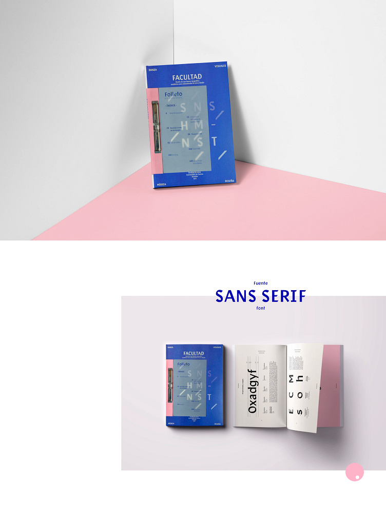
To complement the typographic project with an illustrative and educational intent, applications were generated to showcase the production process of the typeface and its versatility. It is essential to have typographic material to disseminate the project; therefore, a process booklet was printed, showing the development of the typeface from conceptualization, brief, sketching, vectorization, and spacing, to the creation of the specimen and a poster. This material revolves around graphic exploration to present the finished typeface, aligning with the Faculty of Arts' goals of proposing publications that promote expression and experimentation in art and design.
Years later, the typeface has been used many times worldwide. The BBC used Facultad in the advertising campaign for its TV series Dracula. This page displays some of the applications of the typeface featured in the official trailer and in ads placed on the streets of London and Birmingham, as well as the material created for social media.