My Ten Nights: Ramadan Wrapped 2024
Hello there! 👋
I'm John a contracted senior product designer at My Ten Nights; a donation platform for users to automate their donations over the last 10 nights of Ramadan.

So what was the brief?
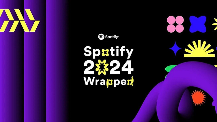
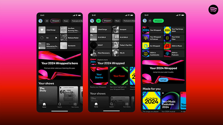
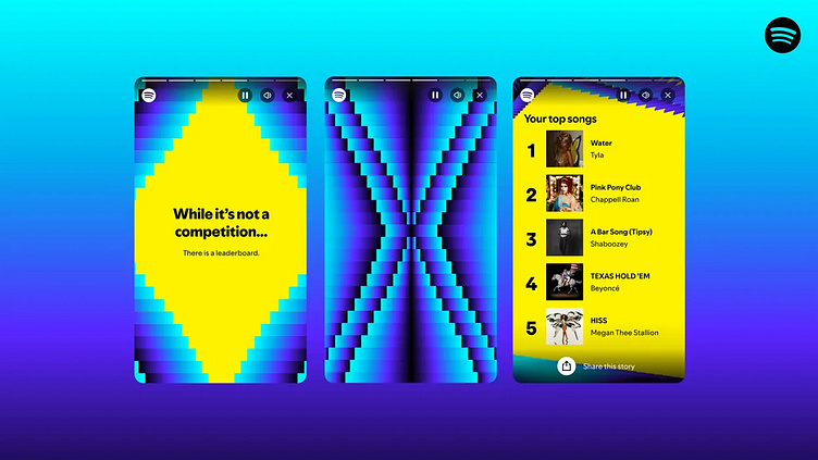
The brief was a refresh of the website's user interface, modernizing it with 2025 design trends and introducing a "Ramadan 2024 Wrapped" feature, inspired by year-end summaries from platforms like Spotify. This allowed donors to share their Ramadan donation statistics on social media, promoting the platform and attracting new donors from their networks.
Feature Branding
My initial focus was developing feature branding that aligned with the established My Ten Nights brand.
To create an engaging user experience, I incorporated a Lottie fireworks animation, drawing inspiration from Spotify's vibrant feature colors. This animation is set against a midnight navy gradient, also evoking the ambiance of a night sky.
Homepage UI Design
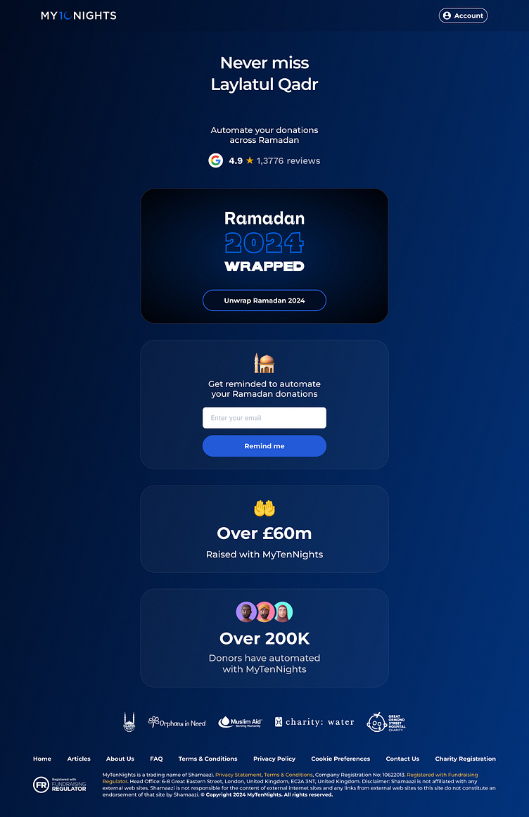
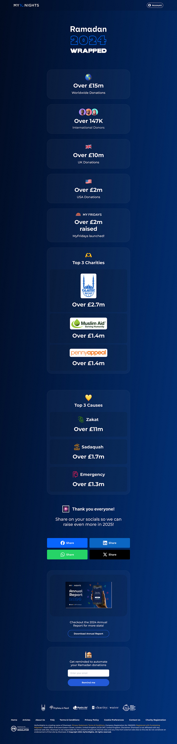
Starting with a mobile first approach with most donors being on their phones in mosques I started with designing the top of the webpage with a simple and clean header with the logo and an Account button inspired by Octopus.
I wanted the UI to be clean, engaging, modern and impactful. I didn't change the logo or the typeface as these were set in stone as part of the design system, but I set them both against a navy to royal blue gradient based on blue tones from the logo.
I wanted the hero content to be instantly engaging so I underlined the hero text with a sparkly stars Lottie animation and included Google reviews to bring trust to the product.
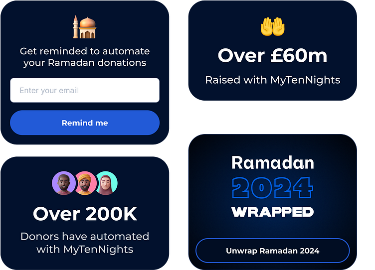
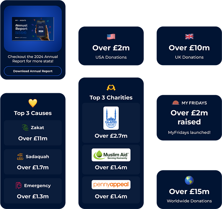
For the homepage cards I wanted them to be simple and easy to digest for the user. I didn't have any brand assets other than the product logo so I found some open source 3D illustrations for the user memoji profile images and incorporated some other emoji's to keep the cards playful and interesting.
I also used a radial background on the Wrapped card to spotlight the logo and give a dark background for the fireworks animation.
After finalizing the mobile version of the homepage I created a simple desktop version using all the same components centered in an 800px content area column that also worked well on tablets.
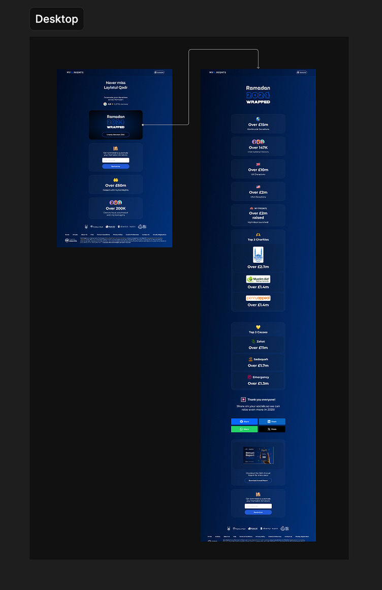
Wrapped 2024 UI Design
I continued my mobile first approach for the wrapped webpage and reused the fireworks animation and feature logo for the hero of the page so it feels like the user is going into the card.
The entry point of the webpage is the Wrapped card on the homepage. I decided the whole card should be tappable not just the button for ease of access.
I reused some of the card components from the homepage and created some new ones to show off the stats married with logos or more relevant emojis.
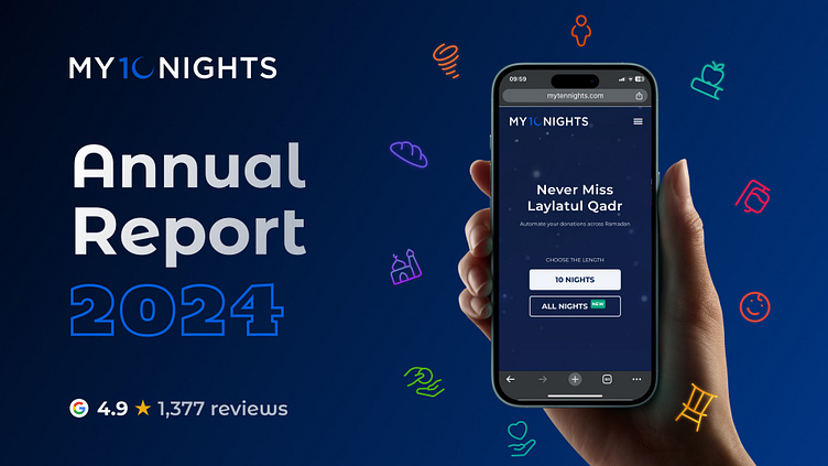
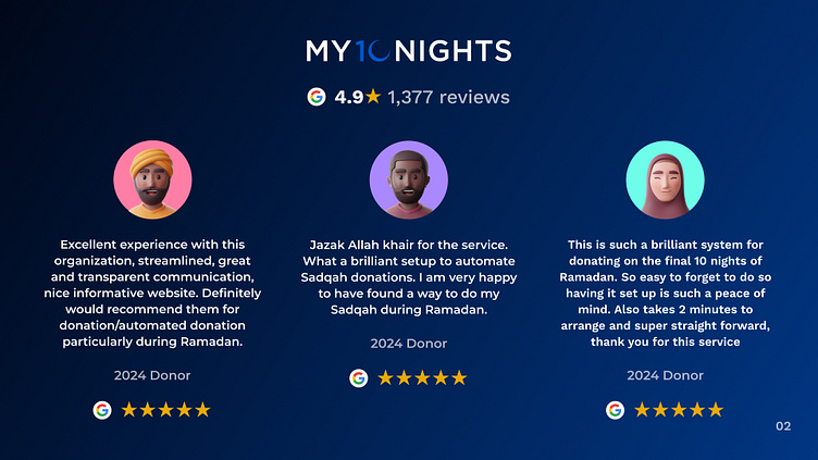
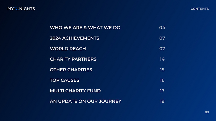
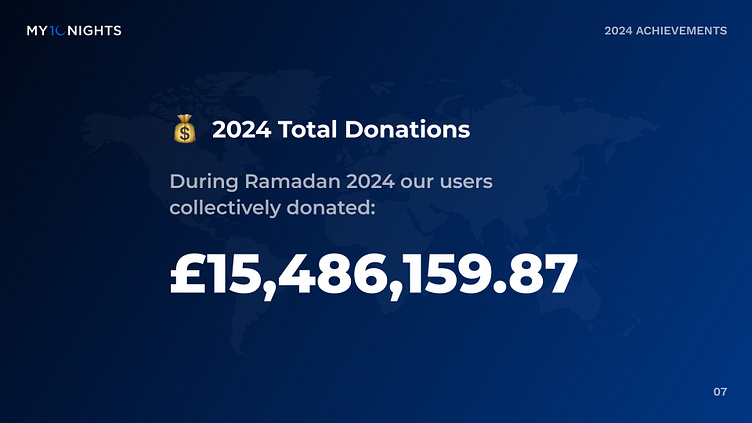
I also created a unique card for if the users wanted to download the Annual Report deck to learn more company stats to invest more trust in the platform.
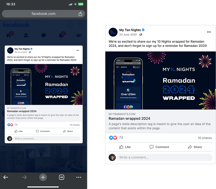
Social Media Sharing 📣
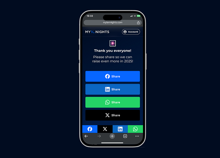
After the user has viewed the stats component cards the user can then tap a button to share the webpage on their social media platforms. There are also sticky social media sharing buttons fixed to the bottom of the screen. These are if the user wants to share when the social sharing buttons are not in the users view when scrolling.
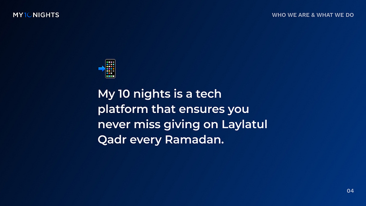
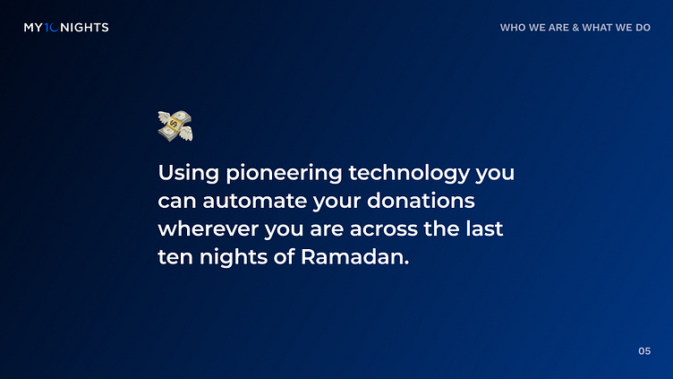
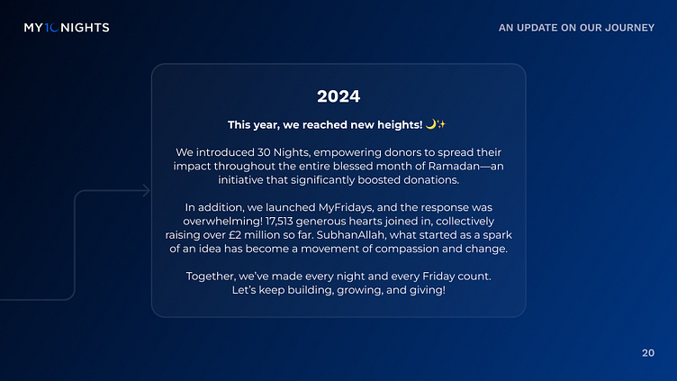
Deck Design Side Quest ⚔️
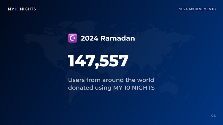
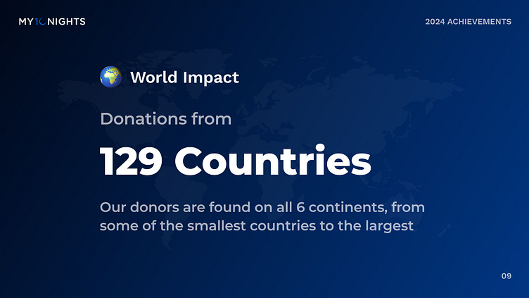
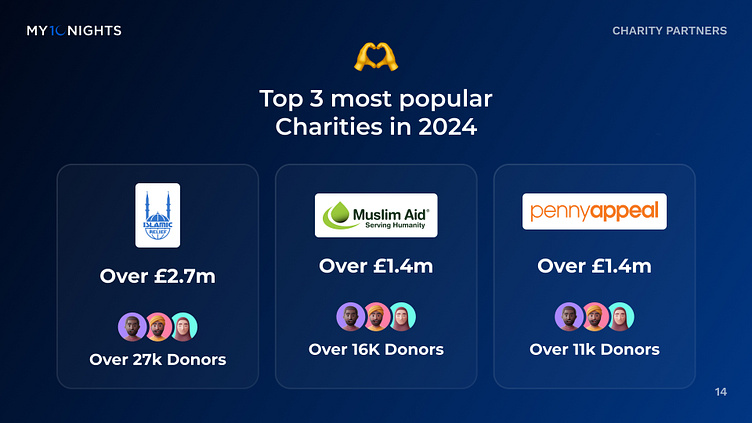
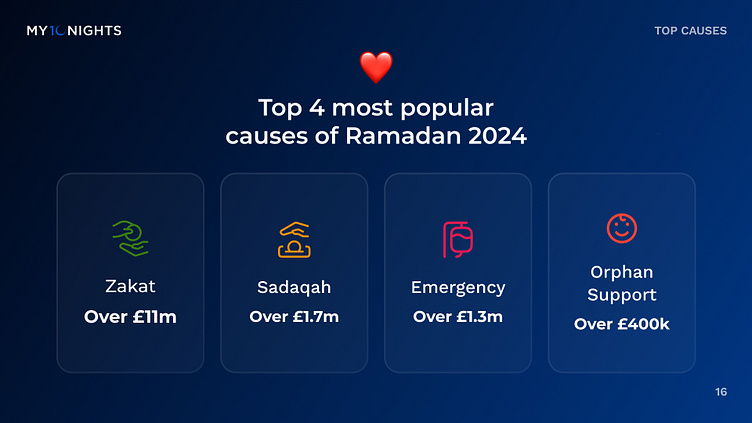
As a side quest I needed to design a deck for the 2024 Annual Report which could be downloaded by users who wanted to learn more stats about the success of the platform. This would also build more user trust and aim to convert more new donors. Some example pages from the deck below.

Email Design ✉️
The Growth team wanted to send out an email branded to suit the campaign to all current donors to promote the Wrapped page and increase awareness and promote sharing.

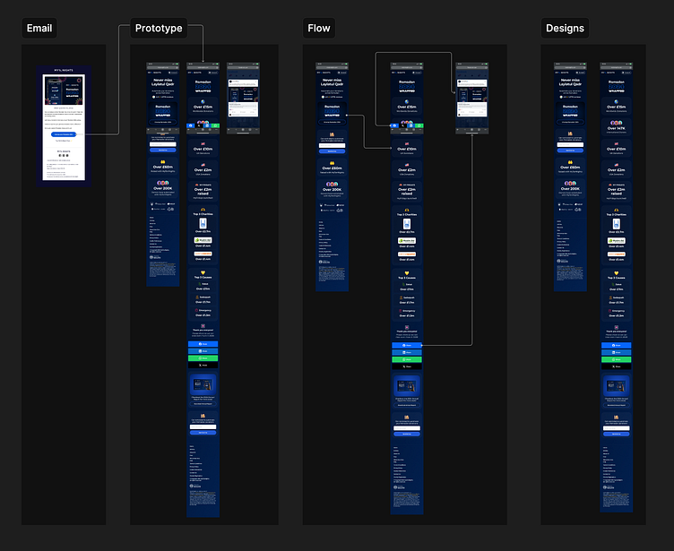
Ready for Development 🧑💻
The designs were signed off and the Figma files were handed over to the engineers. The final designs included mobile and desktop versions, user flows and prototypes.
Thank you for reading, what are your thoughts? Let me know in the comment section! Press "L" on your keyboard to show some love ❤️