Logo Design for Food Brand | Wheatables | Premium, Rustic
The Brand:
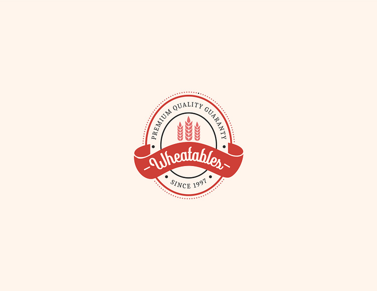
Wheatables is a premium food brand specializing in high-quality wheat products. Its traditional circular logo with a wheat stalk and "Premium Quality Guarantee Since 1997" ribbon conveys heritage and reliability, targeting health-conscious consumers seeking authentic, natural ingredients.
The Problem:
Food brands often blend together with generic branding. Wheatables needed a logo that emphasized its commitment to quality and tradition to stand out in a competitive market.
The Outcome:
The rustic design highlighted Wheatables’ dedication to premium, natural products, attracting customers seeking trustworthy, high-quality wheat-based goods.
More by VERV Design View profile
Like
