Quber™ - Isometric Logo for a construction management AI tool
The Challenge Quber™, a construction management AI tool, needed a fresh identity to stand out in a competitive market. Their previous branding lacked a strong visual connection to their industry and didn’t communicate innovation effectively. They wanted a logo and branding that reflected their tech-driven approach while staying rooted in construction.
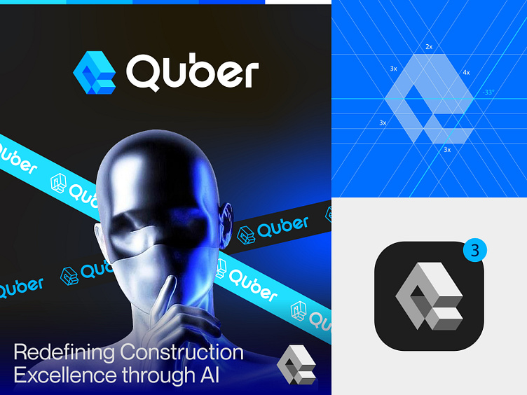
The Concept The logo idea was simple yet powerful: combine the letter “Q” with bricks to symbolize construction and structure. The design subtly integrated bricks into the tail of the “Q,” creating a balance between technology and the construction industry. The choice of blue was intentional. it represents trust, reliability, and innovation, aligning perfectly with Quber’s mission.
The Process
Research & Discovery: We studied the construction and tech industries to understand what resonates with their audience.
Sketching & Iteration: Multiple versions of the “Q + Bricks” concept were explored to find the perfect balance.
Refinement: The final design was polished to ensure it worked across all platforms, from business cards to digital screens.
Branding Extensions: A cohesive brand system was developed, including typography, color palettes, and marketing materials.
The Impact
Stronger Identity: The new logo and branding gave Quber™ a professional, modern look that instantly communicated their expertise in construction and AI.
Increased Trust: Clients and partners responded positively to the clean, trustworthy design, leading to more inquiries and collaborations.
Brand Recognition: The unique “Q + Bricks” concept made Quber™ memorable, helping them stand out in a crowded market.
Client Satisfaction The Quber™ team was thrilled with the results. They felt the design perfectly captured their vision and values. The client mentioned, “The logo and branding have transformed how people perceive us. It’s not just a logo—it’s our identity now.”
Conclusion Quber™’s new logo and branding didn’t just improve their visual appeal—it strengthened their market position and built trust with their audience. The “Q + Bricks” concept, paired with a thoughtful color choice, created a lasting impression that continues to drive their success.
Press "L" to show your love ❤️️
______________________________________________________________________________________________
👉 Say goodbye to ineffective logos and hello to a design that’s both memorable and recognizable!🌟
📩 Available for new projects :
Email: info@rahidrehman.me
WhatsApp: https://wa.me/8801705553455
Telegram: @rahiddesigner
💡 Follow for more update: Dribbble, Behance, Instagram, Twitter, Linkedin
© Rahid Rehman