Kapal KKP Landing Page Redesign
"Imagine navigating through stormy waters without a compass.
That’s how millions of Indonesian fishermen and maritime stakeholders felt when using kapal.kkp.go.id - their critical portal for vessel data. Clunky menus buried under bureaucratic layers. Confusing forms that felt like deciphering naval codes. An interface stuck in the 2000s, despite managing modern fisheries.
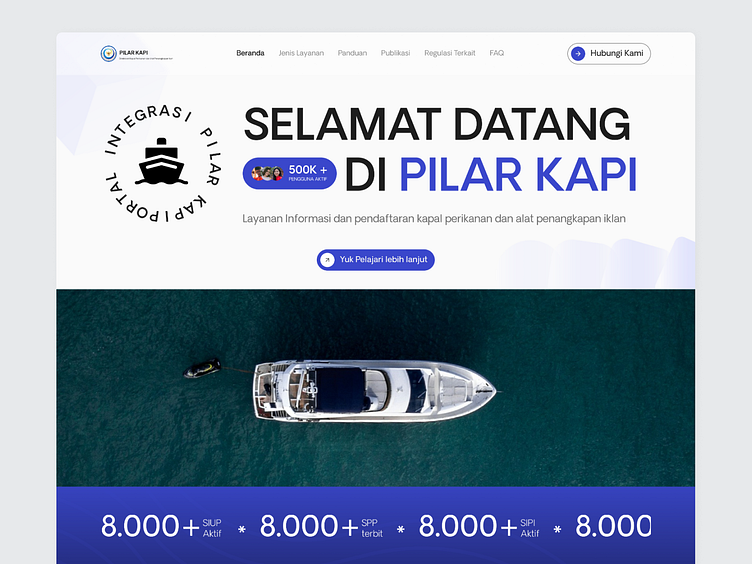
A redesign project for Kapal KKP (Ministry of Marine Affairs and Fisheries), the primary platform for managing fishing vessel data in Indonesia.
🔍 Previous Challenges :
❌ Confusing user flow – Users struggled to complete tasks due to complex navigation.
❌ Unclear system structure – Poorly organized information and features.
❌ Outdated UI – The old interface lacked a modern and trustworthy look.
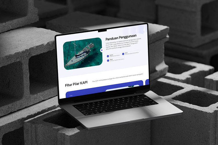
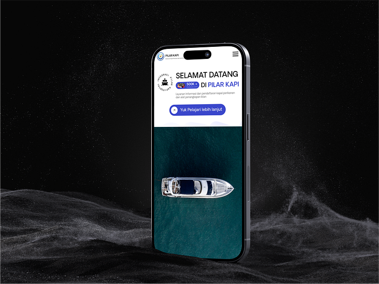
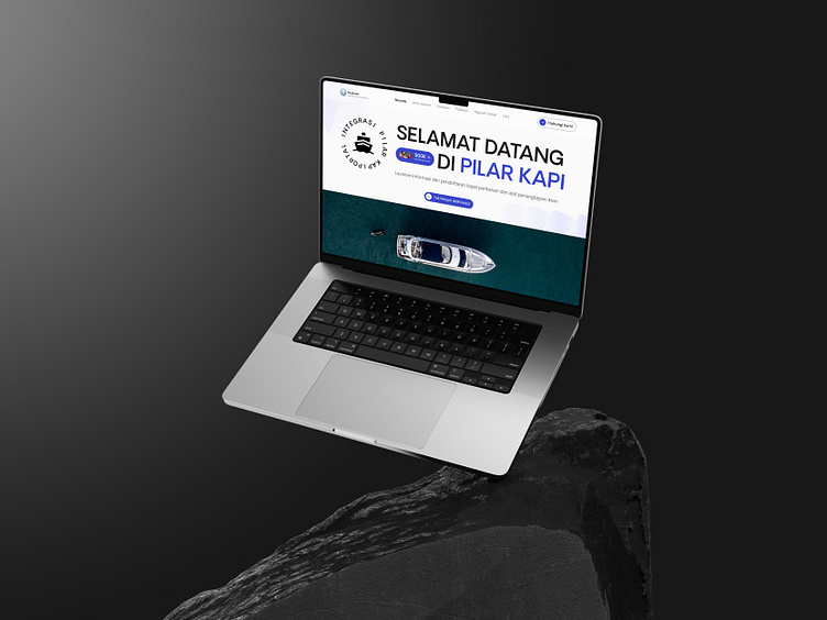
✨ Redesign Solutions:
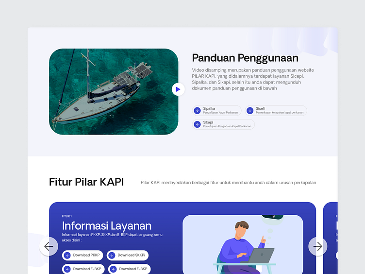
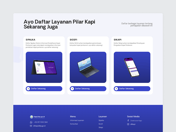
✅ Simplified workflows for a smoother user experience.
✅ Clearer system structure to improve navigation.
✅ Modern & responsive design, optimized for both desktop and mobile.
With these improvements, the Kapal KKP website is now more efficient, user-friendly, and visually appealing, ensuring better transparency and effectiveness in managing fishing vessel data
💬 What do you think? Drop your feedback! 🌊⚓