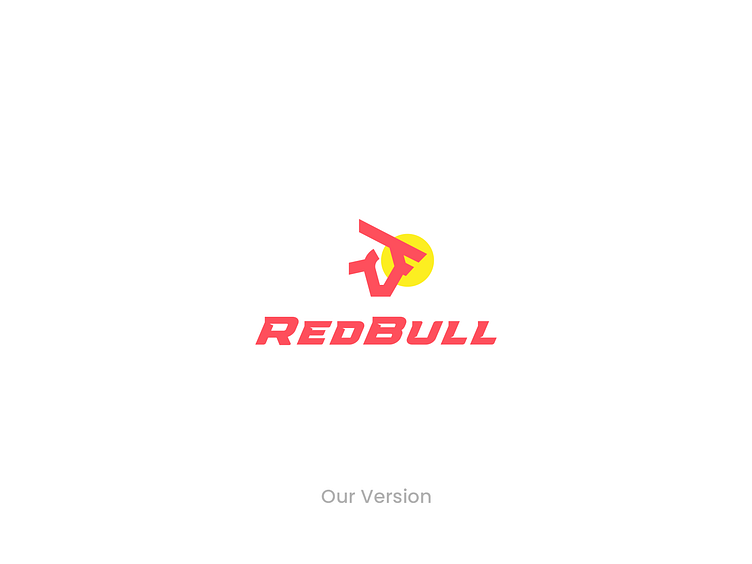
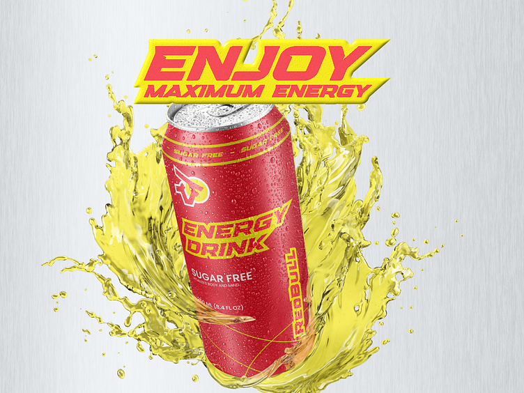
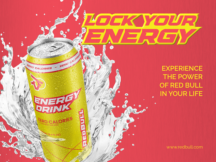
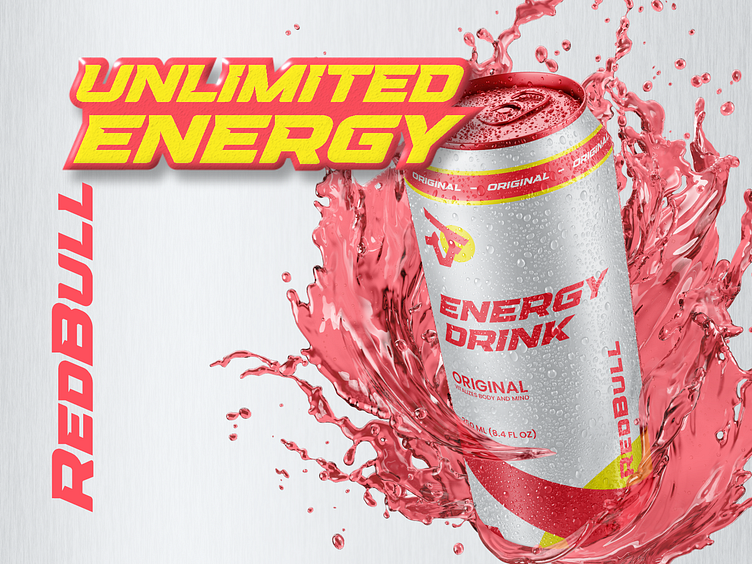
Redesign Logo RedBull

At Garagephic Studio, we’re always down for a challenge, and this time, we decided to reimagine something BIG—the Red Bull logo. You know, the one that’s been giving energy vibes for ages. We thought, “What if we give it a fresh spin and make it feel more now?” So, we got to work and poured our creativity into it.
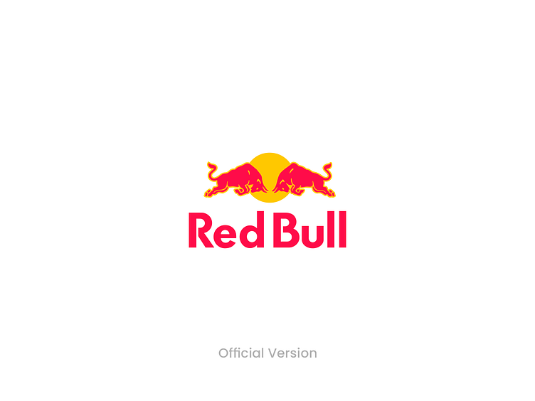
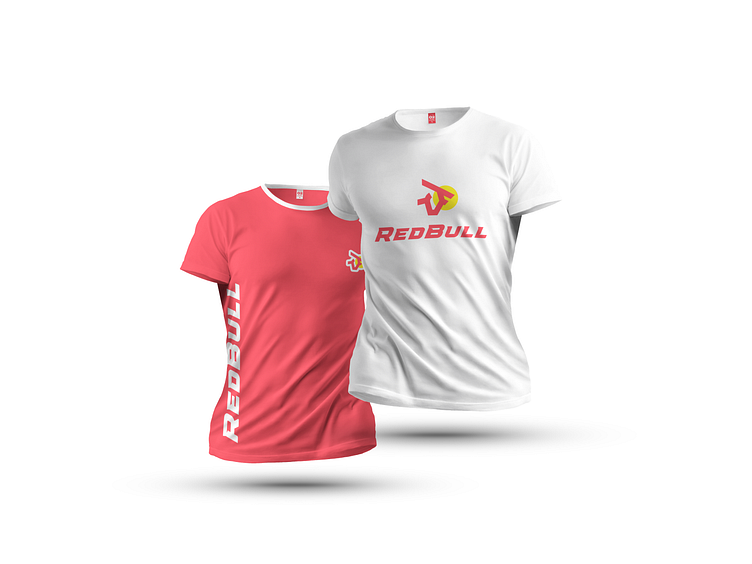
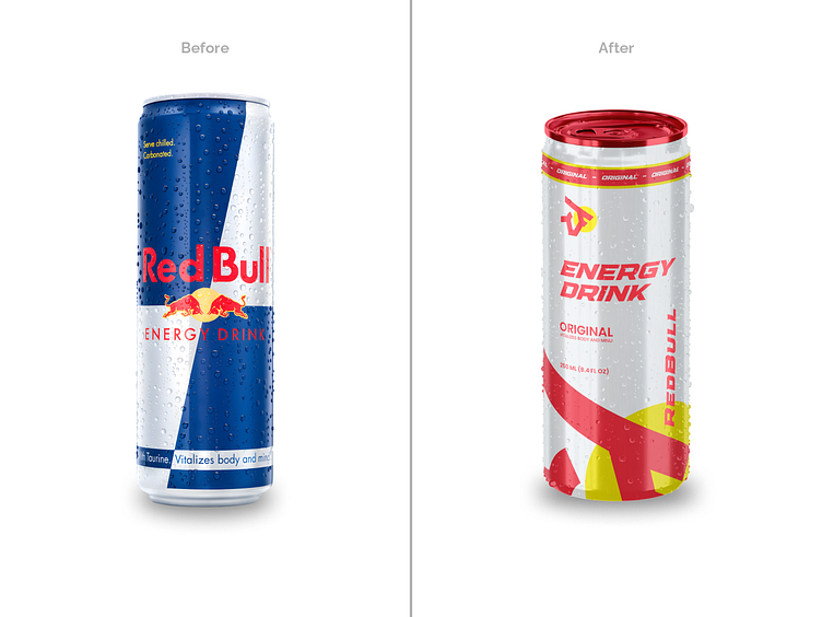
The result? A bold and edgy take that still holds onto the spirit of Red Bull. We kept the iconic yellow sun as the centerpiece, but the bulls? Gone abstract! It’s sharper, more dynamic, and just feels like it’s ready to take off. The typography also got a little upgrade—cleaner and sleeker, while still screaming power.
Now, we know the original is legendary, but sometimes reimagining something isn’t about replacing—it’s about exploring what’s possible. So, tell us, did we push the right boundaries? Let us know if this version’s got you feeling the energy too!