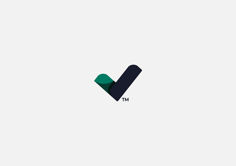
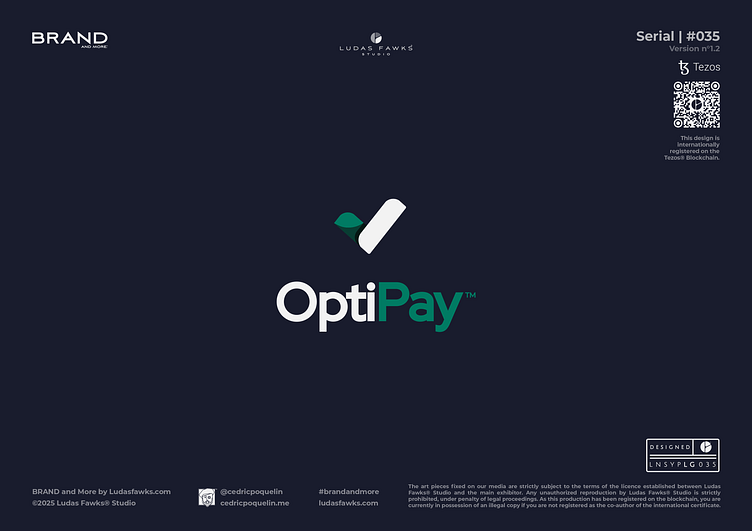
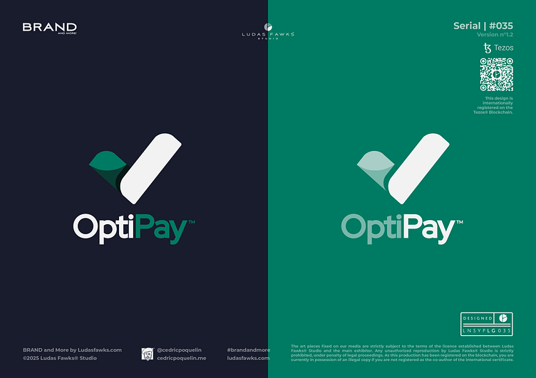
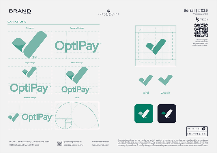
Logo | Optipay™
About the project
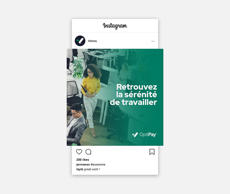
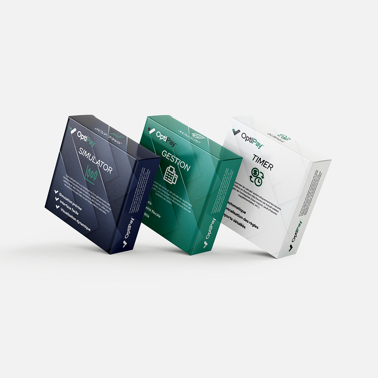
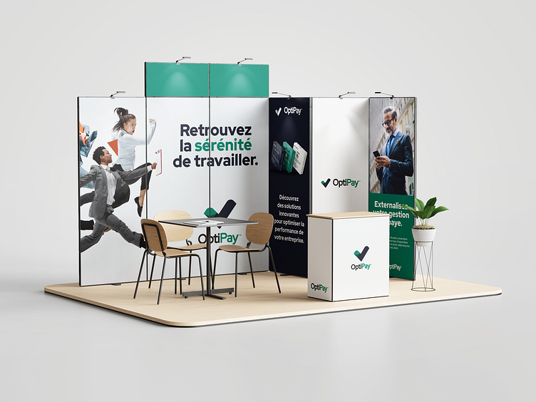
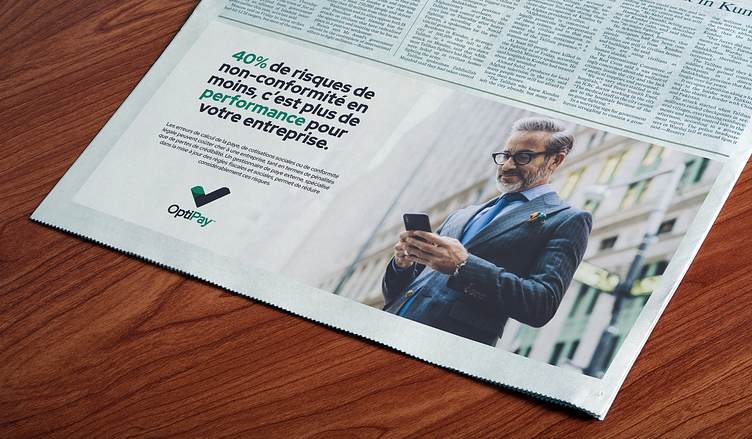
Optipay positions itself as an innovative player in the payroll management field, bringing advanced expertise and cutting-edge technological solutions to companies seeking efficiency. As an independent company, it stands out through its personalized approach and deep understanding of modern payroll challenges.
Specializing in the development of intelligent payroll management tools, Optipay transforms administrative complexity into smooth and intuitive processes. Its team of experts supports companies in their digital transition by offering solutions that automate and optimize the entire payroll cycle, from data collection to payslip generation.
Through its services, Optipay not only ensures strict compliance with regulatory changes but also guarantees maximum security of sensitive data. Its platform, both robust and flexible, adapts to the specific needs of each organization, whether growing SMEs or large companies with complex structures. This adaptability, combined with premium customer service, makes Optipay a trusted partner for any company looking to modernize its payroll management.
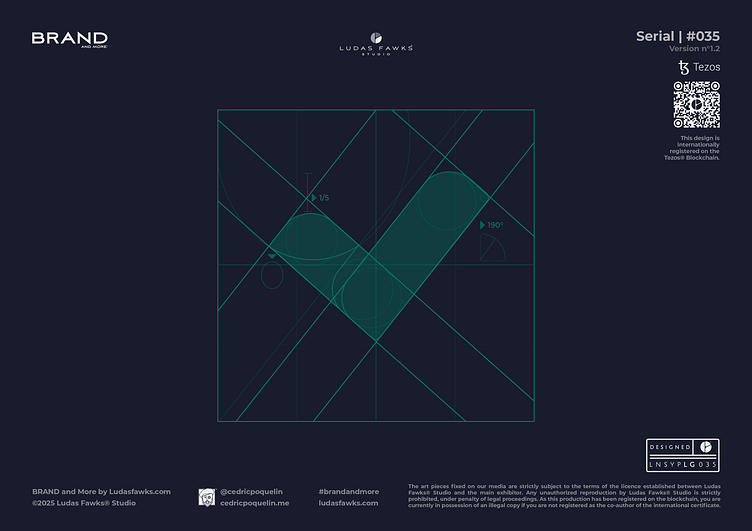
Conception
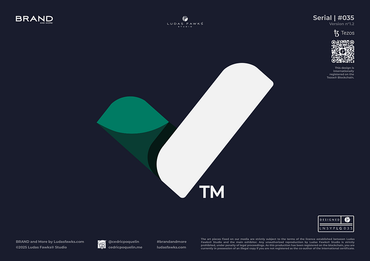
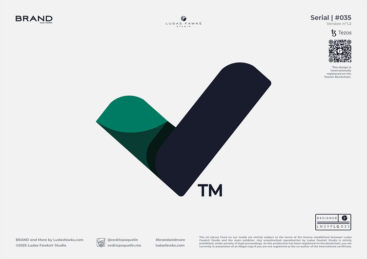
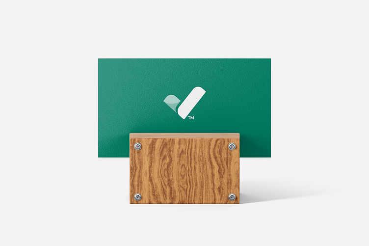
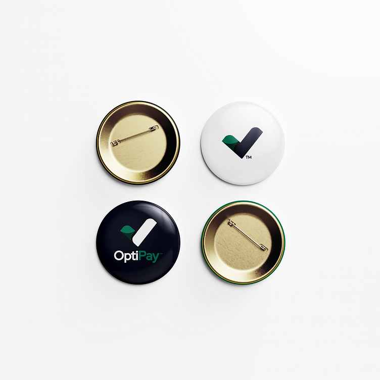
The design of the OptiPay logo evolved through five proposals, ranging from a stylized butterfly motif to a fusion of the letters O and P, as well as the use of mathematical symbols. The final concept stands out for its clever use of a diagonal half-equal sign, forming a minimalist bird within a triangular composition. This design was optimized with a background reminiscent of a checklist and rounded corners, creating a logo that combines lightness, dynamism, and stability— perfectly aligned with the spirit of the project.
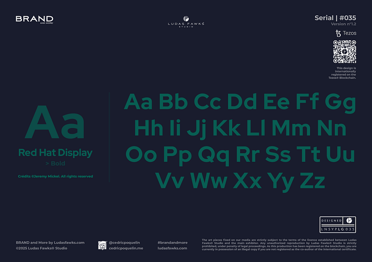
Font
The typography used is ©RED HAT DISPLAY, developed by Jeremy Mickel. The Red Hat Display typography, with its complementary Display and Text styles, stands as an optimal choice for Optipay. Its low contrast and open counterforms ensure excellent readability of financial information, while its geometric sans-serif approach reinforces the platform's modern identity.
Colors
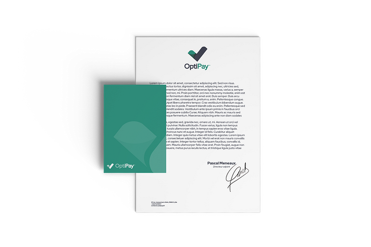
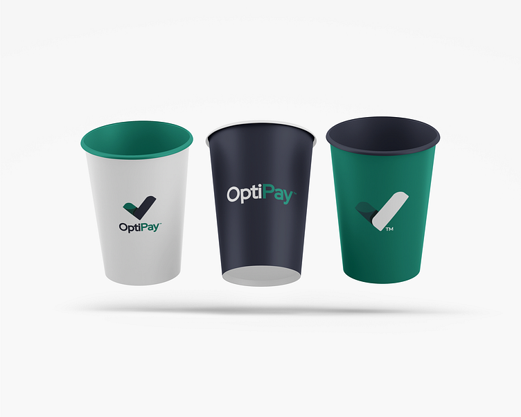
For this branding, the color palette is built around three shades: a midnight blue, which reinforces the professionalism of the branding, enhanced by a viridian green that conveys a sense of serenity, along with a pale white that highlights the overall composition. This color palette allows the branding to exude a serious and efficient atmosphere while subtly suggesting a technological touch.
Copyrights
The art pieces fixed on our media are strictly subject to the terms of the licence established between Ludas Fawks® Studio and the main exhibitor. Any unauthorized reproduction by Ludas Fawks® Studio is strictly prohibited, under penalty of legal proceedings. As this production has been registered on the blockchain, you are currently in possession of an illegal copy if you are not registered as the co-author of the international certificate.
This design is internationally registered on the Tezos® Blockchain.
_______________________________________
Ready to Work on yours?
and make something great with your project !
_____________
What We Do
Contact
> What'sApp | > E-mail : hello@cedricpoquelin.me
Let's Follow
> Behance | > Instagram | > Facebook > Linkedin
_____________
© 2025 Ludas Fawks® Studio X Cédric Poquelin. All Rights Reserved.
