The Sims 4 Design Case Study
A deep dive into the creative and technical steps taken to design a seamless and user-friendly experience in The Sims 4.
Overview
This case study represents the culmination of my experience in the UX/UI for Gaming course provided by Elvtr, led by instructor Ivy Sang. Over two months, I immersed myself in a learning journey, exploring the design process for developing user interfaces for games. From developing player profiles and mapping player journeys to creating paper prototypes, wireframes, mockups, and conducting user testing, I refined my ability to design user-centered gaming interfaces. For this project, I chose to focus on The Sims 4 with the goal of improving the accessibility and intuitiveness of the experience for new players. Join me as I unpack the challenges and insights of designing for one of the gaming industry’s most beloved franchises.
Duration
2 months (December 8th 2024 - January 28th 2025)
My Roles & Responsibilities
This was an individual project. My responsibilities included:
User research
Player journey
Flowchart
Wireframing
User testing
Hi-fi mockup
Accessibilty testing
Case study creation
My Process
The Challenge
A new player’s initial interactions with the game lack sufficient context regarding its functionalities, and the limited number of visible customization options makes it difficult to quickly and effectively explore choices.
The Solution
By incorporating clearer labeling and additional context, while adhering to Gestalt design principles, the game’s functionalities will become more intuitive and user-friendly. Additionally, increasing the number of visible items and providing an option to expand or reorient views will further enable players to compare options more efficiently at a glance.
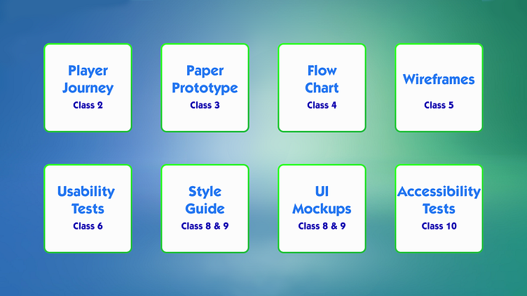
Player Journey

Paper Prototype
Flow Chart
Wireframes
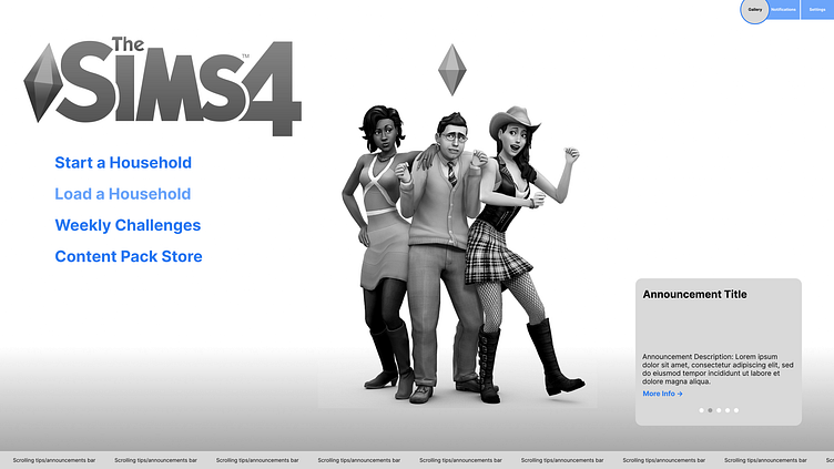
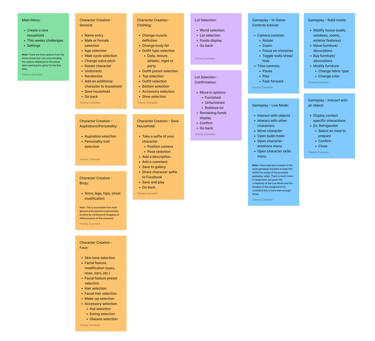
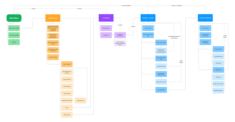
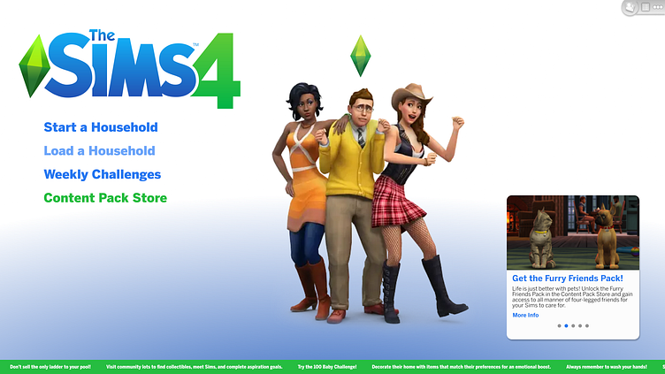
Main Menu
I, like many other people, found The Sims 4's main menu to be a cluttered mess. Tiles for advertising "Content Packs" took a majority of the screen real estate. I decided to move them into an announcement tile and "Content Pack Store" submenu to make room for a larger splash image and simplified menu layout.
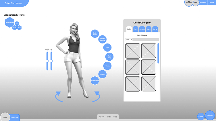
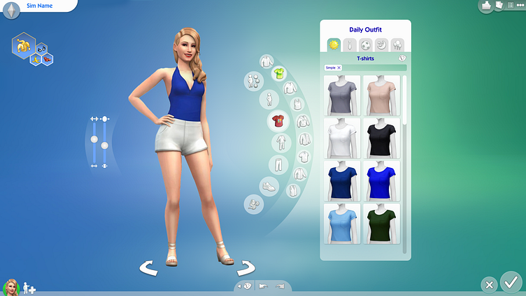
Character Creation
The main issue I found with this screen was the outfit categories and clothing categories only being communicated by icon. I added a reactive label to the top of the clothing menu to display the currently selected outfit category and clothing item category. Additionally, I reorganized and labeled the aspiration and traits menu to make their function more apparent.
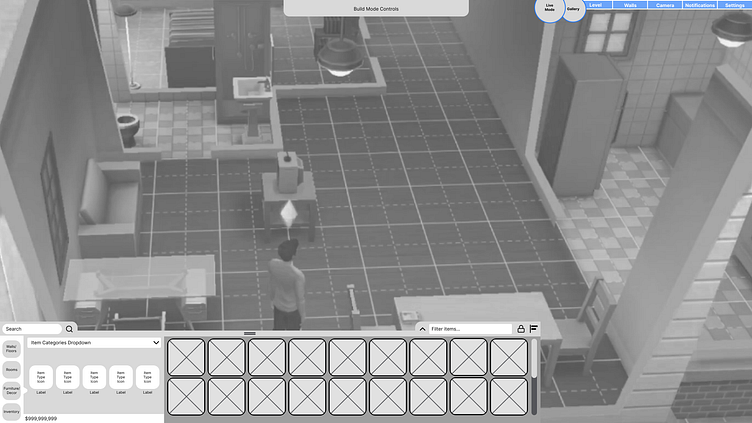
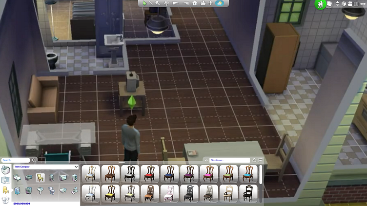
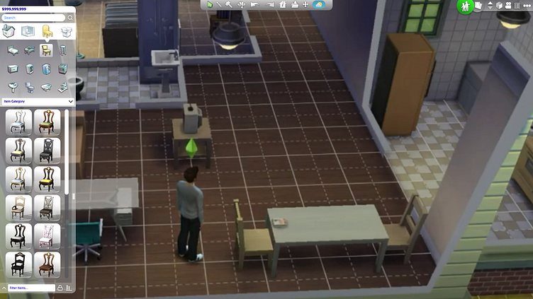
Build Menu
For the most part this screens structure is unchanged. The only additions where an expander so a player could resize the build menu to display more items, an option to reorient the build menu to be vertical and a toggle to lock the build menu at its current size and orientation.
User Testing
Research Objectives
Explore possible pain points/miscommunications in the redesigned screens
Ensure testers can efficiently complete tasks
Ensure players can navigate the provided screens without assistance
Determine if players respond positively to the redesigned screens
Iterate designs based on tester feedback
Logistics
3 Testers
Females and Males age 13 - 30
Have testers explain their thought process aloud
Results
On average, testers found the changes made beneficial and understandable
Testers were able to complete their tasks quickly
Size of font on some of the options was either too large or too small to be read
Organization of clothing items on character needs to be tweaked
Aspirations and traits menu was too ambiguous
Some users want to be able to customize the shape and orientation of the build menu
UI Mockups
Outcomes
This project was a great way for me to broaden my design experience. Games are something that I have been passionate about my entire life and putting myself in the shoes of a Game UI/UX Designer gave me a new found reverence for the craft. The challenge of balancing usability and function with fun while maintaining the general feel and flow of the exisisting interface was incredibly engaging and difficult. If given more time, I would probably focus on making the Main Menu match more closely with the organization style provided in the latest UI update of the Sims 4 (I had been using reference from an old build of the game) and taking more time to polish the vertical build menu mockup.
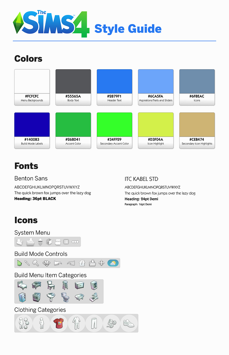
Overall, I feel like I accomplished the goal of delivering an update to the existing interface that increases readability and usability while remaining intuitive and adhering to The Sims existing branding and style guidelines.
If you liked what you saw, please check out some of my other works below!
